LinkedIn Lead Gen Forms vs. Traditional Landing Pages
Lead generation is vital for many of Tuff’s B2B partners. The goal: Create a customer database for future marketing and remarketing initiatives. Social platforms, like LinkedIn, offer native lead generation forms, making it a go-to choice for many brands. Leveraging LinkedIn’s credibility and network, you can attract and drive leads from relevant prospects to boost your business.
However, there’s also the tried-and-true method of driving leads/form submissions via a dedicated landing page experience. This gives you total control of what you’re showing users and the information you’re collecting from them.
As with most aspects of digital advertising, there are pros and cons of both methods. We’ve outlined what these look like below, as well as some questions to think through when deciding which strategy works best for you. Keep these quick tips in mind as you move forward with lead gen efforts.
LinkedIn Lead Gen Forms: Pros and Cons
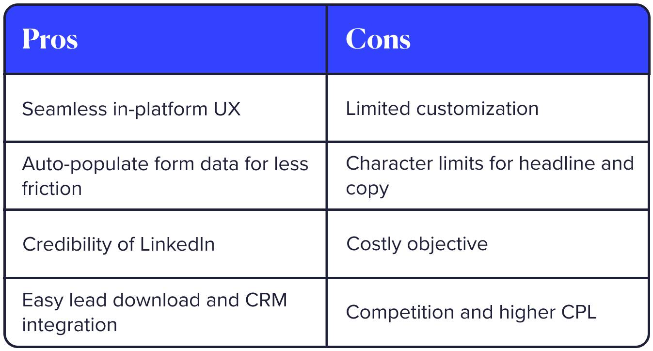
Let’s begin by taking a look at LinkedIn lead generation forms, which are created and hosted in the platform and appear native. These are easy to set up and don’t require any additional resources on your end to implement and execute.
🟢 The Pros
Let’s talk about what makes LinkedIn Lead Gen Forms work:
Seamless UX
- One of the biggest benefits of utilizing LinkedIn’s lead generation feature and the in-platform native lead forms is they provide a seamless and simple user experience. Since forms are integrated directly into the platform, users don’t have to navigate to a landing page and away from their current tab. This reduces any drop-offs on the form submission and, thus, increases the likelihood that the form is completed.
Auto-populate feature in LinkedIn
- LinkedIn stands out from other social platforms for lead generation thanks to its auto-population feature. This means that when users fill out a form, it automatically fills in their name, job title, company name, and sometimes even their phone number and email address from their LinkedIn profile. This saves users from the hassle of manually entering this information, and they only need to edit the phone number and email address fields if necessary.
Credible and trustworthy platform
- Besides the fact that submitting information via a lead form is easy and doesn’t take much time or energy at all, users tend to trust LinkedIn more because it’s a credible platform that they already interact with. They may be more comfortable handing over personal info than they would on an external website. Overall, this comfort coupled with the auto-populating feature above means that lead volume (and lead quality) may be higher. Since users need to have information associated with their profile and since LinkedIn is a professional network, this means that the users submitting their information may be more reputable and genuinely relevant to your product or service.
Efficiently and easily download your leads
- Finally, the process of collecting leads through LinkedIn is really efficient because there are so many ways to set up a landing page and, thus, so many ways to collect lead information. On LinkedIn, you will be able to download leads directly from the platform in a .csv format. Even more convenient, you can also integrate your ad account with your marketing automation or CRM system, such as HubSpot or Salesforce (but those are only two of several!) This means you can automatically send the leads you’re driving into your system so you can bake them into your existing workflows, enter them into your lead nurture campaigns, and more.
🔴 The Cons
Sounds great, right? However, it’d be remiss of us to not mention the cons:
Inability to customize the lead form
- When using LinkedIn’s built-in lead generation forms, you’ll face certain restrictions. One significant limitation is the inability to fully customize the form to your needs. LinkedIn offers a variety of predefined form fields to choose from, but they might not always match your exact requirements. Although you can create a custom field and provide options, there’s a limit to how many options you can include. Alternatively, you can allow users to input their own information in a custom field, but this means that certain fields won’t be automatically filled out, which can add unnecessary friction to the form submission process.
Visual design limitations
- In addition to customization limitations, there are constraints on visual design. You’ll find character limits for the form’s headline and copy text. Also, the image displayed is typically your company page’s banner, and unfortunately, you can’t customize it at this time. (But that’d be really great! C’mon, LinkedIn!)
Costly objective
- Lead generation is also one of the most popular campaign objectives on the platform, meaning it can be costly. LinkedIn is already a more costly platform than the other social platforms. Your CPC (cost-per-click), CPM (cost-per-thousand-impressions), and especially CPL (cost-per-lead), may be higher as you compete against a larger audience in the ad auction.
As you can see, LinkedIn Lead Gen Forms offer convenience and credibility for lead generation but come with limitations and potential added costs. Now, let’s explore the implications of using a traditional landing page for lead collection from LinkedIn.
Traditional Landing Pages: The Classic Approach
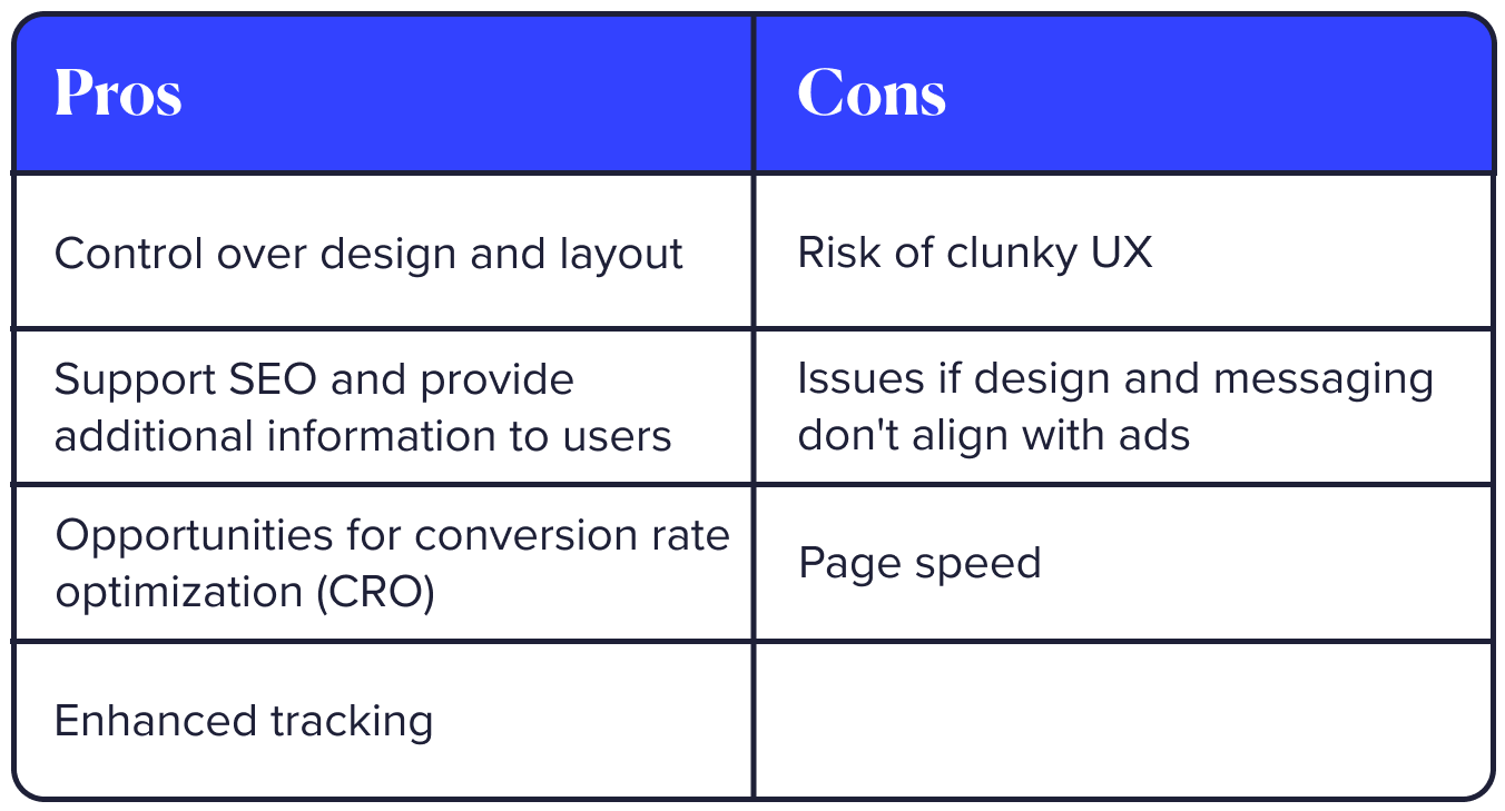
A landing page is a standalone web page that’s created specifically for an advertising campaign. Its primary purpose is to offer more information tailored to the campaign’s audience and present a single clear call to action for visitors, ensuring a straightforward and focused experience.
🟢 The Pros
Let’s chat through why you might choose a landing page:
Control over the design and layout
- When driving to a landing page, you have total control over the design of the page. You can completely customize the layout of the page depending on what landing page host you’re using. Controlling the layout means you can control the journey for the user, and ultimately drive them to the conversion action you’re optimizing for. This means you can implement best practices around CRO, or conversion rate optimization, to ensure you’re keeping people on the page and steering them toward the action of submitting the form. You also have visual and functional control over the form. You can add your desired amount of text to intro the form and you can include form fields that are necessary to your business. It is important to note, however, that the fewer the form fields, the more likely people are to successfully fill out your form without abandoning it for TikTok.
Incorporate multi-channel strategies
- Landing pages also give you more opportunities to utilize multi-channel strategies, such as supporting SEO goals alongside conversion goals to bring more visibility to your site. A landing page is also a great way to get visibility to the website for people who might take a longer journey to conversion. Allowing them the chance to visit a page that’s integrated with the main website will give them the opportunity to read more and find further convincing information. It’s also a great way to improve tracking of each user’s journey to conversion allowing validation in what’s working.
🔴 The Cons
And how about those drawbacks?
Similar to LinkedIn, driving to a landing page from your advertising campaign can come with some disadvantages.
Risk of clunky user experience and high bounce rates
- Will the page take too long to load and cause the user to exit the entire experience before filling out the form? Are they using a device like their mobile phone where the experience may not be optimal? Will the landing page include too much information that the user will become overwhelmed and back out? All of these hurdles can factor into a high bounce rate, meaning a user has left the page almost immediately after landing.
Issues if you don’t match the design and messaging between the two
- Smart marketers optimize each landing page to have the same messaging and/or design as the ads driving to it. If a user has clicked on an ad for a reason, they expect to find the same experience when they go to another page. If you’re not aligned in your strategy, people may become confused and believe your product or service is not as relevant to them as they thought. Being strategic about matching the landing page to the ad creative and copy may take more time, planning, and resources.
Choosing the Right Strategy
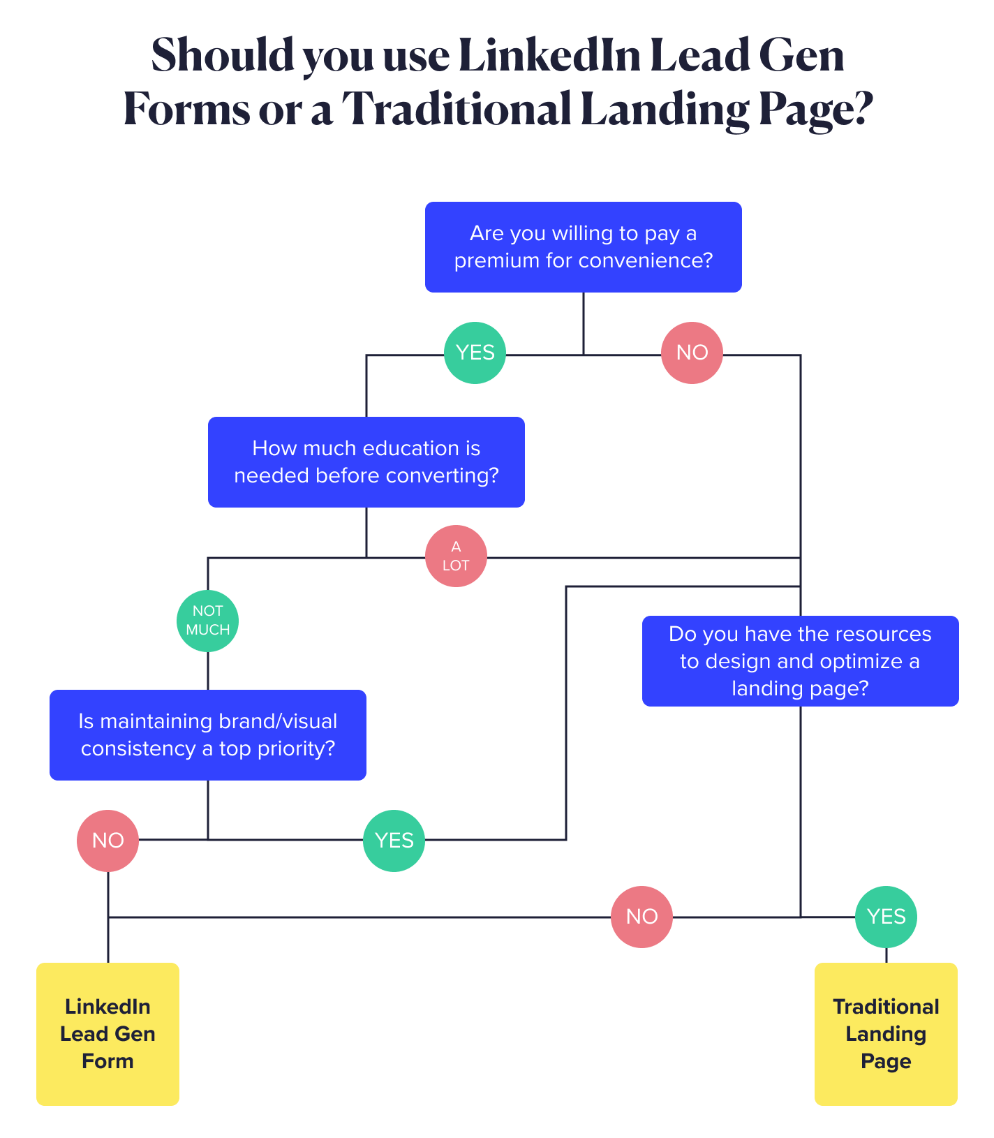
Now that you know the pros and cons of both strategies, it’s time to choose which one is right for you and your campaign. We recommend thinking about the following factors:
- Your goal = Is your goal genuinely to drive as many leads as possible? Is your goal to drive them within an efficient CPL? Are you looking to remarket to the people interacting with these ads? This means you need to send them to a page you can build a retargeting audience off of.
- Your budget = Do you have a budget that would allow you to bid competitively against the other advertisers utilizing LinkedIn lead forms? Do you have a budget (and bandwidth, for that matter) that would allow you to design a new landing page? What about optimizing an existing one for UX?
- Your audience = Is your audience one that’s spending time on LinkedIn – enough of it that they would be taking an extra second to fill out a native lead form OR visit another page? Do they seem trusting of handing over information that’s already populated or filling it out themselves?
A Note on A/B Testing
If your answers are unclear, try out A/B testing. Set up one campaign for lead generation with ads containing a form. Set up another campaign for website conversions with ads driving to a landing page.
Right now, LinkedIn doesn’t offer self-service A/B testing like Meta. You can still target the same audience and use the same budget across two campaigns. But be careful not to spread your resources too thin, which could lead to suboptimal budgets for each campaign.
Tips for Effective Lead Generation
Depending on your chosen strategy, here are some valuable tips for achieving effective lead generation:
In-Platform Native Lead Gen Forms
- Make the form as short as possible to eliminate friction when someone is filling it out. Lean toward the fields that auto-populate with existing information from the user’s profile.
- Utilize engaging formats such as Document Ads or Conversation Ads, which provide more value to the user and increase the likelihood of them completing the form.
- Make your form’s headline and text unmistakably clear about what users will get and what follows after submission.
- Integrate your CRM with LinkedIn before you launch your campaign for quick follow up.
- Provide a strong CTA. Take advantage of the in-platform button and include it on your ad creative. Make it clear what will happen after submitting the form.
Landing Pages
- Test the page load speed before you launch your campaign to make sure this doesn’t become a bottleneck.
- Keep the design and layout simple and straightforward.
- Include only one CTA or action for clarity.
- Ensure that copy and creative on the page match what you promoted in your ad on the platform.
- Utilize the extra space you have by providing valuable content, such as social proof/testimonials, videos, FAQs, case studies, and more
- Install the LinkedIn Insight Tag on your page and set up precise conversion tracking. Use this to monitor and optimize your conversions effectively within the platform.
- Install various platform pixels on this page to enable remarketing on LinkedIn and beyond.
Prepare for Launch
Now that you have the info you need, it’s time to build your form or landing page. Let’s kick off your campaign! And don’t forget – you can ALWAYS A/B test anything. At Tuff, we live by this motto – test fast, learn fast, move fast 🚀
If you’re interested in getting started with a lead generation campaign but need some help, hit us up!

