Cracking the Code to Conversion Rate Optimization: A/B Testing Strategies to Maximize Revenue

It’s always important to make sure you’re investing every marketing dollar in channels that yield the best return. But during periods of economic uncertainty, efficiency becomes more important than ever. To do that well, marketers are asked to leave no stone unturned when analyzing their marketing strategies. This often includes finding ways to make the traffic you are sending to your site convert at a higher rate with conversion rate optimization strategies.
How you approach website testing is often referred to as conversion rate optimization (CRO). This methodology helps make sure you aren’t leaving potential revenue on the table when you are investing in new customer acquisition.
If you’re spending time, money and resources driving traffic to your site, you want to make sure they convert when they get there. A nicely sharpened CRO strategy can help improve your return on ad spend. In this post, we’ll explore different methods for website testing to maximize your media dollars. First, let’s dive into what website A/B testing is.
What is conversion rate optimization?
Conversion rate optimization (CRO) is essentially a marketing experiment that involves splitting your audience into at least 2 or more variations to see which campaign or website change performs better. Many businesses turn to A/B testing when they are looking for ways to maximize conversions like revenue, transactions, leads, and more.
There are several ways to set up a conversion rate optimization test for your site, and we really get into the nitty gritty details in this post. You can use tools like Optimizely to construct true A/B and multivariate tests, or you could lean on A/B experiment features that are native to almost every ad channel. The way that you logistically build your test is unique to each scenario. What you want to learn, the variables you can control (and the ones you can’t), and the amount of traffic you get to your site are all common factors that help determine how you’ll set up your A/B test.
No matter the tool or how you build a conversion rate optimization test, three things should remain top of mind:
- Start with a hypothesis. To build a strong experiment, go back to your 3rd grade science fair project and start with a hypothesis. “If I change X on my website, I think that X more users will sign up for a free demo.” Orienting your CRO plan in an hypothesis will help make sure that your experiment is structured around a problem, the solution, and the intended result.
- Always have a control in every experiment. You need a baseline to compare test results to, and you do that by testing one variable at a time against the control – which is usually a page or website element that’s been in use for at least 3 months and has seen a significant amount of traffic already.
- Minimize the amount of variables that could cause any change in data. If you test too many things at once, you’ll never know which change caused the biggest lift. It’s important to make sure that you’re focusing on one or two variables at a time to know what really works. This includes keeping your traffic mix similar across tests. If you were to suddenly invest 3x in paid search campaigns, you’d see a higher proportion of your traffic coming from a high-intent channel, which would likely skew on-site behavior metrics and conversion rates.
What are the benefits of conversion rate optimization (CRO) testing?
There are several reasons why brands should consistently adopt a testing-first mentality. We’re going to dive into some of the most important benefits, specifically when it comes to CRO testing on your site.
First, it helps you minimize risk. Instead of designing and developing a significant change to your website and implementing it across 100% of your site, you get to test it with a smaller portion of your traffic. Rolling out a new change to all users without knowing how it will impact them is swimming in dangerous waters.
In fact, publishing a new website experience on your site without testing it could hurt your ROI. Let’s say you’re redesigning the form flow on a webinar sign up landing page. If this change DIDN’T work and you changed the landing page so that 100% of traffic saw the new version, you could have tanked cost per sign up.

With data-backed A/B testing, you only show a small number of users a CRO experience change. Once this runs for a few weeks and reaches statistical significance, you’ll know whether or not you should go ahead and add those changes for all users. Without sacrificing results while you test.
Common website testing misconceptions
One conversion rate optimization misconception is that you need lots of traffic. That doesn’t always have to be the case. There are methods for testing on low-traffic websites where you can still obtain valuable results. You shouldn’t be discouraged from testing just because you overall site traffic is low.
Another misconception is that everything on your site should be tested. If you take that approach, you’ll muddy any key learnings. It’s critical to know your business needs, and prioritize pages and website elements that will help improve your main objective. Do you want to increase purchases? Focus on the product pages and checkout funnel. Are you trying to increase qualified leads that sign up for a product demo? Prioritize CTAs on your homepage, pricing page, and other high-intent pages on your site.
Prioritizing conversion rate optimizations based on impact to revenue
When you have limited resources and are focused on driving efficiency across all of your marketing touch points, it can be overwhelming to decide what to focus on. That’s where a prioritization framework comes in.
First, outline your main goal. Then, define the website elements you want to test. There may be many places on your site to test that can help increase your main goal, so which one should you start with first? The one that will have the most impact on revenue, and with the fewest resources. If most of your new customer acquisition strategies rely on paid media, we recommend optimizing those landing pages first to eliminate wasted spend. Then, we focus on top direct and organic pages.
How we use the ICE prioritization model
Here at Tuff, we use the ICE prioritization model to build a CRO testing plan. Let’s say you’ve identified an opportunity on a paid landing page. You saw that it wasn’t bringing in many qualified lead gen form submissions, so you decided to test a different CTA copy on the form and change the hero image. Which of these should be tested first?
Let’s use ICE model to answer this question. ICE stands for Impact, Confidence, and Effort. For each experiment, you rate each of those three elements on a scale of 1-5 based on how confident you are on the potential impact of the experience, and how much effort it will take to build.
You rate each test and add the sum up. The test with the highest score should go first. Now that we have defined it, let’s answer the question of which one should we test first.
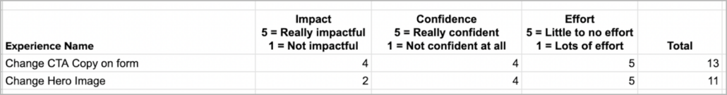
Based on this example, the CTA copy change is the first test that should be implemented because it has a higher score. This is because the impact on the main goal, lead gen form submissions, is much higher than changing the hero image.
Beyond incremental CRO tests: user flow experiments that nurture users
Not all users are ready to take that high-intent action like reaching out to sales, attending a demo, and purchasing that product or service. But that doesn’t mean you shouldn’t find ways to capture their information to nurture them through the funnel. That’s when adding new funnel entry points should be a larger part of your website strategy.
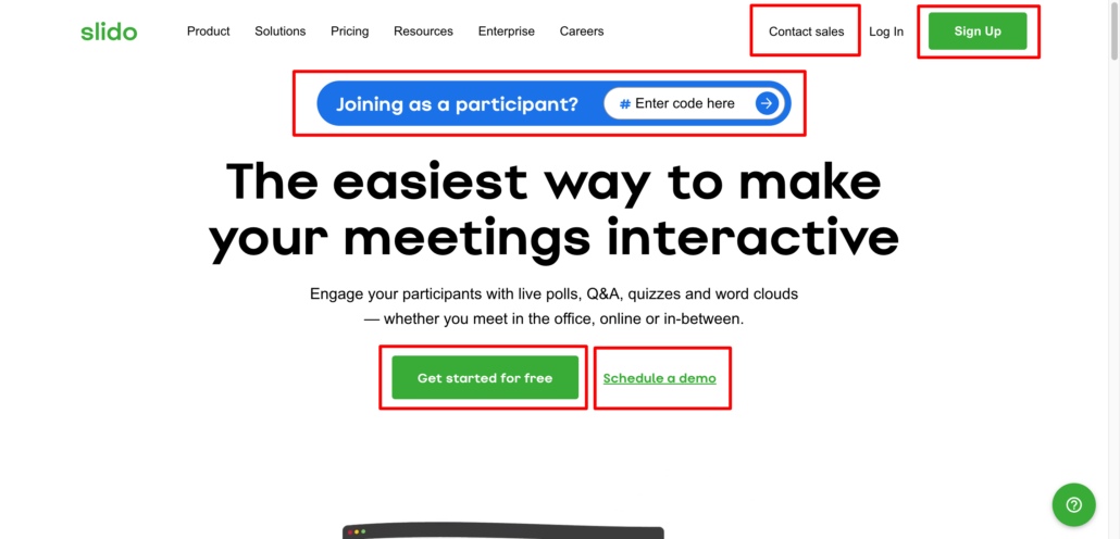
Take Slido for example. You can find five different entry points. You have a contact sales entry point, a signup entry point, a join-a-meeting entry point, a get started for free entry point and a schedule a demo entry point. These entry points benefit Slido as it opens up more opportunities to get leads. They may lead users in different directions but the objective is the same: obtain leads. The approach Slido takes is very subtle and not overbearing with the same CTA or CTA copy.
To build out a lead gen website like Slido’s you have to start by analyzing your user flow.
What is currently working and what is stopping users from moving forward? Answering these questions with data can help you come up with the perfect testing strategy. Let’s analyze two user flow types: eCommerce and lead generation.
Typical eCommerce User Flow
An eCommerce user flow usually begins on the homepage. Does your homepage push users to where you want them to go like a product collection page? The homepage’s only purpose is to push users to other pages so if you’re not contributing to the visibility of your products, you are already negatively impacting your conversions.
eCommerce Homepage
Let’s take a look at Prime Shrimp as an example. On the homepage, there is a section after the value props that categorizes their product based on diet. This is unique because most e-commerce sites categorize by product types/flavors.
eCommerce Product Pages
Once a user visits your site and navigates to the right products, the next action is to add a product to their cart. Based on the content on the product pages, are you convincing users enough to add that product to their cart? Are you explaining why you’re different than competitors? Why should the user buy your product over someone else’s?
This is when you should lean on audience research to understand buyer motivations, and find ways to incorporate those reasons to buy in your product pages. Are there positive reviews that can motivate the user? Are CTAs clearly visible?
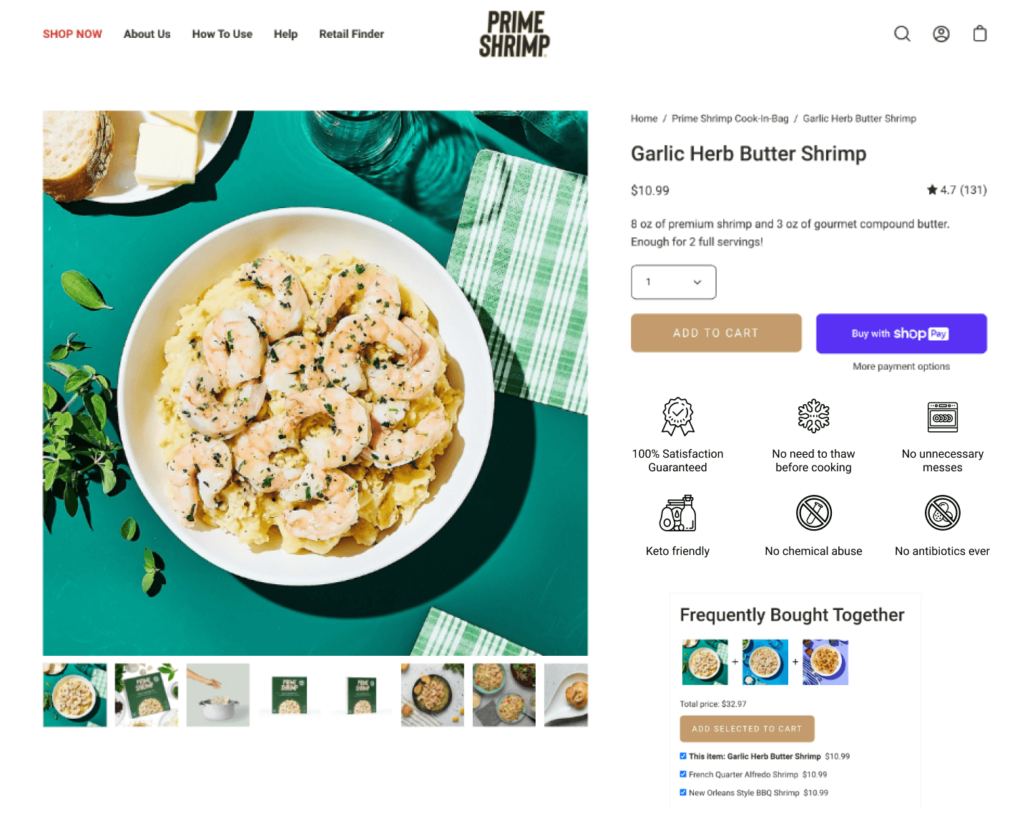
With Prime Shrimp, we saw that including reviews (4.7★ in this case), improves the add to cart rate on product pages.
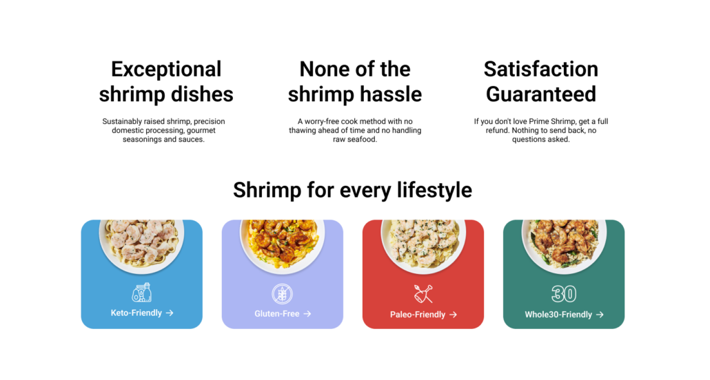
We also tested adding different product guarantees to quickly illustrate other important value props that help differentiate from competitors, like:
- 100% satisfaction guaranteed
- No need to thaw before cooking
- No antibiotics ever
Add to Cart ➡️ Checkout
Once a user adds a product to their cart, are you making it clear that you want them to checkout? When a user is checking out, are you making it easier for them to move to the next step or actually pay? Is it easy for the user to add their information on any device they might be on?
Are there exit opportunities, like a navigation bar that can prevent a user from completing their purchase? These are all example user behaviors that you can construct CRO tests around.
Common Lead Gen User Flows
Every lead gen flow is different. Some are longer than others but the goal is the same: obtain leads. There are many ways to optimize your lead generation flow. You have to first look at the page or set of pages that take users to fill out the form. Does it give users the proper amount of information that they need to convert? How about the form itself? Does it contain unnecessary fields that can be removed?
Remember, the more fields a form has, the higher the chance that a user bounces. Does the CTA outline what’s happening next or is it very broad like “submit”?
One of Tuff’s partners, Tony’s Acoustic Challenge (TAC), does very well in showing the proper amount of information, keeping their form short with only two fields, and having a clear CTA outlining what’s going to happen next.

You can test your entire user flow at once or start page by page to obtain page-specific results. This can help you optimize your site from the homepage all the way to the thank you page.
4 additional CRO tests that drive meaningful results
There are some experiences that, across multiple industries and business models, tend to have a dramatic impact on conversion rates. We’ll dive into some of our go-to conversion rate optimization experiences to test in the first 3 months of a new partnership, all of which can be applied to an e-commerce or a lead generation funnel.
1. Test social proof or security measures in visible areas and throughout the user funnel.
Social proof has always done well on websites, but do you have them located in the right place? The most common place one can find social proof is at the bottom of the homepage where visibility is less than 30%. You want to place it where you want a user to take action whether it is close to an add-to-cart CTA or the submit button of a lead gen form.
After you have placed social proof in a visible area near the main action, test multiple social proof types throughout your funnel. For example, if your lead gen form is multiple pages long, test videos, reviews, ratings, and featured in logos throughout that funnel. This will help strengthen a user’s trust in the brand. If this is an e-commerce site, show a featured section on the homepage hero, add reviews on the product pages or product category pages, and in the cart, show the number of users who have purchased a product or show a very positive review.
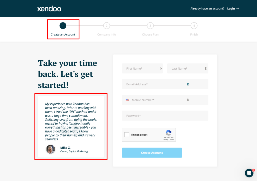
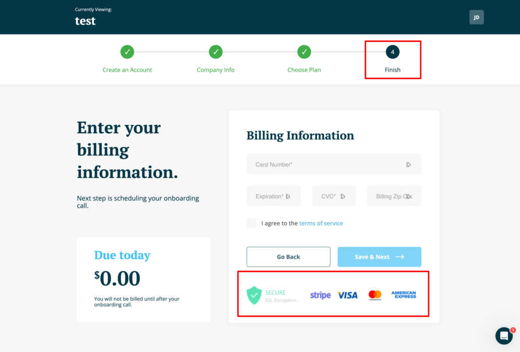
Continuous display of social proof will encourage a user to convert. Xendoo for example has a lead gen form that is several pages long. Throughout it, there is social proof and security measures communicated. These are used to strengthen trust in the brand.
2. Set expectations for the next steps in CTA
If your landing page is from an ad, it’s important to make the entire user journey is cohesive. A way you can do that is to make sure the CTA copy that was on the ad is the same on the landing page. For example, let’s say you are doing lead gen and the ad’s CTA says “book a 10min call” and when the user clicks on the ad, the landing page’s form CTA says “submit”. This copy doesn’t match up with the ad and it may confuse users about what will happen next. If you use the same copy, you are setting expectations for the user and you are helping them establish trust with you. They came to book a 10min call and they expect that to happen when they add in their information
CTA best practices
Even if you are not running any ads, this still applies. It’s important to be as clear as possible about what will happen when a user clicks on any CTA. Will they be contacted soon? Are they booking a call? Will they get a callback? Or start a free trial? Using CTA copy like “next” “submit” or “contact us” is too vague and doesn’t tell a user what will happen next when they submit a form. For eCommerce CTA copy is usually clear like “add to cart”, view products”, or “checkout”. There are, however, opportunities to make this kind of copy clearer.
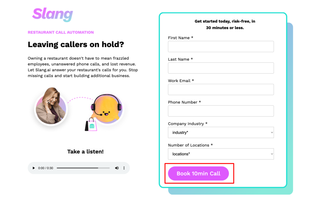
Overall, your CTAs should have three things: be specific, convey benefit, and contain a trigger word. We want our CTA to be specific meaning define what will happen after a user clicks the button. It should also convey benefits. How will clicking on the CTA benefit the user? Lastly, it should contain a trigger word, one that will push a user into clicking. A great example is Slang who advertised a 10 minute call on their ads. Their landing page contained the same objective and this helped increase form submissions by triple digits.
3. Test fewer form fields and autofill
Interested in having more users purchase or lead form submissions? Try reducing your form fields. If there are optional fields of information you don’t need, then try removing them. This is the easiest and most impactful change as each form fill removed will reduce friction. Remember to always test this best practice as sometimes, reducing form fields can have a negative effect on the form itself. It may be considered “spammy” or less legitimate.
Another best practice that goes hand in hand with reducing the form fills is offering autofill the fields that allow it. For example, most addresses can be fully filled by just typing part of it. Doing so encourages the user to continue and brings them closer to submitting the form whether it’s lead gen or a purchase. Using TAC as an example again, we see that they only need two things: a name and an email address. This helps reduce hesitation and increases the likelihood that the user will submit the form.

4. Offer an incentive to encourage users to complete the main goal
Do you want users to sign up for your email, purchase, or fill out a form? If so, you should know that users are usually hesitant to fill out a form or purchase to begin with but if you offer something in return, you increase the possibility of them completing it.
This can either be a discount on a product for an eCommerce site or offering a free download for a lead gen form. Offering an incentive helps answer a user’s “what’s in it for me” question and goes hand in hand with reducing exit and bounce rates. A great example is StyleMe who offered a discount when a user tried to leave the checkout. You ask them for their email address and in return, they receive a personalized discount.

Interested in learning more about how a growth marketing agency like Tuff can help strategize conversion rate optimization opportunities on your website? Hit us up!