Small, Fast, and Intentional Experiments: Using CRO to Grow Sign Ups by 219%

We have a client at Tuff that leverages a webinar as their primary lead funnel. It’s so successful, in fact, that almost all of the brand’s media budget is allocated to optimize this user flow and their conversion rates are some of the best we’ve ever seen.
They had been considering changing their webinar software for months to a solution that promised to be more agile and effective. However, before making such a significant change, we wanted to do a landing page test to see how this update would impact conversions. This is standard practice when it comes to conversion rate optimization and a process that allows us to validate quick wins before implementing something at a larger scale.
To test this quickly and intentionally, we decided to execute a split URL test using different webinar softwares. We wanted to confirm that by switching webinar softwares and offering a slightly different user experience, that we wouldn’t see a decline in results. The primary KPI for this page is form submissions to watch a webinar.
Here’s Levi, CEO of Tony’s Acoustic Challenge, explaining the CRO process and experience with our CRO team:
CRO Strategy
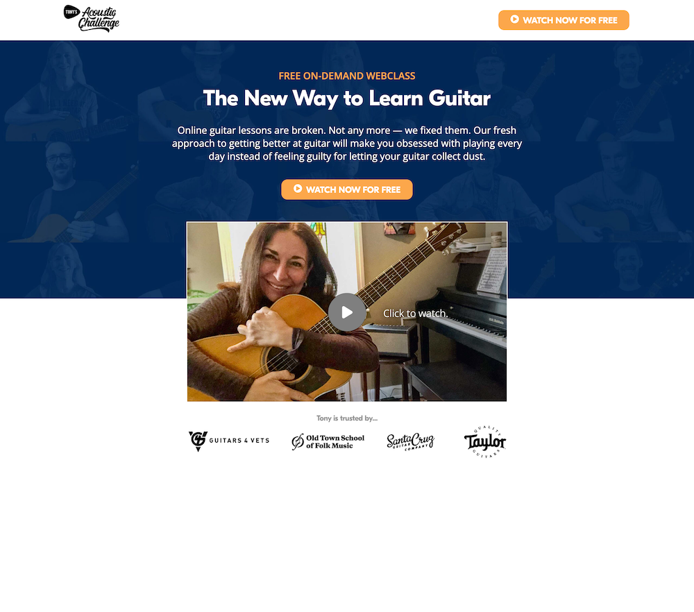
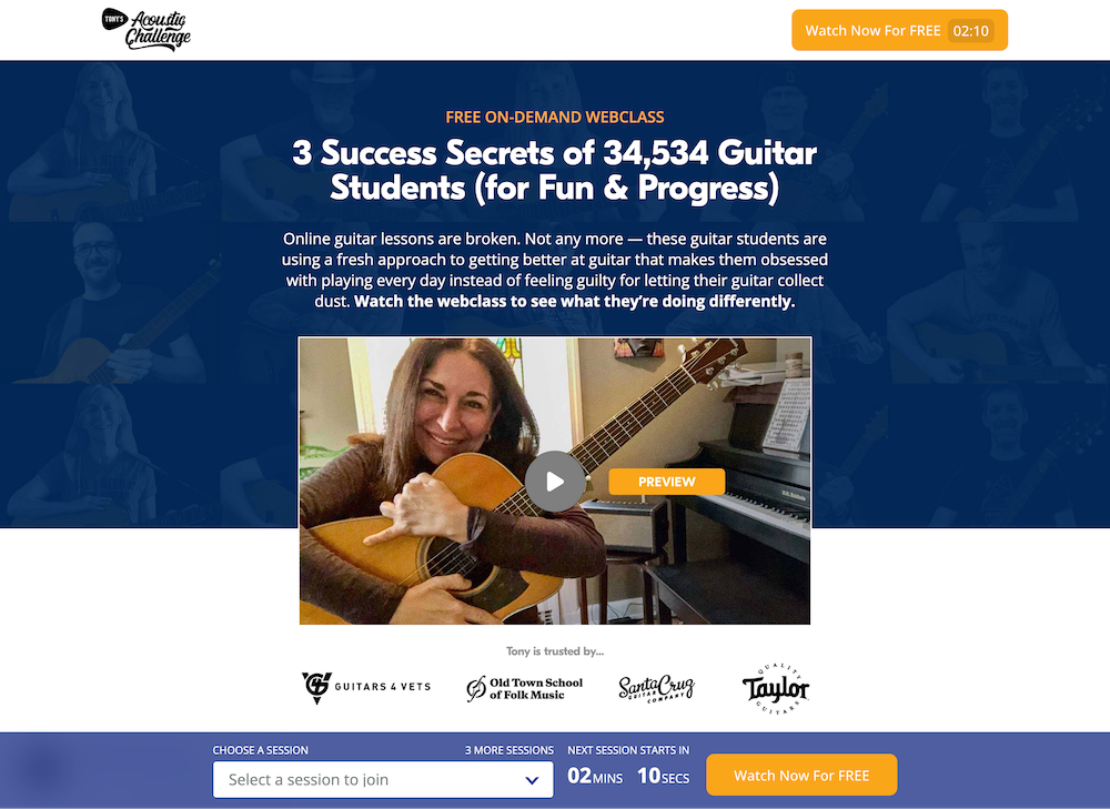
The difference between control and the variant was that the control had a different webinar hosting and the form on the page was hidden behind a CTA. You can see how the page looked here.
Control: Stealth Seminar hosting + the form hidden behind a CTA

The variant which also had a different webinar hosting, took part of the form and pulled it outside of the CTA. This gave users a glimpse that they were signing up for a webinar. You can see how the variant looked here.
Variant: eWebinar hosting + part of the form outside of the CTA

For this CRO testing plan, we started by looking into the behavior of the page that had the current webinar hosting software as this would give us an idea of the overall health of the page. This is what we found:
| Jul 21, 2022– Sep 18, 2022 | ||
| Page | AvG. Engagement Time Per Session | Bounce Rate |
| https://tonypolecastro.com/start-playing/ | 56 s | 63.16% |
Looking at the data, we identified that the bounce rate for this page was over 63%. On average, users also spent about 56 seconds on the page. While this is a significant amount of time compared to the average of 52 seconds, our hypothesis was that we would see these metrics improve, as well as conversions, if we provided more information to make a decision or were not convinced enough to convert.
We wanted to make sure our strategy was going to aid in more form submissions, the primary goal for this page, so we set up a redirect test.
Activation
Once the planning process was complete, it was time to execute on the strategy. We were able to set up a split URL or redirect test. This meant that each variation had their own changes in separate URLs. Here is how our control and variant looked like:
Control: Existing landing page: https://tonypolecastro.com/start-playing/
The control with a different webinar software contained the form hidden behind a CTA titled “WATCH NOW FOR FREE”. When clicked on, a form would appear asking the user to sign up for the free webinar.
Variant: Landing page with new webinar software: https://tonypolecastro.com/start-playing-now/
The variant with a different webinar software as well contained part of the form outside the CTA. You would have to select a session first, then click on the “Watch Now for Free” CTA and it would ask you for your name and email address.
We ran this test until it reached 95% significance. What does this mean? Statistical significance is a way to prove that a certain statistic is reliable. When decisions are made based on the results of the experiment, we want to make sure a relationship exists. For meaningful results, we want to be 95% confident that our outcome is valid.
Results and Insights
| Variation | Form Submissions Conversion Rate |
| Control | 5.35% |
| Landing Page with New Webinar Software | 17.08% |
| Lift | +219% |
Winner: Landing Page with New Webinar Software variant with a 219% lift in conversions.
This version had part of the form out and displayed to the user with the same WATCH NOW FOR FREE” CTA. It gave the impression that the user was signing up for a webinar. In other words, the look and feel of the form set expectations of what was happening next.
When we looked at the control, the form was hidden behind a CTA that says “WATCH NOW FOR FREE”. This indicates that when a user clicks on the CTA, a video will play. However, when you actually click on the CTA, a form appears for a user to fill out. A user may feel deceived and this may cause them to leave.
Takeaway and Learnings
Our biggest takeaway here is that it’s always important to set expectations for the user.
What does this mean?
This means that if you are transparent about what’s going to happen- in this case sign up for a webinar- then the chances of a form filler being negatively surprised will be low. As a next step, we’ll continue to A/B test different optimizations to find and verify new ways to grow the business.