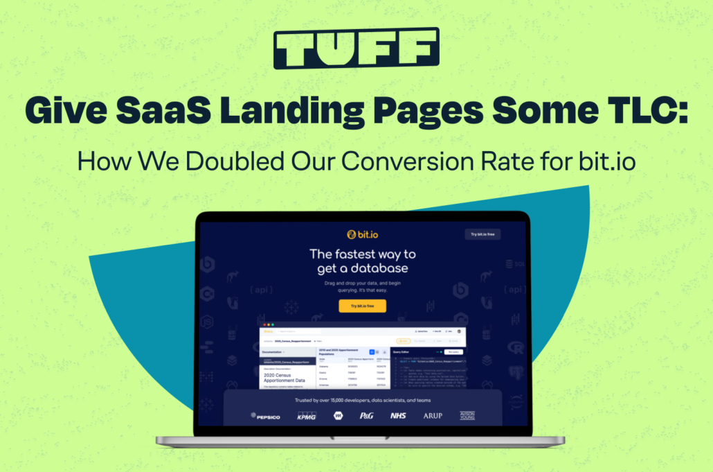
Give SaaS Landing Pages Some TLC: How We Doubled Our Conversion Rate For bit.io
Having a powerful SaaS tool that virtually nobody else can compete with sounds like a huge advantage. That is, until you realize you need to articulate that advantage to users who have never heard of you.
When it comes to building your homepage, how do you get right to the heart of your offering, while still taking the time to explain exactly what that offering is and why it’s so useful? This was the challenge we wrestled when working with bit.io.
In this post, we explore a valuable landing page test we ran for bit.io to make sure that we were offering the best possible experience for new users who were interested in the platform. We’ll walk through just how we got our conversion rate increase by more than 100% and why conversion rate optimization is critical to any long-term growth strategy.
Showcase the platform or showcase its benefits?
There are a lot of SaaS homepages out there that get right to the point and funnel users to immediately get to work. That kind of straightforward and efficient experience is probably welcomed by returning users of a given platform, but what about users who are visiting the site for the first time? Will those users know exactly what to do when their only knowledge of the platform is whatever ad copy they just read (or more likely, skimmed)?
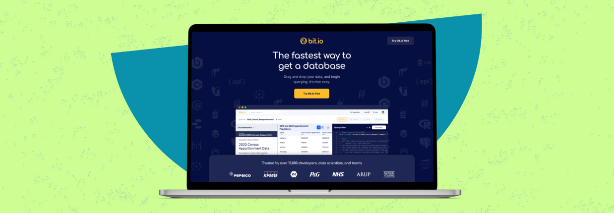
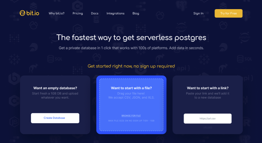
When we first partnered with bit.io, we learned that their homepage immediately prompts users to start building a database with their platform. Our primary KPI for growing the platform was to generate 7% growth in signups. After thoroughly looking through existing ad campaigns and the homepage itself, we decided we wanted to funnel paid media users through an alternate landing page, one that highlighted the platform’s features and prompted signups rather than immediate platform usage.
Knowing that these users were coming from paid ads and were most likely brand new to the platform, we curated a landing page that offered talking points we knew would resonate with our audience, and highlighting the most powerful components of the platform. Let’s dig into what was our recipe for success with this landing page.
Ingredients for a powerful, conversion-minded landing page
Consistent Call-To-Action
We realized that the existing homepage offered a lot (maybe too much) for the user to choose from. We knew we were aiming for signup growth and created an experience to foster just that. All of our CTA text was consistent and concise: “Try bit.io free”. Using words like “try” and “free” immediately creates the perception that no risk is involved.
This consistent message gave the users one choice to continue down the funnel: sign up! By reducing the decisions the user has to make, we created a landing page that streamlined users down our desired path.
Scannable, Short Headlines
Again, it’s easy to overload your audience. We took an existing homepage that had lots of content for the user to digest, and distilled our new landing page into quick hits that new user would be able to instantly digest. We also made the body text larger in order to do everything we could to allow for a quick and easy read. By allowing for a speedy overview of the platform, we helped remove a barrier to signing up.
Color Contrast
The right color scheme and contrast still packs a punch when creating an optimal experience for any user, especially when you’re making a first impression. We altered the new landing page to include bit.io’s original color palette, but in a way that allowed the imagery to stand out with better contrast. Avoiding white-on-yellow and favoring dark navy on yellow made for a stronger, more alluring page.
Social Proof
Social proof is essential to any landing page to increase trust and demonstrate credibility. We made sure to place extra emphasis on social proof. Near the top of the page, we placed logos of well-known companies that use bit.io, paired with a heading that communicates the large number and types of users. We gave user testimonials a dedicated section, styled them with larger fonts, and highlighted compelling words so users could quickly scan for the main features and benefits that customers loved.

FAQ Section
While bit.io already had FAQ’s, we listed them directly on our new landing page. This allowed us to handle objections head-on by immediately answering questions the landing page copy may not have addressed.
Landing Page Test Methodology
We had ourselves a page we were ready to test, but how exactly should we test it? CRO testing can be incredible simple if you structure the test correctly. Our solution was a Google Ads experiment for a small handful of existing Google Ads campaigns. This allowed for a true A/B test, where all other variables were consistent and we could have a clean and direct comparison between the two landing pages. There are other methods of conducting tests like ours (Google Optimize for example), but we wanted to make sure we had a landing page alternative that would perform well with paid ads users.
Results
We ran our experiment for just a week, and the results were conclusive. Our alternate landing page converted at a whopping 11.84% while the existing home page had a conversion rate of 5.59%. We had a clear winner and we started to push more campaigns towards our new landing page.

So what comes next? Well more of the same! We now have a roadmap for future landing page considerations: keep your messaging short and sweet, only offer one simple path for the user, and create a visually compelling page. This knowledge has us eager to keep refining our landing page and find more ways to appeal to new users by offering them a more tailored experience that addresses their questions. A SaaS homepage has its own place and purpose, but for brand new users who are hearing about you for the first time, a tailored landing page might just be what propels your conversion rate.