Got a Crappy iPhone Video? You’ve Got the Perfect Facebook Ad
There’s no one-size-fits-all recipe for successful social ad creative. After working with 50+ brands in all kinds of industries and executing countless A/B tests, we’ve learned a thing or two about what good paid social creative looks like.
Disclaimer: what works for one account might not work for another. Make sure you’re testing different kinds of creative to find what works best for your brand.
Yes, every Facebook ad account has its creative differences. But when it comes to the Facebook ad creative that works the best in 2021, there are definitely some common themes. Check out our tips for developing Facebook ad creative that yields the best results.
Low Fidelity Video > Everything Else
Say “hello” to iPhone videos, and “see ya later” to hella expensive video production. On most all of our accounts, low-fidelity iPhone quality video typically outperforms the polished high-end video we’re testing against.
Typically, brands think that developing video assets = 💸💸💸. But that isn’t the case. Shoot the video on your iPhone, edit it together in TikTok, and export it to use on other social channels. Mimic the latest video editing trends on social, and you can get scrappy with creating your own video content — and see great results.
We tested this for Felt — an app that lets you send handwritten cards right from your phone.
Note: our Facebook campaigns are optimized for app installs, and one of our primary KPIs for measuring success is cost per install (CPI).
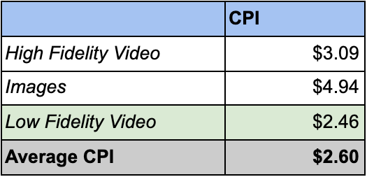
The CPI for ads that featured low-fidelity video assets was 20% lower than its high-fidelity video counterparts and 50% lower than image ads.
The data above shows the average CPI for $36K in Facebook spend.
Curious? Check out some of our ad creative for Felt. This will help give you a better idea of what we’re talking about when we say low fidelity and high fidelity video content.
Low Fidelity Example | High Fidelity Example
Over time, we’ve gleaned a few other tidbits for editing video for social ads. Selfie-style video of someone talking about your brand works really well (this could be the founder, an employee, or an influencer you’ve partnered with) – just make sure you add subtitles! We’ve also noticed that videos with subtitles and graphics that match the in-app design features are also some of our top performing video assets. Ask yourself: What are the kids makin’ on TikTok these days? And how can I copy and paste that style for my brand in a way that makes sense?
What are Non-Dynamic Ads?
Dynamic ads allow you to upload up to 10 images, 7 videos, 5 captions and 5 headlines, and the algorithm will pair different combinations of creative together to make what it thinks is mostly like to perform the best.
In theory, Facebook’s dynamic ad creative option sounds too good to be true. And my grandma always told me that if something sounds too good to be true, it probably is.
For some brands, Facebook dynamic ads can work. But if you’re currently using dynamic ad creative and seeing less-than-stellar results, try switching back to the regular non-dynamic ad creative.
Non-dynamic ads give you more control to make optimizations, and it’s much easier to translate the data into actionable insights.
When we onboard new clients at Tuff, we often see that they’ve been running dynamic ad creative on Facebook – especially if someone in-house has been running their Facebook ad campaigns because it’s such an easy ad format to execute.
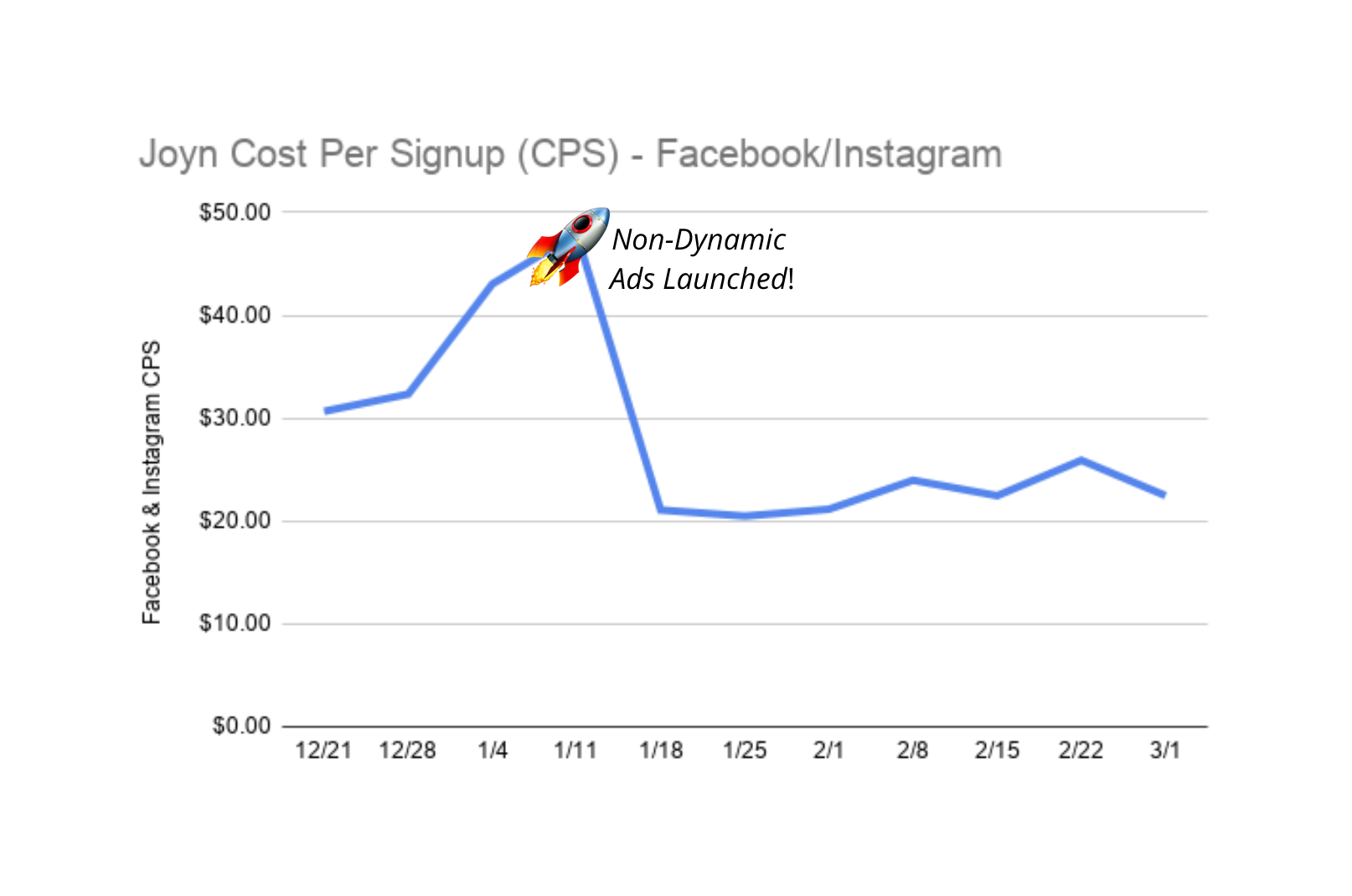
We experienced this with two Tuff clients: Joyn and Team Boocamp. One of the first optimizations we made was to switch their Facebook campaigns from dynamic to non-dynamic ads.
And by making that simple switch, our cost per signup for Joyn and Team Bootcamp decreased 42% and 47% respectively.
Images with Text > Lifestyle Images
You would have never, ever caught me saying this two years ago, but well, here I am. Social media advertising is ever evolving, and so is our approach to developing creative for Facebook ads.
Creating images with text used to be one of the biggest Facebook ad creative faux pas because of the 20% text rule – AKA the bane of my existence.
When Facebook semi-recently did away with the 20% text rule (praise be), it changed the type of image creative that works best for ads. Now, images with graphics and text overlay tend to perform better than the typical lifestyle image.
When you add a bit of text to an image, you give yourself more real estate to get your message across. Think about a text overlay on your image as your headline, and the native text elements in Facebook ads manager as supporting copy.
We put this to the test for Offline – a restaurant subscription service in North Carolina. We found that graphics yielded an 48% lower cost per signup (CPS) compared to regular images with no text overlay.
Aside from CPS, we saw that graphics had a stronger CTR, lower CPC, and drove healthier traffic to the site – doubling the time on site (TOS) compared to regular image ads.
Interested in learning more about our A/B testing methods for social ads? Give us a shout!

Kristin is a senior growth marketer and COO at Tuff. After working in a variety of agency landscapes, Kristin found her way to Tuff to work with teams who make make marketing decisions rooted in data and tied to revenue growth. When she’s not building growth strategies or working with the Tuff team to improve our processes, you’ll find her chasing her two kiddos around the house or playing fetch with her dogs.
