A/B Testing Your Landing Page to Reduce CAC: Tiny Changes & Big Result
There are so many pieces to a growth marketing campaign that it can be hard to tell which levers you should pull to make the biggest impact. Or which levers need a bit of work. That’s where A/B testing comes into play. It’s important to facilitate thoughtful A/B tests for your landing pages, ad creative, audience targeting, CTAs, color choices… and well, almost every single element in your marketing campaigns.
Proper A/B testing takes patience, especially CRO and landing page tests. Here at Tuff, we map out our A/B tests like a science experiment, focused on testing one variable at a time so we know exactly what drove the most impactful results. This approach is methodical and can take a bit of time to execute, but in the end, we’re able to optimize our conversion rates, and scale our budgets while maintaining a profitable CAC.
Note: Throughout this article, I’m going to be referencing one of our partners, Sharetown. Our goal is to increase the number of reps on their team by 15% each month, with a CAC of $900. A rep is someone on their team who picks up and resells like-new furniture as a side hustle.
We have campaigns running on Facebook/Instagram, Google Search, and YouTube. We also just started growth content to help with organic growth.
Our landing page test methodology
For Sharetown, we didn’t propose a complete redesign. Instead, we focus on implementing impactful, but sometimes small, design changes to the existing page’s layout, copy, and images to help increase conversion rate.
It’s also important to isolate as many variables as possible throughout testing so that you can definitively say what improved (or negatively impacted) results. Not all CRO landing page tests go as planned, but with our testing methodology, we can always go back to the previous version of the landing page and start again with a new variable to test.
That’s why we structure our tests bracket-style. (Any other March Madness fans out there? We see you.) We’ll have two almost identical campaigns running in our paid channels, but with the ads pointing to two different landing pages. We’ll take the winner, and pit it against the next iteration of the landing page.
Statistically Significant Testing
Before we make any calls on what worked and what didn’t, we have to make sure that each landing page gets enough traffic to make our insights meaningful. That’s why we aim for 500-1,000 clicks per landing page before choosing the winning landing page. This threshold can be different for every brand, but we normally base the amount of traffic we need on historical conversion rates and CAC.
Establish a Baseline
Even if your marketer’s gut instinct says that the landing page you currently have is going to be a total dud, we still recommend running campaigns with it to establish a benchmark. This will give you the data you need to compare future iterations.
But what the heck do we even test first?
Big Landing Page Elements to Test
Once you’ve established a baseline with the existing landing page that needs a little love, we start by updating the following thing (elements that we’ve identified as having the biggest impact based on previous experience)
- Changing the images throughout the page
- Incorporate images that don’t look like stock photography
- Incorporate designed infographics/explainers that are more intelligible and helpful
- Rewriting the copy to make the page more action-forward and incorporating value props more clearly
- Rearranging the layout of the page to display value props in a more prioritized order
- Changing CTAs and button colors
- Adding simple “how it works’ sections
- Incorporating social proof and testimonials
Sample Landing Page Test Plan
The sample landing page test plan below is from a test we conducted with Sharetown. This test is still a work in progress, and we’ll update with more data as we get the results.
If you’re interested in doing something similar, here’s a sample gantt chart template we use to plan for landing page tests!
Phase 1: Existing Page – Establish Baseline
- Over the course of three weeks, drive traffic to the current page to establish a baseline with paid acquisition channels running (vs. just organic/referral/direct sources)
- This will also give our channel experts an opportunity to collect initial acquisition data to refine targeting and ad creative
Phase 2: Two New Landing Pages – New Layout, Testing Different Copy
- Phase 2 is where we start our landing page test, now that we’ve established a baseline as part of Phase 1.
- We’ll create a new layout to use for both landing pages, but each landing page will have different copy, specifically on the hero image and button. The design will stay true to the integrity of the existing Join The Team page, with updates to the layout and the order in which certain sections and elements appear.
- Variables to Test:
- Header image copy
- Button copy
- Number of Landing Pages to Develop: 2
Phase 3: Brand/Partner Recognition
- We’ll take the winner of Phase 2, and pit it against Phase 3’s landing page
- Variable to Test
- Placement of brand recognition
- Number of Landing Pages to Develop: 1
Phase 4: Video
- We’ll take the winner of Phase 3, and pit it against Phase 4’s landing page
- Variable to Test
- Putting a video in the hero zone
- Number of Landing Pages to Develop: 1
Phase 5: Opt-In
- We’ll take the winner of Phase 4, and pit it against Phase 5’s landing page
- Variable to Test
- Testing an opt-in pop-up
- Number of Landing Pages to Develop: 1
Phase 6: Graphics v. Images
- We’ll take the winner of Phase 5, and pit it against Phase 6’s landing page
- Variable to Test
- Using graphics instead of images throughout the page
- Number of Landing Pages to Develop: 1
Phase 7: Earnings potential calculator
- We’ll take the winner of Phase 6, and pit it against Phase 7’s landing page
- Variable to Test
- Creating an earnings potential calculator (similar to Zenernet’s!)
- Number of Landing Pages to Develop: 1
Measuring your landing page test
Now for the fun part. Digging in the data to determine if your landing page test was successful. It’s important to take a full funnel approach when you’re evaluating the outcome of your A/B test.
We create scorecards that allow us to measure conversion rates throughout the funnel, especially when the user journey includes multiple steps. In the Sharetown example, we have four conversion rates that we monitor:
- CVR from traffic to lead
- CVR from lead to application
- CVR from application to vetted opportunities
- CVR from vetted opportunities to reps
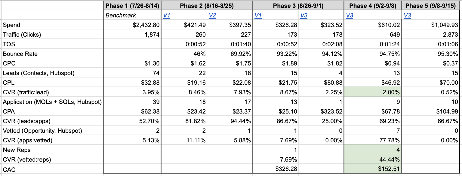
Our first landing page versions had a killer CVR from traffic:lead, more than doubling that conversion rate from our benchmarking phase. But, by working with Sharetown’s sales team, we realized that the lead quality was quite low, and no one seemed to be converting to become a rep.
We asked their sales team to give us any qualitative feedback that they had on why these applicants weren’t finishing the process. After gathering a few call transcripts, we realized that many of those leads were only interested in the first half of the rep role — moving bulky furniture. They weren’t interested in the gig when they found out Sharetown reps are required to resell the like-new furniture on a marketplace, like Facebook or Craigslist.
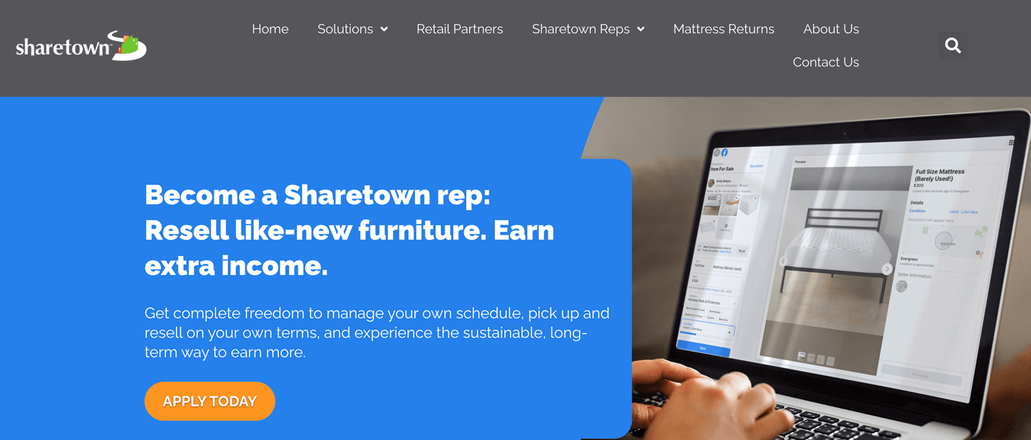
After realizing that, we made tweaks throughout hero zone to emphasize reselling by changing the copy and switching out the image to show a Facebook marketplace listing.
The data in the table above (peep Phase 4), speaks for itself. Our conversion rate from traffic to leads decreased significantly from ~8% down to just 2%, resulting in fewer total leads. But they were the right leads. Our bottom of the funnel conversion rates increased tenfold.
This is a prime example of why it’s important to look beyond initial conversion rates to make sure that your landing page test is actually moving the needle. Without collaborating with Sharetown’s sales team, we would have never known why the leads weren’t converting.
Questions? Comments? Ideas! We’d love to hear from you! Drop us a note.

Kristin is a senior growth marketer and COO at Tuff. After working in a variety of agency landscapes, Kristin found her way to Tuff to work with teams who make make marketing decisions rooted in data and tied to revenue growth. When she’s not building growth strategies or working with the Tuff team to improve our processes, you’ll find her chasing her two kiddos around the house or playing fetch with her dogs.


