7 Well-Designed Landing Page Examples

Well designed landing pages are no easy feat, but much easier to make happen and do well than 10-years ago. With a whole host of tools and content for landing pages at your disposal, developing one for your business has never been easier.
Before you dive into your first landing page, we recommend doing your research and learning the process of how to write, build, and test landing pages. Despite the easy accessibility to tools for building landing pages, it is still possible to build a bad landing page.
In light of this, here are 7 of the best-designed landing page examples for you to hone your skills on.
1. HelloFresh
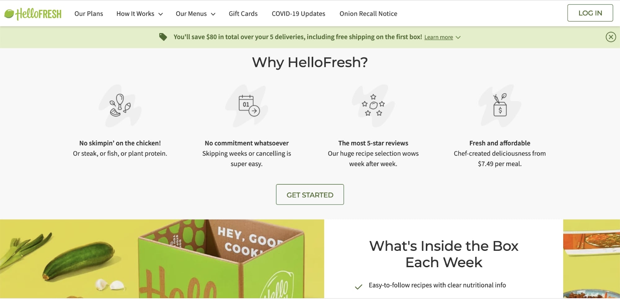
Ever had a HelloFresh box show up out of the blue with really no recollection of how it could possibly have your name on it or be at your front door?
That’s because their landing pages are so dang cute from a design perspective and genius from a landing page strategy, that you barely realized you had signed up for more than one delivery.
We’re not saying that HelloFresh tricks people or anything – we’re all aware of what we’ve done, but the landing page process can be so seamless and the offer can be so good that it’s hard to realize what you’ve done.
That is until you’re standing there with a sack full of new groceries on a Monday staring dumbfounded at the HelloFresh box at your doorstep because you totally forgot it was HelloFresh week and you actually didn’t need to buy groceries.
That’s the power of a well-designed landing page.
2. Winc Wine Club
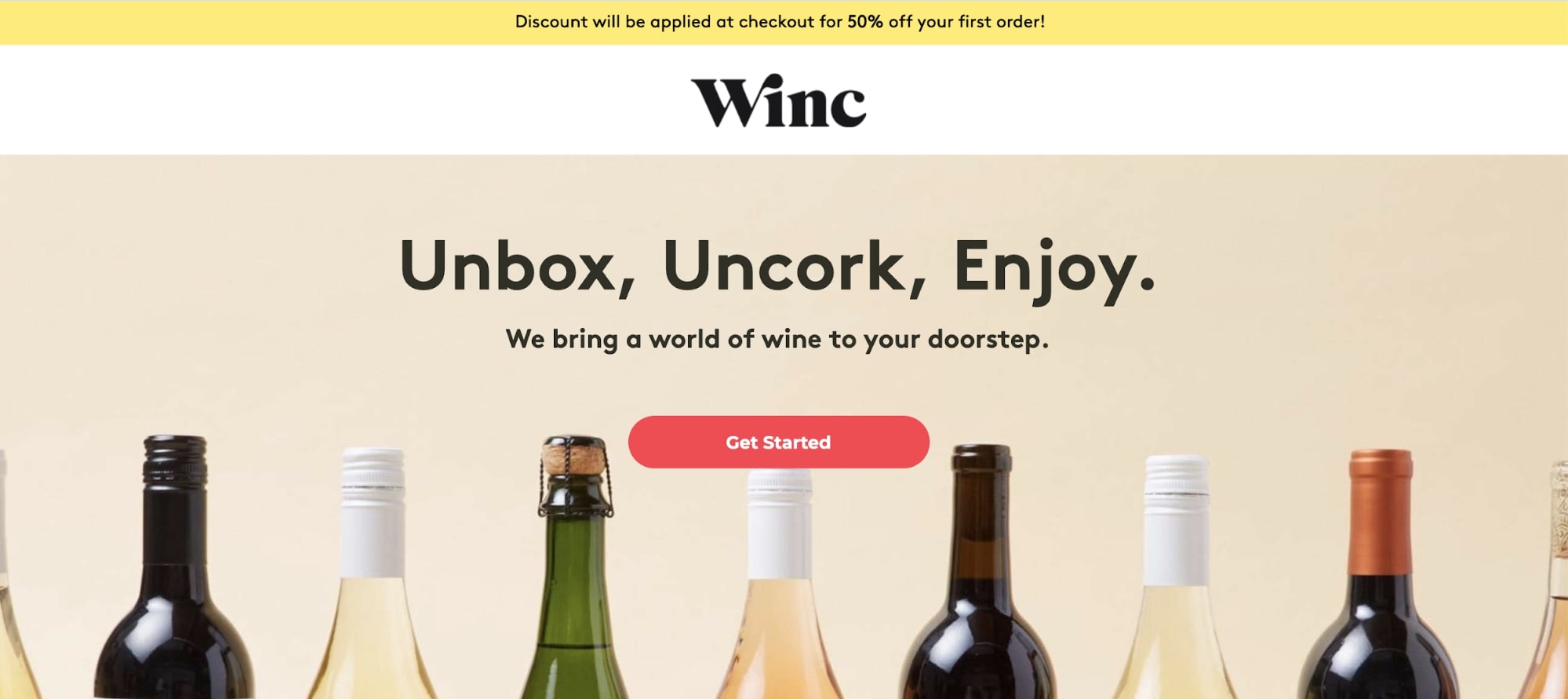
Similar to HelloFresh, ever had a box of wine show up at your house that you totally forgot about because again, signing up was so easy that you barely realized what you were doing until you did it, then forgot about it, then found it delivered at your house?
That’s the power of a well-designed landing page – all the elements come together that it doesn’t even feel like shopping anymore – it feels like… well magic!
3. Yeti Coolers

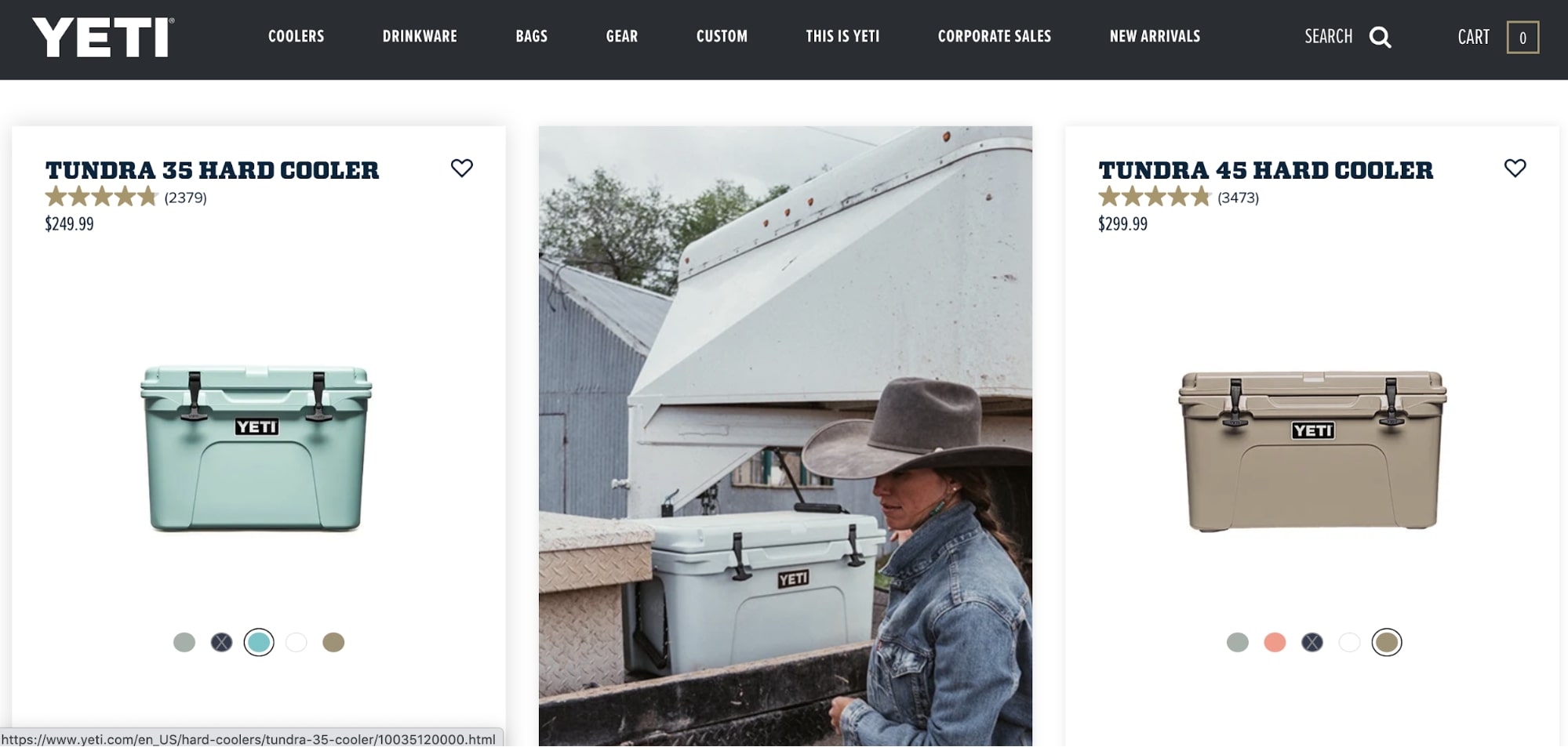
Then there are landing pages that are just seriously thought-through, beautifully crafted eCommerce collection pages in disguise.
Take this Yeti Collection page for their Tundra Yeti Coolers for example. The difference between this one and every single other product collection page you’ve ever seen is that lifestyle image right smack in the middle of the page.
Set there on the page like that to give you some perspective on what one of Yeti’s coolers looks like out in the wild. As you can see, it looks pretty god damn tough – like their messaging points out.
And right there on that page, you get why there’s thousands of reviews for what you might have thought was an overpriced insulated box.
That’s the power of a well-designed landing page.
4. Monday.com
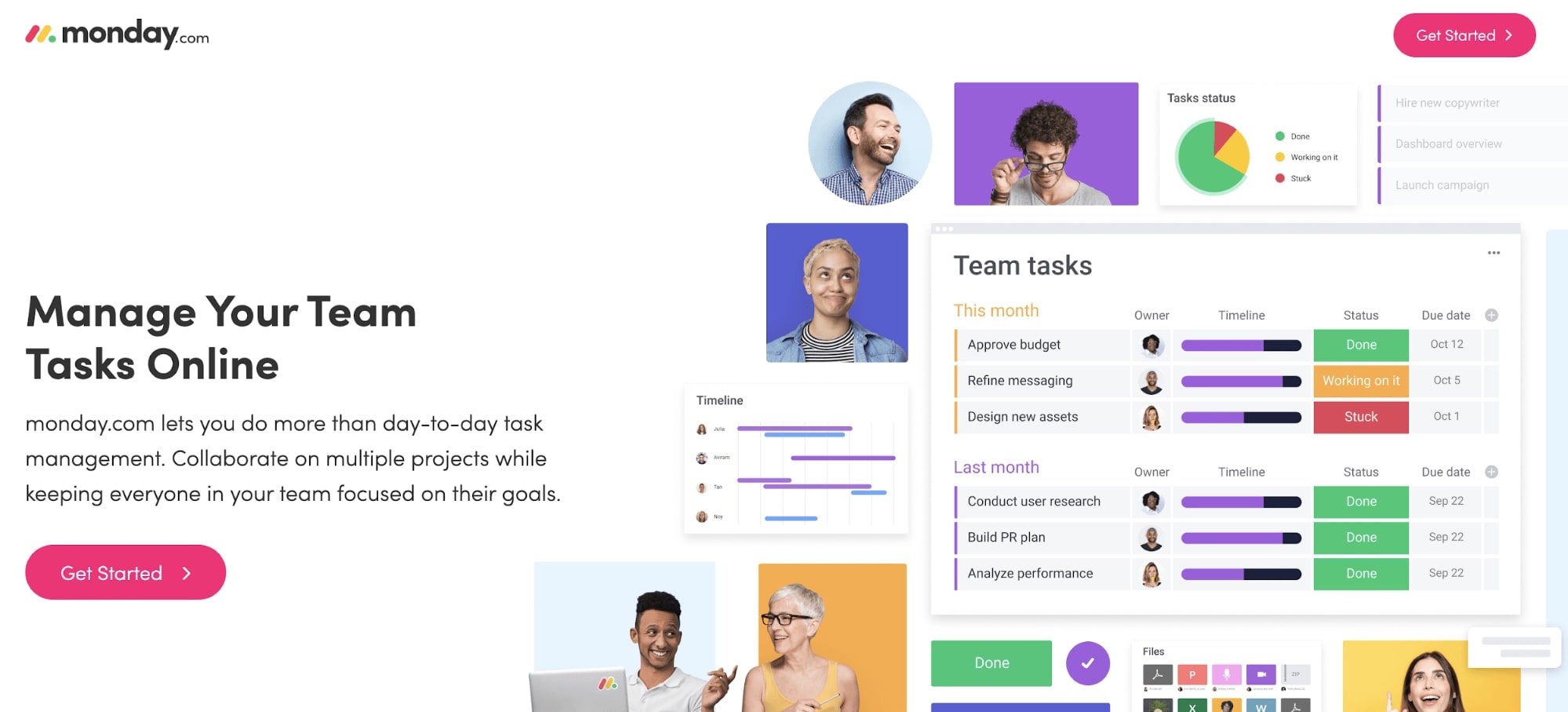
Great copy, perfectly styled creative, and well placed CTA can go a long way!
But not as far as it can go when it’s positioned perfectly between a conversion and an aligning search ad. I triggered this landing page off of searching for “Scrum Board Software.”
Knowing that my intent was based on managing team tasks, Monday.com came to my rescue and made me feel like they had just the solution I needed for my search.
That’s the power of a well-designed landing page.
5. Zapier
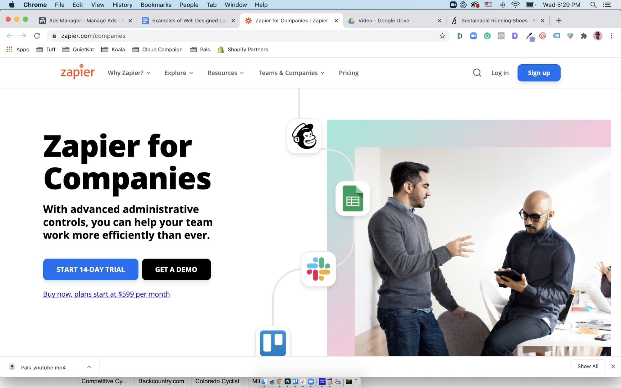
The reason all of these landing pages are so impressive is partly due to the fact that they are all built around search ads triggered by specific phrases.
When done right, search advertising paired with a supporting landing page that is dialed to the query is the perfect example of an optimized customer journey.
What I love about this hero copy is that it provides the user with three CTAs:
- The demo is a bit less aggressive than the trial
- The trial still being front and center
- And then that bold small offer looking for the 0.01% who are also looking for an offer to pull the trigger on.
That’s the power of a well-designed landing page.
6. Allbirds
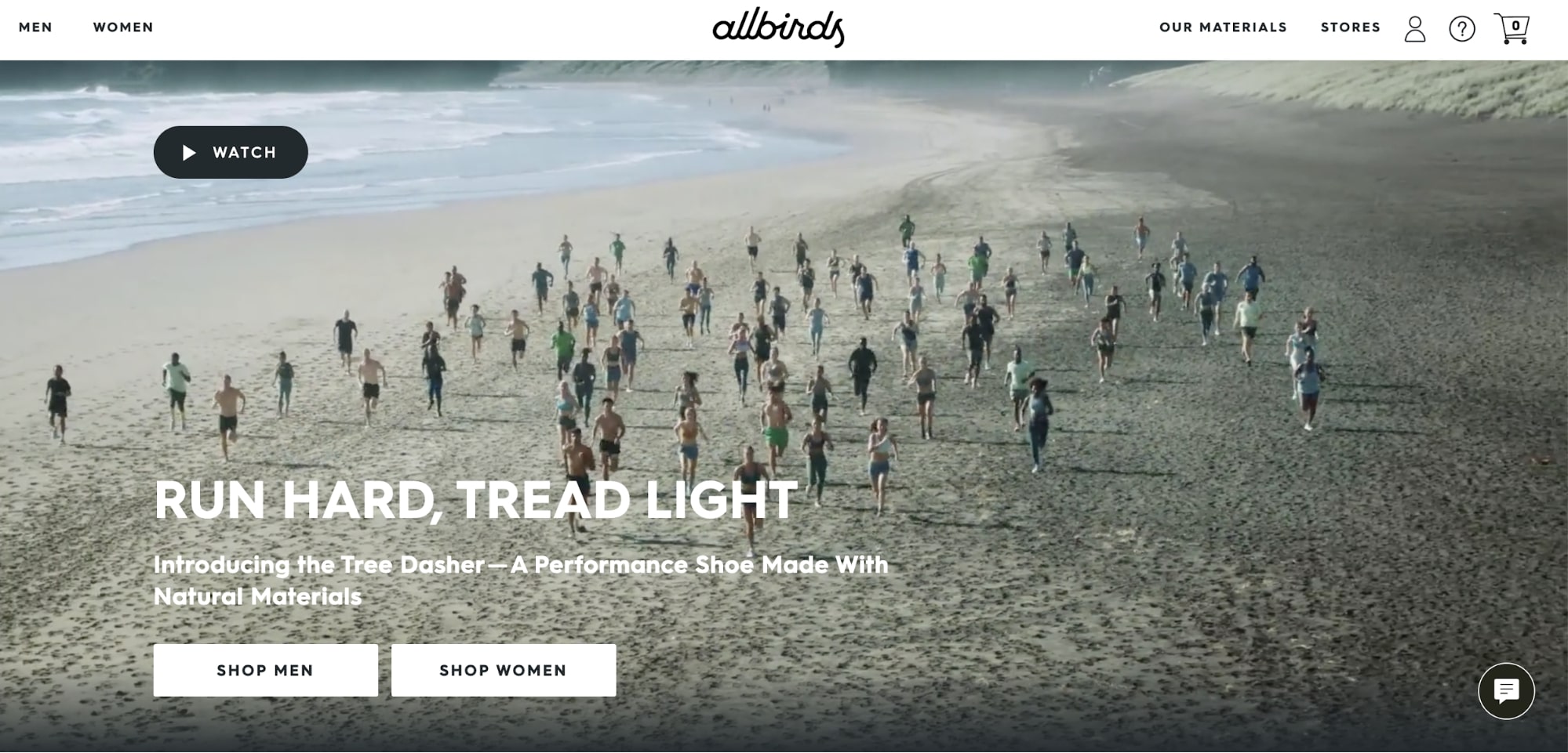
Other times, you end up somewhere you didn’t really intend to be.
You were searching running shoes and thinking you would end up with some Adidas or Nike ads, instead you get an allbirds ad and think, “allbirds? Is making performance running shoes now? I should probably check this out – just for fun of course.”
And you get there and it’s as if allbirds is saying, “Hell yeah we’re making running shoes, come check them out, you won’t be disappointed!”
And you’re so drawn in by the hero video of people running on the beach in what you guess are allbirds, that you have to keep scrolling, and then all of the sudden… you have allbirds on the way to your apartment.
That’s the power of well-designed landing pages.
7. Shopify
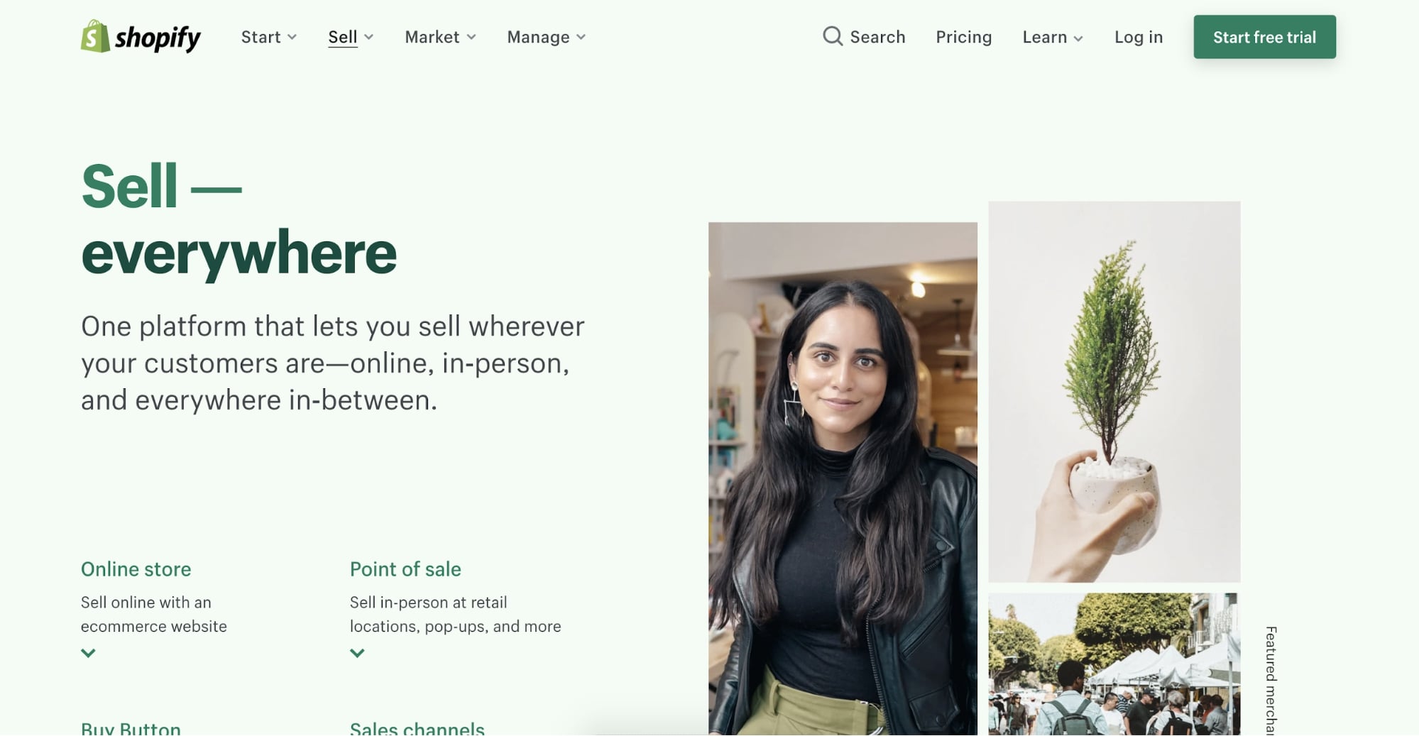
And then there are those familiar ones – the ones you use every day, the Shopifys of the world.
You run a search just to see if there’s anything else out there.
A dumb search like, “Sell goods.” You think, maybe… something… anything else has come up that might dwarf Shopify in comparison.
First, search result, it’s Shopify. Well of course it’s shopify, you think. You click it – what the hell?
You don’t need to be sold on Shopify, but you see the landing page and know you’re still in good hands.
That’s the power of a well-designed landing page.