How UX and SEO Can Work Together to Increase Organic Traffic
You can have a website that is 100% optimized for search engine ranking, but what if that comes at the expense of your site’s user experience? Well, you could actually be holding yourself back from ranking for your target keywords.
Tuff’s SEO team works with our UX designers to publish SEO-friendly landing pages with great user experiences. This collaboration has boosted our SEO team’s results for Tuff’s clients. So what is the link between user-experience (UX) and search engine optimization (SEO)?
What is SEO?
Search engine optimization (SEO) involves making it easier for people to find your business online. You can achieve this by making changes to your website to make it easier for search engines to understand your content. You’ll also need to upload new pages and content to your site to answer people’s questions. And finally, drive traffic back to your site through links and mentions from other sites.
What is UX?
User-experience (UX is how people interact with and experience a product, website or software tool. For websites, it encompasses how users navigate the site, how quickly they find what they’re looking for, and how intuitive the design is on the page.
Is SEO a part of UX?
SEO focuses on aligning your content with the questions people are searching for on Google. After someone clicks on your webpage in the search results, it’s important to make it easy for them to find the answers to their questions. Having a good UX design for your landing pages and blog posts will make it easier for visitors to find what they’re looking for.
There is no reason why you can’t optimize your site from a UX and SEO perspective at the same time. In fact, working to align your SEO and UX efforts can actually boost your results in both areas.
Your SEO efforts will drive traffic to your site, while UX will make sure the information on your site is easy to find.
SEO content that is written only for search engines will be hard to read and not very useful. A website that isn’t designed for PEOPLE will be difficult to navigate and understand.
Why is UX Important for SEO?
UX and SEO Are Both About Making Your Users Happy 😃
The goal of SEO is to bring users to your site to give them the information they are searching for. The goal of UX is to make it easy to navigate the page on your site to find that information. One important aspect of SEO is looking at user-intent and aligning your content with that desire or motivation. Improving the UX design on a page can help meet that user intent faster.
Making your website search engine-friendly is key for driving organic traffic. However, if you want to maximize the impact and reach of your content, user-experience is just as important.
UX Makes Your Website Sticky
A good user-experience will keep people on your website for longer. This can encourage them to visit more pages on your website and can even make the call-to-actions on your site more enticing.
Optimizing your site’s user experience can make it easier for your visitors to navigate to other pages on your site that interest them. This helps increase the time that visitors spend engaging with your content.
Good User Experience is a Ranking Signal for Google
Google says that “when ranking results, Google Search evaluates whether webpages are easy to use and promotes more usable pages over less usable ones, all other things being equal.”
Google’s RankBrain algorithm looks at “behavior metrics such as the site’s bounce rate, organic CTR, pages per session, and dwell time.” In addition to looking at the quality and structure of your website, it’s also important to look at your site’s user-experience to give your content the best chance of ranking in Google Search.
UX Impacts How People Perceive Your Brand
Your website’s user experience (UX) is partly driven by search engine optimization (SEO). The two work together in the sense that both affect how users perceive your site.
The most prominent component of your website’s UX is, of course, your content. If you want to write SEO-friendly content, you need to make sure that your writing is structured well and easy to understand. If people view your site as a trustworthy source of information they will be more likely to return to your site, or do business with you.
On the other hand, if you write content that reads like it was written for search engines, your users will find it difficult to read and not very useful. This could turn them away from your site and lead to them doing business somewhere else.
UX Helps Improve Your Conversion Rate
While SEO focuses on bringing users to your site, UX focuses on how to best keep those users on your site and how to increase the conversions you get from that traffic. By placing CTAs throughout your pages and by making your site easier to navigate, UX designers can play a key role in conversion rate optimization.
6 Steps to Improve Your Site’s UX and SEO
- Make your site responsive: This improves user experiences for visitors on mobile devices like phones and tablets. Google predominantly uses mobile versions of content for indexing and ranking, even if your visitors are exclusively on desktop.
- Break up your content: Use headers, bulleted lists, and graphics to break your content into smaller, easier to read pieces. Avoid large chunks of text, which can cause users to look for the answers to their questions elsewhere. This will keep visitors on your site longer, which can be a strong signal for Google that your content is valuable.
- Improve your site speed and page load times: When your site loads quickly, visitors won’t have to wait around for your content to load. This allows them to jump right into your content rather than potentially clicking the back button.
- Make your site easy to navigate: Once users land on your site, it should be easy for them to navigate through your content to find what they are looking for. If you have other pages that they might also be interested in, you should make it easy for them to find those pages as well.
- Minimize your bounce rate: A high bounce rate indicates that users can’t quickly find the information they are looking for, or they are running into another issue that is causing them to leave your site immediately after arriving. Improving your pages’ UX can help decrease your bounce rate.
- Improve your site’s hierarchy: By organizing your pages on your site in an intuitive way, you make it easier for users to navigate through your site. The navigation on your site guides users from one page to another, so making this as intuitive as possible will improve user experiences.
Do UX Designers Need to Know SEO?
Not necessarily, but it’s certainly a valuable skill for anyone to have when making changes to your website. If the UX designer isn’t knowledgeable of SEO principles, they can still work alongside an SEO specialist to make sure that their changes are having the intended impact on your site, and that your site is search engine-friendly.
What are Best Practices for UX and SEO?
A strong user experience and search engine optimization are two of the most important aspects of managing a website.
Users and search engines alike benefit from the following practices:
- Make your content easier to digest by breaking it down into smaller sections
- Use bullet points and numbered lists
- Use more images and illustrations to communicate your message
- Write content that aligns with your users’ intent
- Test your pages on different devices (desktop and mobile) and different browsers
- Minimize your CSS and JavaScript
- Make your site load quickly
- Publish content that is user-centered and easy to read
Integrate Your UX and SEO Practices
Rather than publishing SEO landing pages on your site and then trying to go back through them and optimize them from a UX perspective, you should try to implement UX best practices at all stages of the development process.
If your UX and SEO teams can collaborate and exchange constant feedback, you’ll end up with a much better end product.
Conduct a UX/SEO Audit to Find Opportunities to Improve Your User Metrics
- Look at time-on-site metrics like average session duration or bounce rate. Pages on your site with a low average session duration or high bounce rate, could likely benefit from a UX redesign or content update.
- Monitor your site for broken links or slow loading pages. Slow loading pages and broken links are frustrating for the people visiting your site. Redirect or replace your broken links and speed up your page load times to improve your user experience.
- Check for pages with low conversion rates. If certain pages on your site are getting a lot of traffic but aren’t driving conversions, you may need to adjust the CTAs on the page to make them more relevant.
Here’s how our SEO and UX teams go about developing new content for our clients:
- We identify a need for a certain page on the website. This typically comes from keyword research, if we notice that a relevant term for their business has a high search volume or is especially valuable for our client.
- Our SEO team creates an outline for the page and works with our writers to source the copy. The outline is where we determine the direction and the structure of the page. We then make sure that the copy is clearly written and aligns with our target keyword and search intent.
- The SEO team formats the brief and hands it off to our UX team. When providing our UX designers with the copy for a landing page, our SEO team formats it in a way that makes it easy to understand the structure of the page, and the important sections that need to be included.
- The UX designers create mock-ups of the new landing page. Our UX team creates wireframes and mockups in tools like Figma or Adobe XD, for the client to approve. This step makes sure that the new pages are optimized from a UX and CRO perspective.
- We present the designs and walk the client through the mockups. After putting together the mockups, we share them with our clients to walk them through the new content and give them a chance to provide any feedback.
- Then, we hand off the mockups to the developer to implement and push live. Once we’ve received approval, we give the mockups to the developer to implement on the site.
- The last step is to make sure the page was implemented properly and optimized. We make sure the focus keyword, meta description and other SEO data are set correctly and that the page doesn’t have any bugs or broken links.
How We’ve Combined UX and SEO for Tuff’s Clients
For new landing pages on our clients’ websites, our SEO team works closely with our UX team to produce landing pages that are optimized from both an SEO and UX perspective.
Landing Page for Visory’s Bookkeeping Service
Tuff worked with Visory, an online bookkeeping service, to create landing pages around bookkeeping for specific industries. Our SEO and UX teams collaborated to create pages that were optimized both for ranking on Google and for providing great user experiences.
This landing page, for example, is targeting keywords related to “bookkeeping for eCommerce”. We looked at the top ranking pages for our target keyword and identified what we needed to include on our page to match the search intent for our target keyword.
Our UX team also considered how we could make this page intuitive to navigate and easy to read. We also looked at how we could make the calls to action (CTAs) more enticing for users to click on, to optimize the page’s conversion rate.
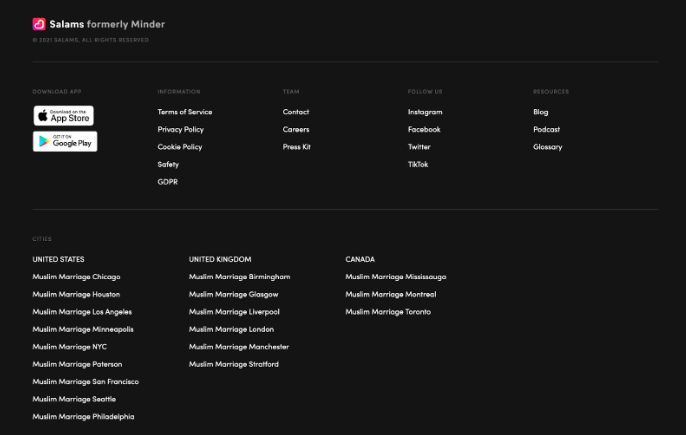
Footer Navigation for Salams
Tuff worked with Salams, a Muslim dating app, to increase organic traffic to their website and to drive organic app installs. We were able to increase organic traffic by 117% in 90 days by publishing new content on their site and making technical SEO optimizations.
Beyond just publishing this new content, we also redesigned the footer on the Salams website to improve both SEO and UX.
As we started publishing new landing pages, we noticed that many of these new pages were “orphan pages” and weren’t linked to from other pages on the site. Our solution was to add these new pages to the footer so that they would be linked to from every page on the site. This helps show Google that this content is important and is worthy of ranking.
This also helped improve the UX on the Salam’s site. By having these pages linked in the footer, users can easily navigate to other pages that they might be interested in on the site. This helps keep people browsing on the site rather than clicking the back button and looking for more information elsewhere.


