The A/B Test that Increased Our Conversions by 210%
As a growth marketing agency, A/B testing is part of our team DNA and that extends to our own growth strategy. Last month, we wanted to increase form submissions from users who landed on the homepage. We looked to improve the section that users see the most: the hero. Focusing on the hero copy and imagery, we were able to create a powerful strategy that helped us generate a triple-digit lift in form submissions.
Main Goal & Data Diving
As mentioned in our most recent blog, one of the first things we should do prior to testing is to identify our main goal. Our main goal on our site was to increase form submissions from potential prospects and that’s what we wanted to test.
After the main goal was defined, it was time to jump into the data and refine further. On Google Analytics, we looked into the form submission and the form fill rate had decreased by 12% in the past 6 months and had around 60 less form fills. This was an opportunity to tackle areas that can help increase our form submissions.
| Let’s Talk Form Submissions | |
| Mar 1, 2022 – Sep 5, 2022 | 424 |
| Aug 24, 2021 – Feb 28, 2022 | 484 |
| % change | -12.40% |
Opportunity and Strategy
We looked into what pages users were coming from when they entered the form submissions page and it turned out to be the homepage. This is the page we wanted to work on.
Once we chose the page we wanted to test, we defined how this test was going to be executed. We decided to tackle the hero where an entry point to the form submissions page was located.
The hero is one of the most important sections of a page. It usually captures 100% of the user’s attention and you only have a few seconds to convince the user that they need that product, service and that you are trustworthy. With just looking at the hero, the user decides whether to leave or stay. We can say that first impressions matter greatly when it comes to the hero.
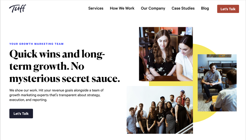
After reviewing the hero section on the homepage, we decided the first thing we would test was the copy (vs the visual). We hadn’t updated the copy in the hero section for almost 18 months and felt it was outdated for our ICP and no longer reflected the value of our team. We decided to update the copy and test three different versions of the hero.
Variant A: Control
Version B: Growth Marketing for Startups + Scaleups
Version C: Growth Marketing Process + People
Execution
Once we had a strategy in place, we needed to execute this idea on our site. With the help of Google Optimize we were able to set up an A/B/C test that contained different copy and imagery for our hero. We made sure our entry point to the forms page CTA was left untouched.
We ran this test until it reached 95% significance.
Results
| Variation | Form Submissions Conversion Rate |
| Control | 0.48% |
| Version B: Growth Marketing for Startups + Scaleups | 0.52% |
| Version C: Growth Marketing Process + People | 1.49% |
Winner: Version C: Growth Marketing Process + People with a 210% lift in conversions.
Version C that contained distinct copy and imagery from version B and control lead in a triple digit lift in form submissions. Users were more drawn to copy that mentioned our methodology and our expertise.
Up Next
As mentioned, a hero section is one of the most important parts of a page. You only have a few seconds to make a first impression. Version C included copy that articulated our methodology and expertise, users were more drawn to it and were more willing to add in their contact details through form submissions. It’s important to always be open to testing on your site, as this can help you understand the users on your site and help increase conversions.
