The Psychology of Website Visitors: How We Use It to Improve Conversions
For marketers, psychology plays a vital role in both website optimization and conversion rate optimization (CRO). By integrating a few psychological principles into the design, content, and the user experience (UX) of your website, you can directly impact visitor behavior, drive desired actions on your website, and ultimately fuel business growth.
Why psychology matters when optimizing a website for conversions
Decision making is driven by a multitude of psychological factors, such as cognitive biases, emotional connections, and social or environmental influences. By leveraging these three factors correctly, businesses can optimize their website to align with visitors’ preferences and desires.
For example, utilizing principles like social proof can help build trust and credibility by showcasing customer testimonials or user reviews. Picture this: a potential customer lands on your e-commerce website and BAM! They’re greeted with amazing testimonials from happy customers who LOVE your product. Those testimonials act like a trust boost, making the visitor feel more confident in your brand and nudging them toward hitting that CTA button. It’s all about using social proof to create a sense of reassurance and safety. Effective communication through the content on your website is key to driving conversions. Use that emotional connection to craft compelling and persuasive messaging that converts!
User experience (UX) is also a critical component in the success of any website, and psychology plays a pivotal role in shaping overall UX. Websites that are intuitive, visually appealing, and designed using psychological principles such as cognitive load reduction and visual hierarchy can boost user satisfaction and engagement. By minimizing distractions, simplifying navigation, and strategically placing important elements, psychological principles inform the creation of seamless and enjoyable user experiences. When visitors feel effortlessly guided through a website, their trust and confidence in the brand increase, leading to improved conversions and even long-term loyalty.
Below we’ll walk through psychology principles used in design, UX, and copywriting that can help guide a user to the action you want them to take and ultimately push them to convert.
The psychology behind your website’s content
When it comes to content and psychology, there are endless principles we could discuss, but we’ll focus on some favorites at Tuff. Before we dive in, I want to clarify that these principles can be tactics of persuasion–but a common theme you’ll notice is clarity and simplicity– which take precedence over tricks and “hacks”. Humans bring their past experiences to all situations, and in the era of endless media consumption, it’s hard to fool most people. Stick to being clear and concise around who you are, what you stand for, and what you’re offering the user.
Let’s dive in.
The Focusing Effect
According to the Focusing Effect, people tend to base their decisions on the most pronounced or obvious information, neglecting other equally significant information that may be less prominent in their cognitive processing. In other words: Out of sight, out of mind.
Take a look at your homepage. Is your value proposition prominently placed to be the user’s first introduction to your site and your offerings? Is there enough strategically placed information next to your CTA to entice a user to convert? Wait… is there even a CTA?! 😱
When writing content for your website, make sure your core offerings or value propositions are prominently placed for the user to process as the most important information on that page. Along those same lines, remember to keep CTAs consistently and strategically placed next to the right information. In short, follow these guidelines for your homepage hierarchy:
- Feature your core offerings or value propositions prominently.
- Place CTAs strategically next to relevant information.
- Use a clear headline to communicate what makes your product/service different from competitors.
- Highlight key benefits and features concisely.
- Include visually appealing images.
- Showcase customer testimonials and other social proof.
- Ensure intuitive navigation and menus.
- Make contact information easily accessible.
Following these guidelines will help create a user-friendly homepage that maximizes conversions and engagement.
The Cognitive Fluency Effect
Remember the mention of clarity and simplicity taking precedence over tricks and hacks? Well, the Cognitive Fluency Effect suggests the easier a piece of information is to process, the more likely our brains will perceive it as honest and reliable. This concept revolves around the notion that our brains, in their limited capacity, tend to quickly move past information that is familiar or similar to what we have previously encountered.
Knowing this, make sure you’re cutting down on the noise in your content. Leverage simple, descriptive headings throughout a page for quicker processing of the right information by the user.
Example: Imagine you’re a B2B tech company offering cloud computing solutions. To leverage the Cognitive Fluency Effect and enhance UX on your website, instead of using complex technical jargon in your headings, opt for simplified and descriptive titles that resonate with your target audience. For example, instead of “Advanced Cloud Infrastructure Services,” consider a heading like “Seamless Cloud Solutions for Scalable Business Operations.”
By using straightforward and relatable language, you help users quickly process and understand the value your company provides. This approach not only improves the cognitive fluency of your website, but also enhances trust and credibility among potential clients in the B2B tech space. It’s a win-win.
The Priming Effect
The Priming Effect describes how exposure to a previous experience can impact how we react to the next experience, even without awareness of the influence the past experience had on us.
For example, throughout a product page, you’ll want to take every opportunity to show a user why they need or want your product. Leveraging emotional language to relate to their problems will influence whether or not they convert.
Similarly, in CRO, a best practice is to use your main CTA repeatedly and to stay consistent with the language. This allows the user to always know what the ultimate action is throughout their journey, priming them (see what I did there 😉) for when they’re ready to convert.
Even looking at the intro of this blog, I made sure to prime my readers for what they can expect to process throughout the page! Remember priming when you write content for your website. Stay consistent, connect emotionally, and make sure users always know what to expect next.
The Illusory Truth Effect
The Illusory Effect, or the Illusion of Truth, suggests people are more likely to perceive information as true when they encounter it repeatedly. Leveraging the Illusory Effect in website content writing means writers can enhance the credibility and persuasiveness of the information presented. By employing repetition, consistency in brand messaging, social proof, and visual reinforcement (infographics, charts, etc.), the content becomes more memorable, engaging, and trustworthy for readers, leading to increased user engagement and conversions. Try it out on your website using some of these tactics:
- Brand Messaging Consistency: Use key messages, slogans, and brand values throughout the website to create familiarity and reinforce credibility.
- Repetition of Benefits: Highlight key benefits repeatedly to reinforce their importance and aid in user recall.
- Consistent Design Elements: Use consistent design elements (color schemes, fonts, layouts) to create a sense of familiarity and credibility.
- Statistics and Data: Present relevant statistics and data points througout your site to increase credibility.
- Call-to-Action (CTA) Repetition: Use consistent and clear CTAs to encourage desired actions and reinforce the message.
By strategically incorporating repetition and reinforcement, writers can influence the perception of the content, increase trust, and boost engagement and conversions on your site.
Social Proof
Humans are social and tend to look to others for guidance when making decisions. By showcasing social proof on your website, such as displaying the number of satisfied customers or the popularity of products, brands can tap into the psychological phenomenon of conformity. When visitors see that others have made a particular decision, they are more inclined to follow suit, ultimately leading to increased conversions and even more happy customers (and brand evangelists).
See how Tuff uses customer testimonials to hype up social proof on our homepage.
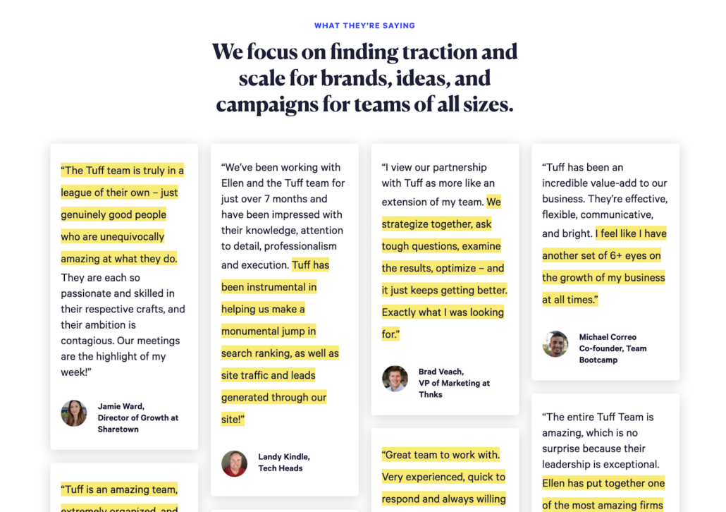
Overall, social proof provides a powerful persuasive tool to influence website visitors and improve conversions. By showcasing real customer experiences, endorsements from reputable sources, and relevant statistics, websites can build trust, influence decision-making, reduce objections, and establish credibility, leading to higher conversion rates and increased business!
Using psychology in website design and usability
When designing a website, it makes sense to focus on the psychology of the visitors you’re targeting. Every choice a designer makes should be intentional and hyper-focused on the goal of the website: buy this thing, sign up for this platform, watch our videos, and more.
Just like with content, people bring their past experiences from other websites and use that to judge yours. Let’s take a look at some of the key principles used to move the user to the desired action.
Aesthetic-Usability Effect
The Aesthetic-Usability Effect says people perceive designs with great aesthetics as easier to use. A visually appealing design elicits a favorable response in individuals’ minds, leading them to perceive the design as more effective.
When a product or service has an aesthetically pleasing design, people tend to be more forgiving of minor usability problems. Along the same lines, a visually appealing design can hide usability issues, making them less likely to be identified during usability testing.
For example, with SaaS companies, designers will use pieces of the software with added visual effects instead of actual screenshots of the software because the screenshots aren’t as visually appealing.
Basically, if someone in your organization requests that something looks “prettier,” they’re not wrong!
Familiarity Bias
Familiarity Bias is leveraged in website design by incorporating elements and patterns with which users are already familiar. When users encounter familiar design elements, they feel a sense of comfort and ease, which can positively influence their perception of a website. Here are a few ways Familiarity Bias is utilized in website design:
- Interface Design: Websites use common design conventions, such as placing the navigation at the top or right side of the page, with standard icons for common actions like a magnifying glass for search, or a shopping cart symbol on e-commerce sites. By incorporating these familiar design patterns, users can quickly understand and navigate the website without confusion.

- Visual Hierarchy: Familiarity Bias is also utilized in establishing a clear visual hierarchy on a website. By following established design principles, such as placing important information prominently or using font sizes and colors to guide attention (see the red Tuff CTA?), users can easily locate and focus on the most important elements. This familiarity with visual hierarchy allows users to navigate and interact with the website more intuitively.
- Content Formatting: Websites often follow familiar content formatting techniques to improve readability and user comprehension. For example, using headings, subheadings, and bullet points are common practices that facilitate scanning and understanding of the content (like I’m using here!) By leveraging familiar content formatting, websites can smooth out their user experience, remove friction, and encourage users to engage with the content more effectively.
Overall, leveraging Familiarity Bias in website design helps create a user-friendly experience by aligning with users’ expectations and existing mental models. Websites can then enhance usability, engagement, and overall user happiness.
Hick’s Law
Hick’s Law, also known as the Hick-Hyman Law, is a psychological principle that states the time it takes for a person to make a decision increases with the number of choices presented to them.
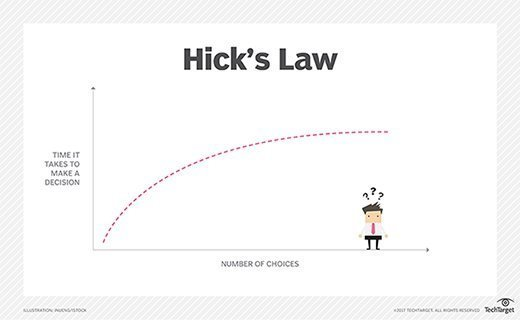
In the context of website design, Hick’s Law suggests that reducing the number of choices or options available to users can lead to faster decision making AKA conversions.💰
Website designers leverage Hick’s Law in the following ways:
- Simplifying Navigation: By limiting the number of options in the navigation, designers can help users quickly find what they are looking for. Streamlining the navigation and organizing content into logical categories reduces conversion friction and enhances usability.
- Minimizing Form Fields: When designing forms, adhering to the principle of Hick’s Law means keeping the number of input fields to a minimum. Reducing the cognitive load associated with filling out forms improves completion rates and reduces user frustration.
- Providing Clear Calls-to-Action: Effective use of Hick’s Law in website design involves presenting clear and focused calls-to-action (CTAs). By reducing the number of CTAs and making them visually distinct, users can make decisions more efficiently and take the desired action without confusion.
- Implementing Progressive Disclosure: Progressive disclosure is a technique that involves revealing information or options gradually as users interact with the website. By presenting information in bite-sized portions and progressively revealing additional details, designers can prevent overwhelming users with excessive choices to facilitate quick decision-making.
Overall, Hick’s Law emphasizes the importance of simplicity and reducing cognitive load in website design. By minimizing choices, simplifying navigation, optimizing form design, and implementing progressive disclosure techniques, designers can make users happy–happy enough to convert!
Law of Proximity
The Law of Proximity, also known as the Gestalt Principle of Proximity, states that elements that are close to each other in proximity are perceived as belonging together or forming a group.
In website design, the Law of Proximity is used to visually organize and group related content, enhancing user comprehension and creating a more organized and intuitive user experience.
Here’s how website designers use the Law of Proximity:
- Grouping Related Elements: By placing related elements in close proximity to each other, such as grouping navigation links or related product features, designers can visually communicate their connection. This makes it easier for users to understand relationships and find relevant information quickly.

- Organizing Content: Grouping similar content blocks, such as testimonials, product descriptions, or pricing plans, helps users perceive them as coherent units and simplifies information processing.
- Creating Visual Hierarchy: By placing elements that are meant to be perceived together closer to each other, designers can guide users’ attention and highlight the most important or relevant information.
- Improving Scannability: Users can quickly scan a webpage and identify clusters of related content, enabling them to locate specific information more efficiently.
By applying the Law of Proximity, designers can improve the user experience by visually communicating relationships between elements, organizing content effectively, establishing a clear visual hierarchy, and improving the scannability of a page. This aids users in understanding the structure and organization of the website, making it easier for them to navigate, locate desired information, and engage with the content. All the necessary ingredients for delicious conversions!
Honorable mention: Color psychology in marketing
Color psychology plays a significant role in marketing. You can harness the power of colors to evoke emotions, shape perceptions, and influence consumer behavior in ways you may not expect. Let’s explore how color psychology is utilized in various marketing strategies and campaigns.
Branding & Advertising
Brands carefully select colors to convey their unique personality and values. In ads, colors are often leveraged to capture consumers’ attention and evoke particular emotions. Check out some common colors used and examples of the major brands that we associate with these colors:
- Red 🔴 is often associated with energy, passion, and excitement, making it suitable for brands in the entertainment industry. (Netflix)
- Blue 🔵 symbolizes trust, reliability, and professionalism, making it a common choice for financial institutions and technology companies. (Facebook)
- Green 🟢 represents nature, growth, and sustainability, frequently used by brands that want to be associated with eco-friendliness or being organic. (Whole Foods)
- Yellow 🟡 is known to stimulate optimism and joy, making it ideal for creating cheerful and eye-catching ads. (McDonald’s)
- Black ⚫ is associated with sophistication, luxury, and exclusivity, making it a popular choice for high-end brands. (Chanel)
- Orange 🟠 combines the energy of red and the warmth of yellow, often used to create a sense of excitement and enthusiasm. (Fanta)
![]()
Source: The Logo Company
Website Design:
Websites strategically use colors to enhance user experience and guide user behavior. Consider the following examples:
- Calls-to-action (CTAs) are often highlighted in contrasting colors to draw attention and prompt user actions. (e.g., “Buy Now” buttons in red or orange)
- Trust and credibility can be established through the use of blue tones for important elements such as navigation menus or testimonials. (e.g., corporate websites)
- E-commerce websites frequently utilize warm colors like red or orange to create a sense of urgency during sales or limited-time offers. (e.g., countdown timers, “Limited Stock” notifications)
By understanding and leveraging color psychology, marketers and designers can effectively communicate messages, connect with target audiences, and create memorable brand experiences. Since colors hold significant power over human emotions, make sure you consider the cultural and personal meanings attached to different colors to ensure the chosen hues resonate positively with the target audience.
Psychology beyond psychologists
As you can see, psychological principles are used in everyday practices for the things we interact with the most. When you’re creating something for the average user, understanding what makes them tick is an important step in your research phase that gets overlooked all too often.
At Tuff, intentionality behind every choice from your website hierarchy to the headers on a page and the colors you choose for your brand is second nature to us. If it seems a little overwhelming to you, we’ve got your back. 💪