How Wireframing Will Improve Your Landing Page Conversion Rate
We sometimes get questions about how other clients work with Tuff to reach their growth goals — so we’re sharing some stories to help bring our services to life. Meet Xendoo.
Xendoo is an online accounting and bookkeeping service partnering with small business owners to take on their business financials and accounting with a dedicated team of CPAs. They give small business owners time back to focus on their business and give them peace of mind by knowing their books are being done correctly. Founded in 2016, Xendoo received an initial round of funding in 2017. We were lucky to start working with them later that year.
“Not only are they a true pleasure to work with, they achieve phenomenal results. Highly recommend the team to people that are committed to growing their business. When you hire TUFF, prepare to hang on for a great ride.” – Lil Robets, CEO, Xendoo (View our reviews on Google & Facebook)
We partnered with Xendoo to improve their landing page conversion rate and as a result, they had their highest client acquisition month ever with:
- 35% increase in conversions MoM
- 82% Increase in new clients MoM
Why Xendoo Focused On User Experience
A website is one of the most powerful user acquisition channels for businesses today, and for good reason. If you build it right, your website can be the best and most cost-effective marketing tool you have. Especially when you’ve done the research to know which complimentary user acquisition channels are going to drive the most growth for your audience.
For a fast-growing startup, it’s common to outgrow the early versions of your site. As you scale, your positioning will evolve, your brand identity will become more established, and you’ll hone in on your ideal users.
As this happens, it’s critical that your site also evolves. If you put consistent effort into improving the user experience of your website and everything that goes with it, you can consistently improve your conversion rate and scale your user acquisition.
Xendoo launched their site in late 2017 with two core goals in mind: client acquisition and fundraising. The site needed to serve and secure new clients, but it also needed to attract investors. We launched our paid client acquisition efforts in January of 2018 and immediately started growing a slow, but steady, client base. As Xendoo gained more traction throughout the year, the site data started pouring in and areas of improvement were easily identified.
So, how did we double their conversions (yes, that turned into almost twice as many clients per month!)?
Let’s dive in and take a look.
Xendoo’s Playbook
Customer Research
Designing a great user experience requires understanding the problems different visitors have and then working to solve those problems. Before we worked on the structure of the website, we leveraged Google Analytics, LiveHelpNow (live chat), and CallRail (phone calls) to identify hurdles that stopped people from moving through the conversion funnel.
Three distinct themes surfaced:
What services does Xendoo offer exactly?
Ideal: When someone lands on this page, they should immediately know how it’s going to help them.
What services do you integrate with?
Ideal: This should be quick and easy to understand.
How do I start a free trial?
Ideal: Consistent language and visuals around one primary CTA.
Clear CTA
Leaning on the data we turned our focus to the site structure, designing the primary CTA first. Making the CTA the first element you include in your skeleton layout will ensure that the rest of the website supports the CTA and isn’t buried on the page. When working on user flow, you need to ask yourself “What is the number one thing we want users to do?” and “What value does our service or product fulfill for the user?” The intersection of these answers is your primary call-to-action. For Xendoo, this CTA was a month of bookkeeping for free.
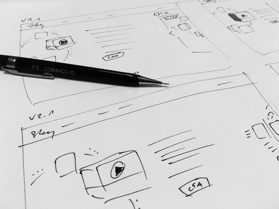
Wireframes
Once we had the CTA’s identified, we built the site wireframes. Wireframes are a blueprint to define the information architecture and layout of your website or product. They allow you to take a step back from the design and develop a clear understanding of all user paths throughout a site. This is one of the most essential, yet overlooked, steps in creating a high-converting website.

Mock Up
The final step in the wireframe process was to develop a sample mock. It’s a common practice for designers to use “Lorem Ipsum” while wireframing and designing mockups. But, when it comes to increasing your conversions your content is equally, if not more important, as your layout and design. Once we had the copy down, we were able to work it into an illustrative mock that set the tone for the entirety of the site design.

Results:
- Best client acquisition month ever!
- 35% increase in conversions MoM
- 82% Increase in new clients MoM
We’d love to work with you.
Schedule a call with our team and we’ll analyze your marketing, product, metrics, and business. Then, present a Growth Plan with actionable strategies to find and keep more engaged customers.

Ellen is the founder at Tuff and one of the team’s core growth marketers. She is a versatile marketer with expertise in multiple channels – from ppc to seo to email to others – responsible for the experiments and testing. She is happiest when she’s on the ski hill or outside pointing her mountain bike downhill.