How Performance Creative Generates Bold, Actionable Results for Growth Marketing
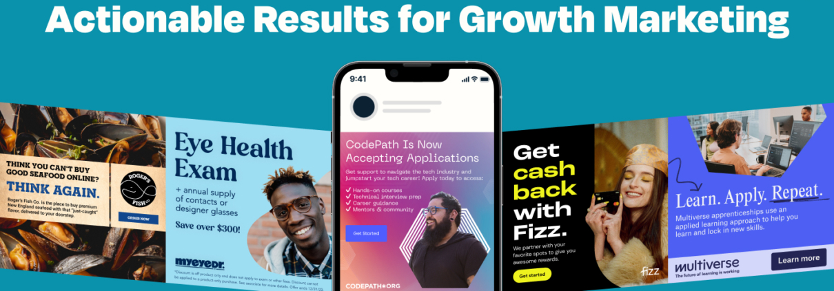
Performance creative challenges marketers to dig deep into what makes ads “work” better than others. Through deliberate testing and tweaking and testing again, we use data and analytics to not only understand the needs of our target audiences, but to also address them directly–in ad creative and copy.
Simple as that, right?
Key components of performance creative
Yes, there’s more to advertising than color and copy (a lot more). Ad creative is particularly unique because 75% of campaign success is driven by creative. We know that attention spans have dropped since iPhones magically appeared in all of our back pockets in 2007. That means that first impressions count more than ever, and ad creative is one of the few things that has the ability to still grab someone’s attention mid-scroll. And aside from reading someone’s mind, testing that creative is the best way to understand what made them stop scrolling in the first place (so we can get more people to do the same). We do that testing after we establish a few key elements.
5 key elements for successful performance creative in growth marketing:
- A clear understanding of the target audience: This requires research into their demographics, interests, and behaviors, as well as anything you can find on their motivations for clicking, browsing, purchasing, signing up, etc.
- A clear and measurable goal: Set a specific data-driven goal for each marketing campaign so at the end of a test you can say: “We learned something useful here.”
- A strong value proposition: The ad creative and copy need to clearly communicate the benefits and value of the brand.
- Engaging content: Strong ads capture the attention of the target audience.
- A compelling call to action: All ads should include a clear and persuasive call to action, such as “Sign up now” or “Learn more,” that encourages the target audience to take an action immediately.
By syncing these elements, performance creative will be set up to trigger specific actions–that are measurable! The “performance” aspect comes in when we start changing ad creative to influence what actions people take (and who’s taking them). We change the ad creative methodically because clear tests mean clear results.
The creative testing process
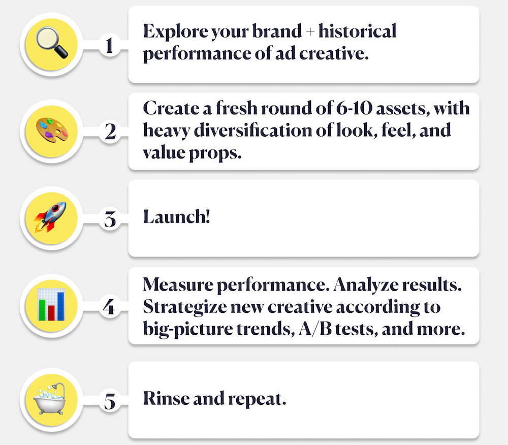
Remember the scientific method from middle school science class? Our process follows the same steps. (If it worked for Galileo, then it’ll work for us too.)
- We observe how the current creative is performing.
- We ask: Does one stand out from the pack? Are they similar? Is there an obvious gap in format, messaging, or brand elements?
- We make a hypothesis based on our experience working with hundreds of companies, products, and partners: “You know what, a bite-sized testimonial might do really well for this SaaS audience.” …or… “I think a video will get more people to purchase than a static quote here.”
- We whip up the creative and run the experiment for at least two weeks to test just one variable (like an animation vs. static quote). We change one element of the ad and present it to similar audiences. Everything else has to stay constant or else we’ll run the risk of incorrect conclusions about the relationship between our variables (i.e. it gets messy).
- We draw conclusions based on specific performance metrics like cost per click (CPC), click-through rate (CTR), and conversion rates. If we’re able to pay less to get more people to take the desired action, that tells us that one specific aspect of your ad is more impactful than the other (and should be tested more!)
What testing performance creative shows us
We don’t launch any campaigns without clear questions and hypotheses outlined beforehand. As a growth marketing agency, the broader goal is to understand which messages or offers (or formats or buttons, etc.) are more appealing to different segments of the population, and which channels or platforms are most effective for reaching those audiences. A/B tests provide valuable insights into the attitudes, preferences, and behaviors of our target audience, which helps us continually put out stronger creative and campaigns.
To learn about our audiences, we typically ask questions such as:
What ad formats work best across my acquisition channels and their respective audiences?
We load up our campaigns with a mix of ad creative formats so we can continually test their performance and efficiency against each other. It’s been particularly interesting to see the popularity of video ads skyrocket over the past 7 years, only to begin leveling out with stills this year (according to our data). In the past few months, we’ve seen carousels pick up in popularity across Facebook and Instagram, even more so than video.
What messaging (and copy placement) resonates with our audience best?
We use value props to create the base from which all marketing messaging for a particular brand is derived. Using a tried-and-true value props template, we outline the specific elements of a brand that set it apart from the competition, the very specific problems it solves, and how this solution benefits the user. Then–you guessed it–we test ‘em to see which resonates most.
We also test the placement of messaging in our ads. In Facebook ads, for example, there is copy above, overlaying, and underneath all visual ads. It’s important to test where a CTA like, “Get 20% Off Now” works best. A possible test would be to include that CTA directly on the ad creative vs. in the caption underneath. Run the test for two weeks and see which gets more clicks/higher CTR and how many of those clicks lead to purchases. There’s your answer.
Which creative works best with which audience (and drives the best results per objective?)
The creative that works best with a particular audience and drives the best results per objective will depend on the campaign’s (or just the test’s) goals. Here are a few factors that can influence the effectiveness of your creative:
Relevance: Creative and copy that is relevant to the target audience’s pain points are more likely to inspire action.
Clarity: Ads that are easy to understand are more likely to resonate.
Emotional appeal: Imagery and messaging that elicits an emotional response (through storytelling, colors, keywords, etc.) from the audience is often more effective.
Brand consistency: Creative that is consistent with the overall brand identity (including colors, fonts, messaging, and even CTAs) is more likely to be effective.
Ultimately, the best creative for a particular audience and objective will depend on the specific context and needs of the campaign. It’ll almost always be necessary to test different types of creative to see which one performs best with the target audience.
Example
Say we spent $2,000 on a 2-week creative test on Meta: $1,000 on an animated ad and $1,000 on a static ad with the same messaging, same CTA, and same audience.
Each ad received 9,000 impressions. Out of 9,000 impressions, the animation got 200 clicks that led to 4 purchases. Out of 9,000 impressions, the static ad got 100 clicks that led to 5 purchases. That leaves us with these metrics:
| Animated Ad | Static Ad | |
| Spend | $1,000.00 | $1,000.00 |
| Impressions | 9,000 | 9,000 |
| Clicks | 200 | 100 |
| CPC | $5.00 | $10.00 |
| CTR | 2.22% | 1.11% |
| Purchases | 4 | 5 |
| Cost Per Purchase | $250.00 | $200.00 |
| Conversion Rate | 2.00% | 5.00% |
There are a few key areas to consider when deciding which creative asset was more successful. The KPI will differ depending on the business’s goals, but let’s stick with purchases as the main measurement for success.
The quick answer: The static ad saw a lower cost per purchase, so we can draw an initial conclusion that the people interacting with it are further down in the funnel and more likely to buy. This means that it’s more cost-effective to serve a static ad to that audience rather than a video ad, and that’s where we should put our budget. HOWEVER—we’re seeing more engagement with the animated ad (double the clicks from the same number of impressions = higher click-through rate).
From those numbers, we might form a new hypothesis that those people are higher in the funnel and not quite ready to enter their credit card info. They’re interested in learning more (because they clicked the ad to go to the website), but they’re ever-so-slightly less likely to buy (4 purchases vs. 5).
By now you know that testing performance creative isn’t a one-and-done type of deal. These early results aren’t strong enough to hang our hats on just yet. In this scenario, we’d want to create another test to poke holes in our static ad and build them up stronger, or maybe rethink the audience we’re putting the animation in front of. There are so many elements to A/B test, and it’s the marketer’s job to decide which to focus on first.
Need a push? Here are some ideas…
Try these A/B tests!
Our advice: Start small. You won’t find the answers to all your advertising questions in the first month of testing. And if you take anything from this article, take this list of creative testing ideas you can put into action immediately.
- Headline + CTR: Test two different Facebook ad headlines with the same creative to see which one gets a higher click-through rate. Then use the winning headline on two different creatives. The result? An optimized ad with a proven headline and creative.
- Call-to-Action + CTR: Test two different CTAs to see which one gets a higher click-through rate. Then power up your optimized ad from above with the most effective CTA. Triple threat!
- Audience targeting + purchases: Test different target audiences using the same exact ad to see which group completes more purchases. Those are your people. (Then show the less active audience a different ad to see if that works better!)
- Audience targeting + time on site: A lesser-used test, you can compare which audiences spend a longer time on site to gauge their engagement level. We want to know what happens after someone sees our ad and before they complete a purchase for a fuller picture of what they need and where they are in the user journey.
- Ad format + cost per purchase: Test two different ad formats (text-based vs. image-based) with the same ad copy and same audience to see which results in more cost-effective acquisitions. The lower your cost per purchase, the more efficient and effective your ad format is. When you can double down on the most effective ads over and over again–then you’ve cracked the growth marketing code. Nice!
There are hundreds of ad elements and metric combinations you can use to evaluate your performance creative. With so much data at our fingertips, it’s the growth marketer’s job to ask the right questions and demand more of our creative and campaigns.
What performance creative can tell us about people
Creative that’s backed by data is one of the superpowers of growth marketing. It tells us more about our audience, how much they know about our brand, how much they want to know about our brand, and just how close they are to making a purchase (or similar action). By measuring their actions like clicking an ad, scrolling a website, starting the check-out process, or even ignoring us altogether, we can learn first-hand what makes an ad effective–down to the color of a CTA button–and where we need to shape up.
The key is to keep testing and iterating and testing and iterating. Campaigns should flex and flow and change with the market, the audience, the product, the platforms, and the inexplicable tides of people using the internet. Pay attention to the numbers and your performance creative will be better than ever. We promise. 🚀
Psst 👋 want help? We got you.
Hey! I’m HB, the Head of Creative Ops at Tuff. With a decade of experience across marketing and web, I specialize in complex problem-solving, strategic planning, and organic acquisition. My focus is on facilitating client growth, supporting our creative teams, and consistently improving efficiency across our org. Let’s chat!


