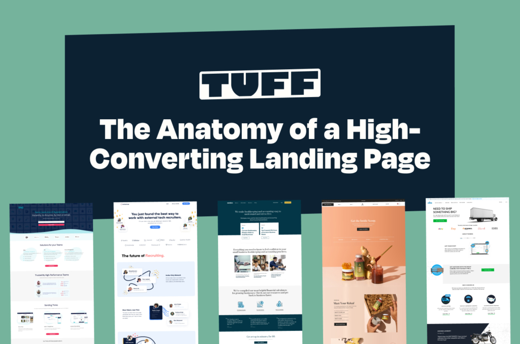
The Anatomy of a High-Converting Landing Page
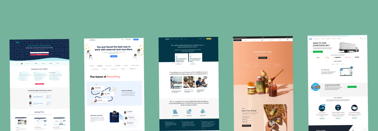
At Tuff, landing pages are a go-to growth marketing tactic for generating leads and increasing sales. But not all landing pages are created equal. One of the most critical parts of high-converting landing pages is their design.
In this post, we’ll walk you through each component you need to include on your landing page, so it looks great and turns visitors into customers.
What is a landing page?
A landing page is a web page distinct from your homepage. You can think of your homepage as a catch-all location made for exploration and a landing page as a goal-focused location made for conversion. Visitors are directed to landing pages when they click on a link from a specific source, like an ad on social media, Facebook, or Google. In fact, landing pages are a common conversion rate optimization tactic for paid campaigns to help get user’s to take a specific action more often.
The conversion goal
Landing pages are designed around a single conversion goal, such as downloading a free guide, purchasing an item from your store, or getting visitors’ contact information so that you can market to them in the future.
Focus on one conversion goal per landing page. If there are multiple goals at play, it can confuse visitors and make them less likely to convert.
Types of landing pages
As a growth marketing agency, we think about landing pages in two categories: click-through landing pages and lead-generation landing pages. A click-through landing page is a page where the conversion goal is presented as a stand-alone call to action button which prompts visitors to click through to another page. A lead-generation landing page includes a form to capture visitors’ contact information, usually in exchange for a reward (e.g., a discount code or free download).
Why use landing pages?
Effective landing pages capture leads, drive conversions, and generate revenue. When done correctly, landing pages can be one of the most effective tools for driving conversions and increasing your return on investment.
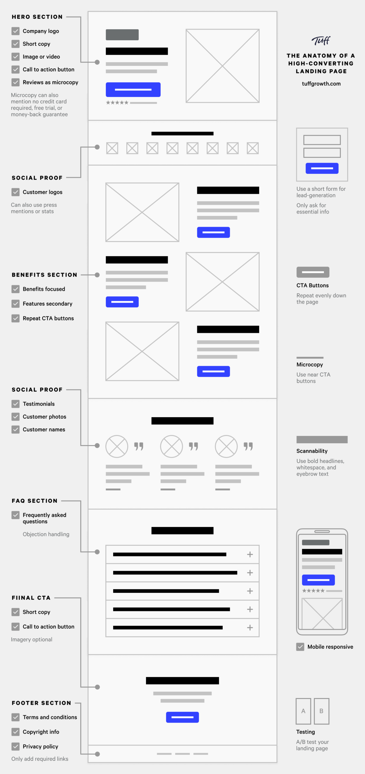
The Navigation Bar
A navigation bar allows users to access different website or application sections quickly. It usually consists of a horizontal bar containing links to the various pages of a website or application. The navigation bar typically appears at the top of a web page and can include interactive elements like links, drop-down menus, and search boxes.

You don’t want to distract visitors from your single conversion goal, so you will want to do one of the following:
- Simplify the navigation bar by removing any distracting links that would typically be present on a website.
- Remove the navigation bar.
- Only use anchor links.
Simplified navigation bar
A simplified navigation bar should not contain links to other pages but can include the company logo and a call to action button. One exception for linking is linking your company logo to your main website. This single link gives visitors easy access to your website if they want to learn more about your company before deciding to purchase.

Remove the navigation bar
Removing the navigation bar helps to focus the visitors’ attention on the main call to action button in the hero section. If you decide to remove the navigation bar, you will need to find a new place to put your company logo. The company logo is usually placed in the hero section of the page, along with the copy and main call to action button.
Use anchor links
Lastly, you can add anchor links to your navigation bar. Anchor links, also known as jump links, are links placed on a web page that point to specific sections of that same page. They are excellent for pages with lots of content because they allow visitors to quickly navigate to areas of the page that interest them most without needing to scroll down.
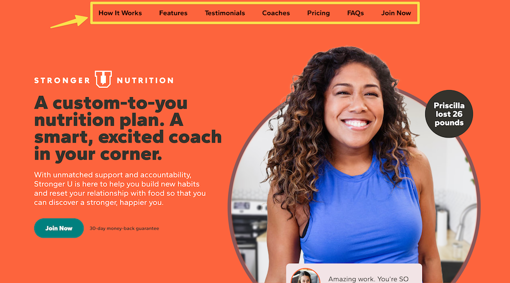
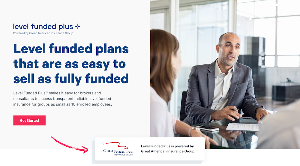
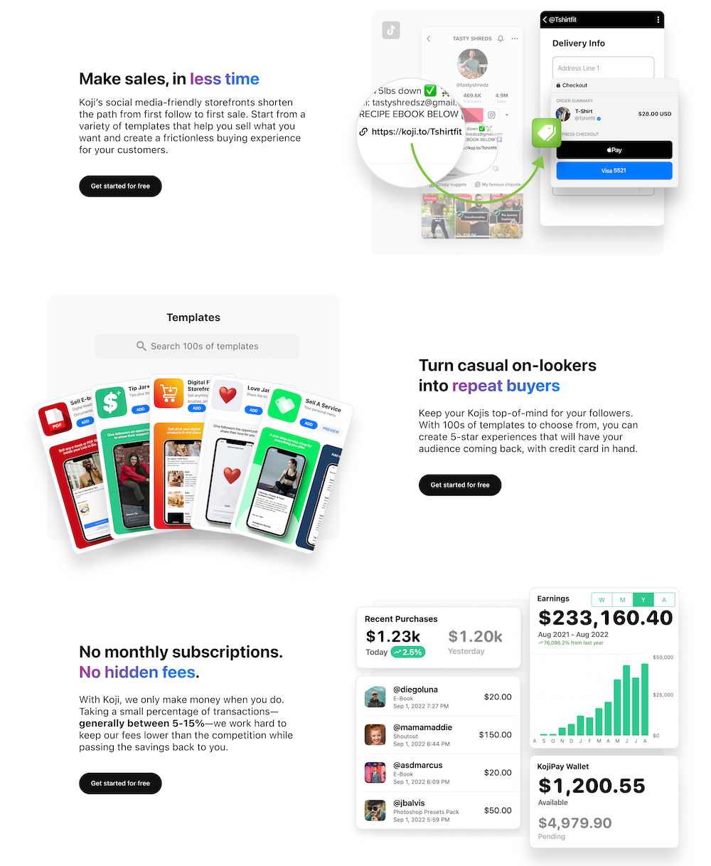
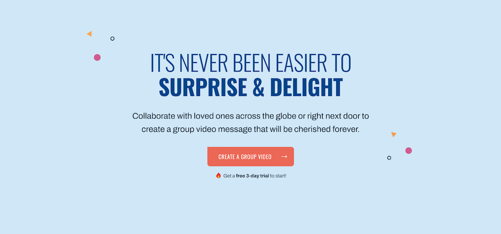
The Hero Section
The hero section is the primary area of focus at the top of your landing page. It is designed to be visually appealing and capture the attention of visitors. It typically includes a headline, a short description, and a call-to-action button. It can also include your company logo if you opt to remove the navigation bar. The main goal of the hero section is to explain the product or service, highlight the key benefits, and encourage visitors to take action.
Copy
Hero section copy should be short, attention-grabbing, and conversion-focused. Large amounts of text can be overwhelming and cause visitors to leave. Use words specific to your visitor’s needs and explain how your product or service can help them. At Tuff, we create value propositions to guide strategic messaging for landing page designs.
Imagery or Video
You will want to include an eye-catching image or video that speaks to the copy and aligns with the brand’s aesthetic. Imagery or video that can evoke an emotional response in visitors is always best.
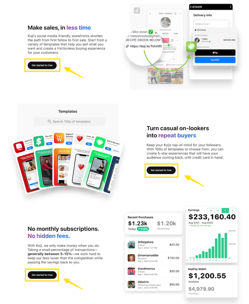
Call to Action Button
The call to action button should stand out, be descriptive, and communicate what users will get or where they will go after clicking it. Avoid generic button copy like “Submit.”
You can also use a secondary call to action button to show additional information or play videos on the same page. Since you don’t want to distract visitors from your single conversion goal, secondary buttons should never link to other pages.
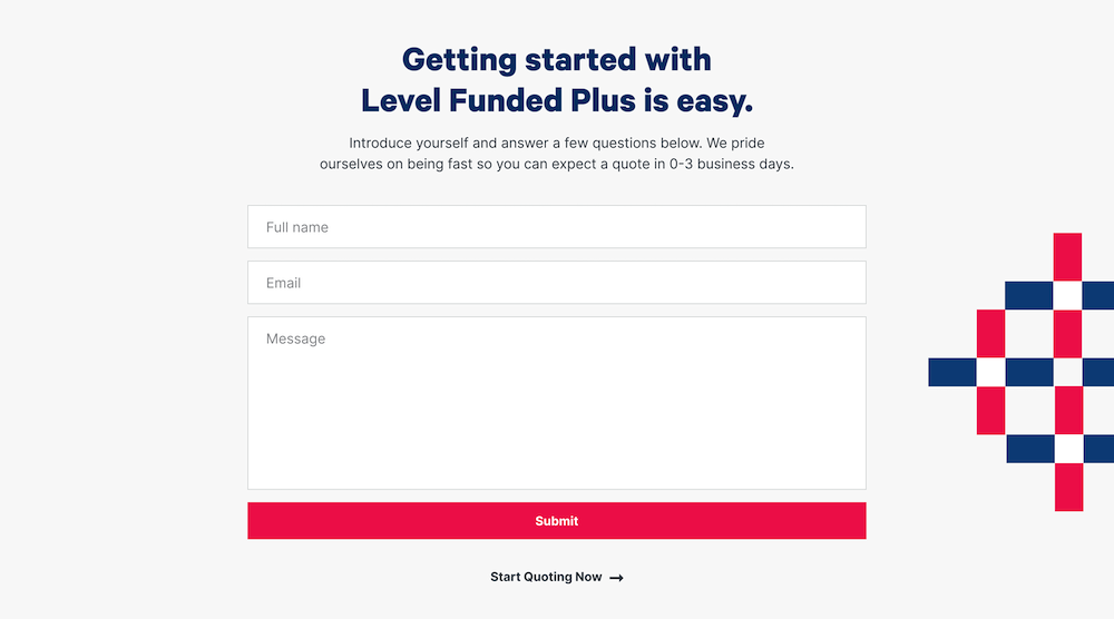
Forms
As mentioned earlier, a lead-generation landing page will typically include a form. Ensure you only ask visitors for essential information to identify and contact them. Forms with the highest completion rates only ask for a name and email address.
You can incentivize visitors to complete an opt-in form by offering them a reward like a free download, trial, or discount. It’s best to keep your form above the fold in the hero section, although you can also place it lower on the page. If placing your form lower on the page, use a call to action button with an anchor link that brings visitors directly to the form section after clicking.
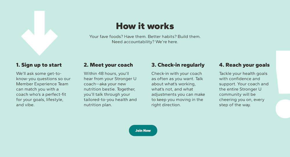
The How It Works Section
Not all landing pages need to explain how it works. Sometimes, the reader can gather details about how the process or product works from the benefits section.
However, if your product requires visitors to understand the process before they use it, then a more detailed how it works section can be helpful. The how it works section should ideally be three or four numbered steps and formatted into columns.
The Benefits Section
The benefits section should focus on the product or service’s benefits and how it will positively impact the customer. While you can add a few notes about the product’s features, it’s best to keep this section centered around the benefits, as the key benefits they’ll get from their experience with the product/service are often more appealing.
Social Proof
Social proof is evidence from other users who’ve purchased a product or service and found it valuable. It helps increase conversions by providing reassurance and helps build trust, as visitors are more likely to buy from you if they see that other people have had positive experiences with your brand.
New or early-stage companies will usually have to launch landing pages with very little or no social proof, but established companies should have many options for social proof. Typical forms of social proof on high-converting landing pages are client logos, testimonials, reviews, press mentions, and statistical data.
Client Logos
Software companies often display customer logos on their landing pages to show visitors that many well-known companies use their products. Service-based businesses often place high-profile client logos on their landing pages to attract similar clients. Placing client or customer logos underneath or inside the hero section is common and helps to increase the chance that visitors see them without needing to scroll.
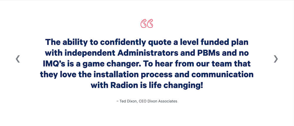
Testimonials
Testimonials are statements from customers or clients who have had a positive experience with a product or service. When using testimonials on a landing page, include the name and photo of the customer. Visitors will question their credibility when testimonials do not include names and pictures.
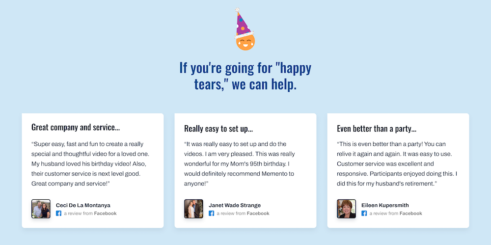
Reviews
Reviews are usually in-depth, unsolicited evaluations of your product or service written by the customer. You will often see companies display reviews on their landing pages from places like Trustpilot, G2, The App Store, Google Play Store, and social media.
Press Mentions
Press mentions are when a publication, website, or other media outlet mentions your business or product. They can help to build your brand’s reputation and visibility, which can help to attract more customers.

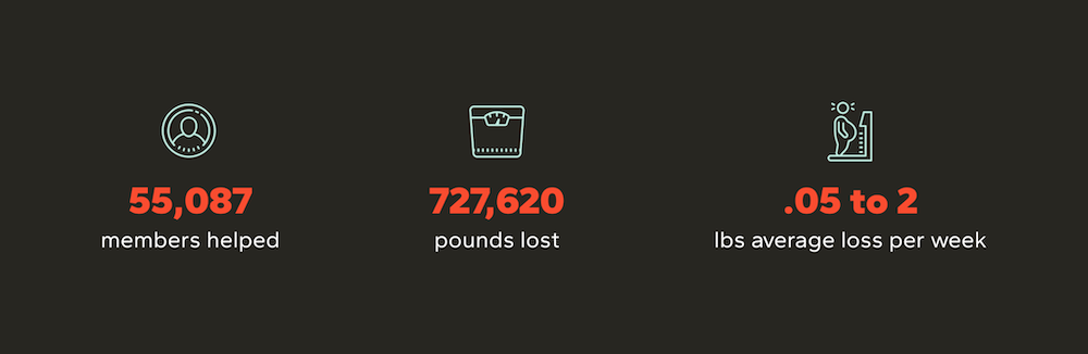
Statistical Data
Statistical data is often used on high-converting landing pages to provide potential customers with a visual representation of the success of a product or service or the impact it has had on other customers. Frequently used data includes total registered users, number of downloads, and user-generated content statistics. An example of statistical data would be a headline that reads “Trusted by millions” or “Over 200,000 projects funded”. Another option for statistical data is to display your total number of positive reviews.
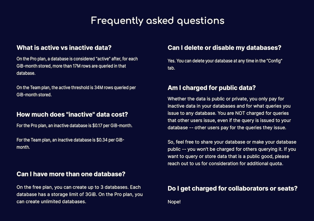
The FAQ Section
FAQs, or frequently asked questions section, helps to handle visitor objections by answering any questions your landing page copy still needs to address. It is best to place FAQs near the bottom of your landing page after visitors have explored most of the page.
The Final Call To Action
Provide a final call to action section at the bottom of the page to provide a straightforward way for visitors to take their next steps toward conversion. The components of this section are similar to the hero section and contain copy and a call to action button. Optionally you can add imagery. It is best to reword the messaging here so that it isn’t identical to the hero section or focus on highlighting a different value proposition.
The Footer Section
Similar to the navigation bar, the footer section should be simple. Only add what is necessary, like your company’s terms and conditions, copyright information, and privacy policy.

Bonus Tips
Mobile Design
Landing pages should always be mobile responsive. Currently, about half of all internet traffic comes from mobile devices. Mobile responsive pages automatically adjust their layout and content to fit any screen size, allowing visitors to easily navigate and interact with your landing page on any device. Ensuring your landing page is easy to read and navigate on any device is the optimal user experience and leads to better conversions.
CTA Buttons
Repeat your call-to-action buttons throughout the page. You’ll want to evenly spread them apart down the page to provide ample opportunities for visitors to convert. For example, another great place, to add call-to-action buttons is underneath each benefit in the benefits section.
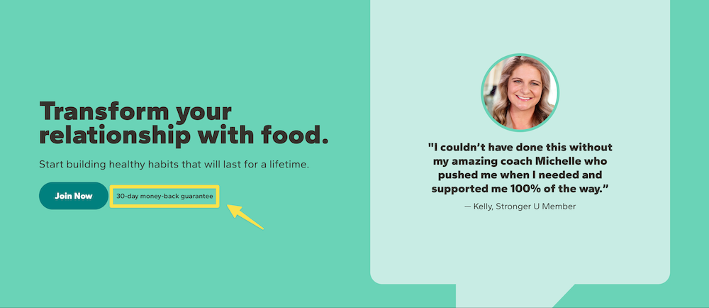
Microcopy
Microcopy is a great way to highlight specific benefits or ease visitor worries. The best place to put microcopy is near the call to action buttons. Here are a few examples of microcopy: no credit card required, 14-day free trial, 30-day money-back guarantee, or 4.9 out of 5 stars on Trustpilot.
Scannability
As evidenced by Nielsen Norman Group’s eye-tracking studies, visitors are far more likely to scan than read word for word. To increase your landing page’s scannability, use more prominent, bolder headlines to break up your page’s body copy, and use whitespace to show a clear division between sections. You can also add “eyebrow” text – a descriptive keyword or short phrase placed above headlines – to highlight key takeaways on the page
Testing
A/B test your landing page. A/B testing works by randomly assigning different users to different versions of your landing page and then measuring user behavior on each version to see which performed better. CRO tests commonly include variations to your copy, images, layout, and colors. Test each element individually, so you know which variation affected your conversion rate.
Conclusion
So, is there a one-size-fits-all solution to building landing pages? No, but a high-converting landing page will always adhere to the same basic structure mentioned above. Each business has a different audience with unique motivations and values. When building your landing page, focus on your customer’s wants and needs and test to discover the elements that work for your business.
Do you need help writing, designing, and testing landing pages? We’d love to work with you. Schedule a call with our team to talk about conversion rate optimization.