14 Ready-to-Go Growth Marketing Spreadsheets Startups Can Use to Boost Productivity
Note: this post was updated in September 2022 with one new spreadsheets to help with SEO forecasting.
One of our team values at Tuff is to work smarter, not harder. For the work that we do, this often means creating clear and repeatable processes.
We also think dashboards are a little overrated.
Although they give you a snapshot of important metrics, and they look good, dashboards aren’t great at providing the details or context that effective data-driven decision making requires.
This is why spreadsheets have been such a staple for our growth marketing agency, helping us to collaborate more efficiently with our startup partners, track budgets and core metrics, see our growth more clearly, organize our experiments, and get more work done.
That being said, building the right spreadsheets that are actually helpful and relevant to your startup can be time-consuming. We’d love to help.
We’ve pulled together a list of the essential spreadsheets and templates we have used and improved to help prioritize experiments, run campaigns, and track growth for Tuff and our startup partners.
Let’s jump in…
For many of the growth marketing spreadsheets linked below, you can download as an .xls file to use and customize in Excel or Google Docs. Google Doc users can also go to “File > Make a Copy …” to add the spreadsheet to their account, then edit.
1. Growth Marketing Framework
Use for: Prioritizing and tracking your growth marketing experiments
Grab a copy of this spreadsheet here >>
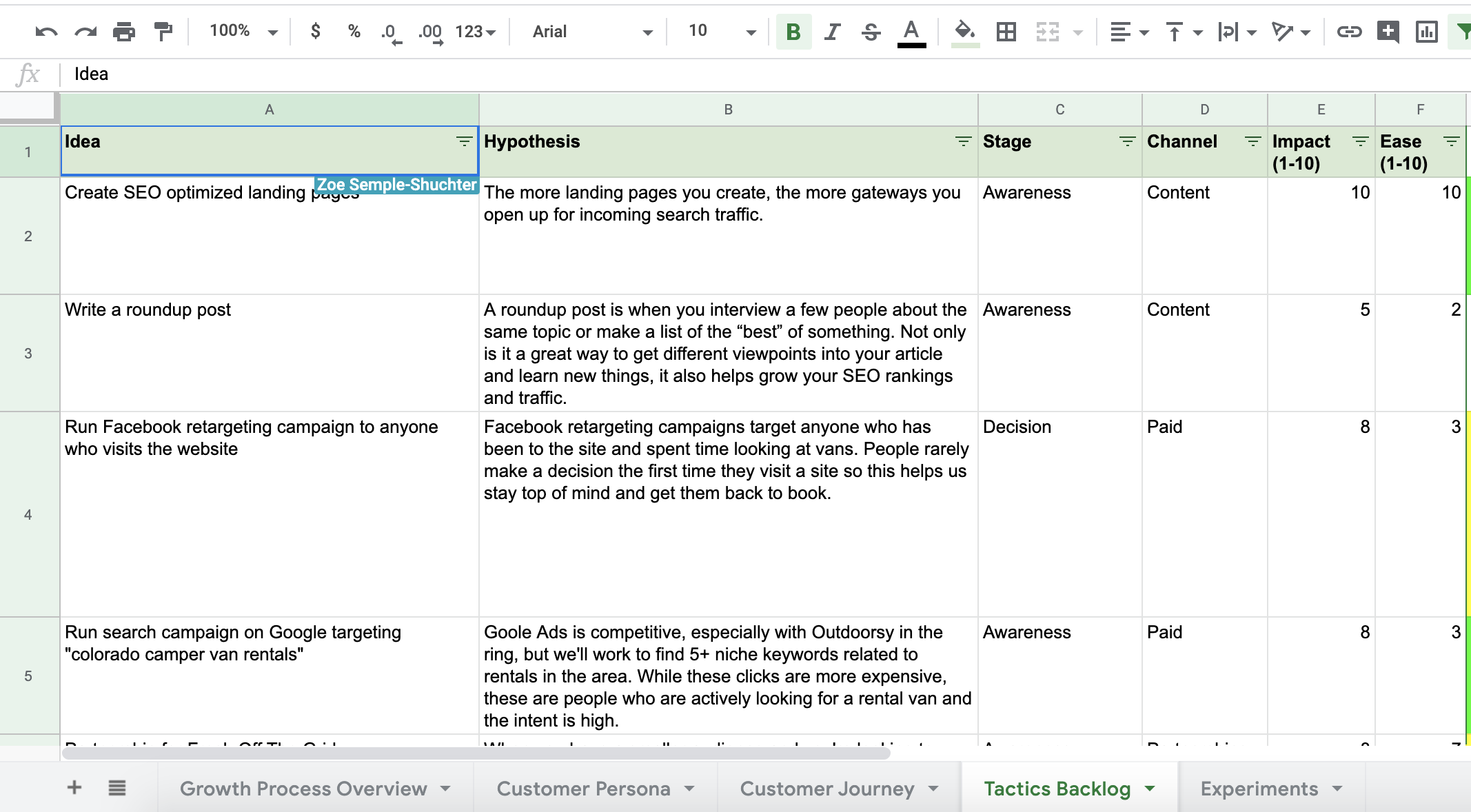
We discovered this Growth Marketing Framework spreadsheet after attending Sid Bharath’s talk at the GrowthMentor summit last year. We tested it out on our own and it’s quickly become a go-to for our team when we need to prioritize campaigns, identify new experiments, and find big wins for our partners. We like it so much that we have one for Tuff that we look at weekly as a team.
In this spreadsheet, you have four core tabs:
- Customer Personas
- Customer Journey
- Tactics Backlog
- Experiments
Our favorite part about this spreadsheet is that your customer personas exist in the same spreadsheet as your ideas. In the past, we built out personas in a word doc or slides with visuals and descriptors, and sometimes we still do. But having your target audience in the same place you go to list ideas and pick experiments is extremely helpful when it comes to prioritization. Before we add any ideas to our backlog, we can revisit our personas, their journey, and then truly assess if they are the right fit for our audience. With this setup, your personas become a driving force for tactics instead of an afterthought. You end up with experiments that hit the mark more often because they’ve passed the persona check.
2. Channel Projections for Experiments
Use for: Forecasting budget based on historical data and determining projected performance
Grab a copy of this spreadsheet here >>
We get these two questions a lot: How much should I spend? And, what can I get in return?
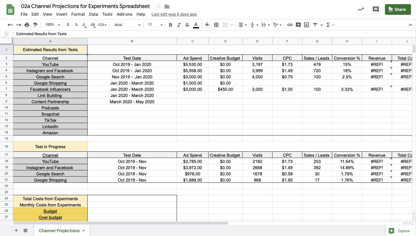
In order to set monthly budgets and projections, we start with core KPIs. What are we trying to achieve? Do we want to book more demos, increase sales, drive more leads? Once we understand these goals, we can forecast budget based on historical data and determine projected performance using this spreadsheet. This isn’t an exact science but it helps us align as a team about what we’re trying to achieve based on specific targets. It also helps you know how much you need in the bank to test and learn.
For traffic and conversion rate data, we lean on tools like Google Analytics, Shopify, Metorik, Firebase, Salesforce, Facebook, and Google Ads. If you don’t have this data available because you haven’t experimented on these channels, you can still use this spreadsheet, you’ll just need to take bigger leaps with the numbers based on industry averages.
3. Growth Marketing Scorecard
Use for: Tracking results daily, weekly, and monthly in one shared spreadsheet
Grab a copy of this spreadsheet here >>
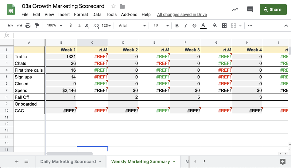
When you’re running experiments and testing new campaigns, we like to have a reporting template that gives us true insight into what’s working and what’s not. We use this spreadsheet to track daily, weekly, and monthly results for our campaigns.
One of the most important things about this scorecard is that it’s 100% manual. While there are a bunch of automated dashboards out there, after three years and 35 startups, we still think this is the best option for our team and partners in the early stages. It’s simple (no fluff) and sticks to the most important metrics. While pulling the data from various sources takes time (about 10 minutes each morning), it gives you an opportunity to really look at the data, dig into what it’s telling us, and then make smarter optimizations and budget allocations.
4. UTM Generator for Campaigns (Tracking)
Use for: Understanding which campaigns are driving meaningful results
Grab a copy of this spreadsheet here >>
UTM codes are snippets of text added to the end of a URL to help you track where website traffic comes from if users click a link to this URL. If you’re anything like the data-driven campaign managers on the Tuff team, you probably don’t run any campaigns without UTM parameters. By tagging your URLs with UTMs, you can get a good understanding of how your visitors interact with your website, allocate budget more efficiently, and cut out anything that isn’t working. For a full rundown on UTMs, we turn to Niel Patel’s ultimate UTM guide here.
So what’s with this spreadsheet? If you’re running multiple campaigns and experimenting quickly, it’s easy to lose track of your URLs. For example, we have a batch of Facebook campaigns active right now, with 23 different audiences, using 23 different URLS. These can add up! This spreadsheet keeps all active URLs organized so anyone on the team can check the URL, review performance in Google Analytics, and then help make smarter marketing decisions at the campaign level.
5. Blog Post Traffic Tracker from Buffer (Content)
Use for: Knowing which posts are gaining the most traffic
Grab a copy of this spreadsheet here >>
This is one of the best spreadsheets to understand how your content is stacking up. If you don’t have a blog yet, skip this spreadsheet.
The blog post traffic spreadsheet from Buffer enables you to keep an eye on which posts are hitting your traffic goals and it’s also really great to keep an eye on what topics are performing best, too. While this is easy to see in Google Analytics, pulling the data into a spreadsheet helps you benchmark performance more easily to identify content wins.
One of the more actionable ways we use this spreadsheet is to help us identify articles we want to update. To increase the effectiveness of your SEO efforts and boost your search engine traffic, you canupdate your old content and give yourself an improved freshness score.
Buffer has 10 other very helpful social media and content spreadsheets here, in case you want more.
6. Budget Tracker for PPC Campaigns (Paid)
Use for: Creating an automated monthly budget pacing dashboard for Google Ads
Grab a copy of this spreadsheet here >>
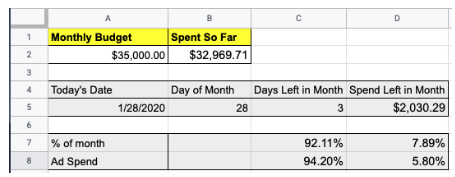
When you build this spreadsheet, you’ll get a quick glimpse at how your budget is pacing for the month on Google Ads. This can be helpful when you have specific monthly targets you want to hit.
With this spreadsheet you can see how far through the month you are, what percent of spend you’ve used, and how close you are tracking towards your goal. For example, you might be 61% of the way through your budget but only 53% of the way to your revenue goal.
This works best with larger budgets (below $1,000 per month is less effective) but as you ramp up, it can help you stay more efficient and effective with your spend.
7. Influencer Marketing Template (Influencer)
Use for: Managing and tracking your Instagram influencer marketing campaign
Grab a copy of this spreadsheet here >>
Performance-based influencer campaigns can drive revenue and user growth if you can tap into the right communities.
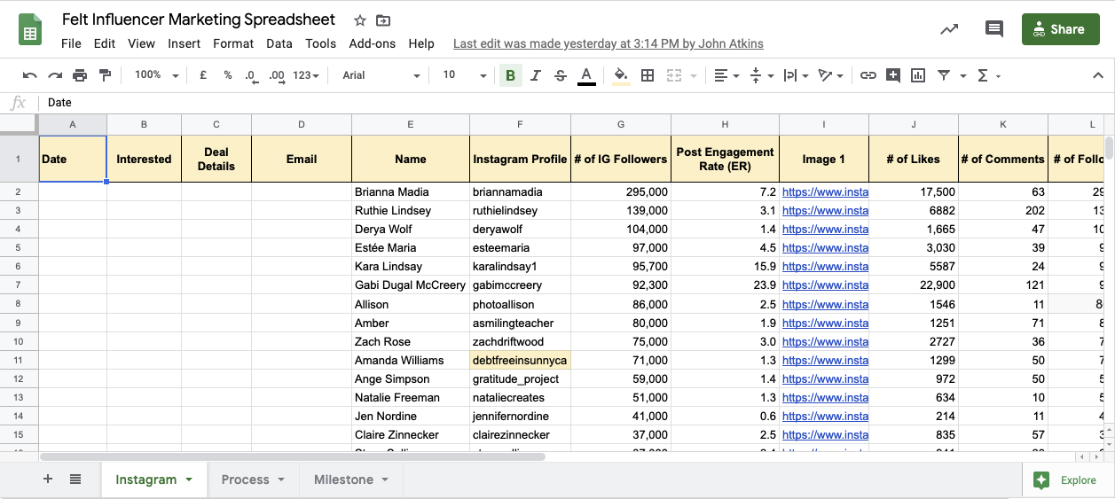
The way that this spreadsheet works is simple. Once you’ve defined your niche and set goals for your influencer program, you can start compiling your influencers in this spreadsheet. From here, you can start to calculate each influencer’s engagement rate. This will tell you who has an active audience.
There are a bunch of different ways to calculate engagement rates and this spreadsheet uses the below formula:
ER post = Total engagements on a post / Total followers *100.
A higher engagement rate typically spells out a wider reach and stronger influence.
Again, this is another manual process and it takes time. If you find early traction with your program in the first 90 days, we recommend transitioning to a tool to help manage as you scale.
8. Email User Onboarding Flow (Email)
Use for: Building and visualizing your welcome email flow
Grab a copy of this spreadsheet here >>
Installs, sign ups, and demos mean nothing if you can’t keep your users — which makes your onboarding email campaign incredibly important.
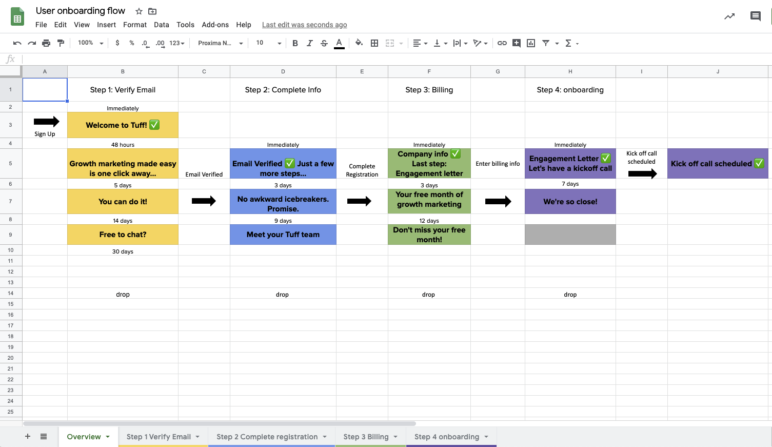
We use this template to outline our Email user flow from start to finish. For a successful strategy, it helps us:
- Set a goal for each email in the series
- Set timing for each email
- See the entire flow at once
From here, you can start thinking about copy, CTAs, and design for each email, benchmark performance, and start testing. This structure has helped us get higher retention rates and increase revenue.
Bonus Template: If you don’t have an onboarding flow for new customers or leads, this email marketing planning template from Hubspot is handy for planning marketing and transactional emails.
9. Google Ads Keyword Audit (Paid)
Use for: Efficiently auditing your PPC keywords & search queries to identify top performers based on ROAS.
Grab a copy of this spreadsheet here >>
When it comes to optimizing paid search campaigns, keyword optimizations can oftentimes be time-consuming, scattered, or – even worse – ineffective. A keyword with a high CTR and low CPC may be performing well at first glance, but these are surface-level metrics and they don’t necessarily correlate with the most important metrics.
Organizing your keywords and search queries into a format that helps you focus on what really matters the most – in this case, ROAS – will give you a clear picture of which keywords to invest more money into and which keywords to scrap from your campaign(s).
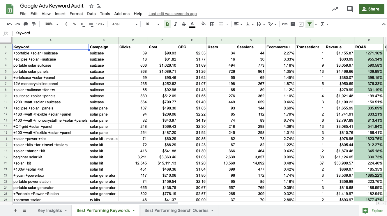
To use this spreadsheet, export your keyword report from Google Analytics for your chosen time period. Be sure to include the following attributes: Keyword, Campaign, Clicks, Cost, CPC, User, Sessions, Ecommerce Conversion Rate (or Goal Conversion Rate), Transactions (or Goals Completions), & Revenue.
The first row in this spreadsheet maps to these attributes. In Column K, you’ll find a ROAS calculation equipped with Conditional Formatting that will provide you with a quick visual representation of your Keyword success.
As a starting point, we’ve got Conditional Formatting set up to turn cells in Column K green when the ROAS is greater than or equal 250% and red when the ROAS is less than or equal to 150%.
With your exported data placed in this sheet, you’ll quickly see which of your keywords are driving the best ROAS.
To help sort, we have a filter placed in row 1 that provides you with endless filtering and sorting options. There’s also a nifty word count formula in Column L which will provide some insight into how your long tail and short tail keyword performance compare.
Run the same report at the Search Query level and compare it with your Keyword list. You may find some standout queries that can be added as Exact Match keywords to your campaigns.
10. CRM Spreadsheet Hack
Housing your website signup leads for b2b and b2c businesses doesn’t have to be complicated and doesn’t mean you automatically need to upgrade to an expensive email service provider (esp) or customer relationship management (CRM) software.
Take it from us at Tuff Growth. We don’t use a CRM or ESP to manage our inbound prospect leads but we also don’t spend time migrating information from lead forms to spreadsheets.
Our solution for a CRM is 100% free and utilizes tools that you likely already know about and some you might already use.
This solution isn’t for everyone. If you have over 100 leads coming in per day and need to send them down specific email drip funnel campaigns or assign them to specific sales managers, then a free CRM solution like Hubspot might be a better option for you.
For us, we have a manageable amount of leads come in through our website form each day and we either reach out to them should they look to be a good fit for our business or we do not. We also don’t have a full-service sales team and don’t plan to for the foreseeable future. All of our leads are 100% inbound generated and referral driven, which speaks to our dedication to SEO Content Strategy and doing great work for our existing clients.
To learn more about how you can create your own free CRM, let’s dive in:
At Tuff, our website is built on WordPress and we use the basic WordPress forms known as WPForms. Once a prospect enters their information into our form, then that person’s contact form information is sent directly to our Website leads Google Spreadsheet that is broken out by month.
The way that we send the form from WordPress Forms to our Google Sheets’ Lead Form is through a tool called Zapier which connects software APIs through no-code integrations.
To set up this particular Zap, you will need to have a Zapier account, access to your WordPress site, and access to your website lead form sheet.
Enter your email to download the process for setting up this Zap:
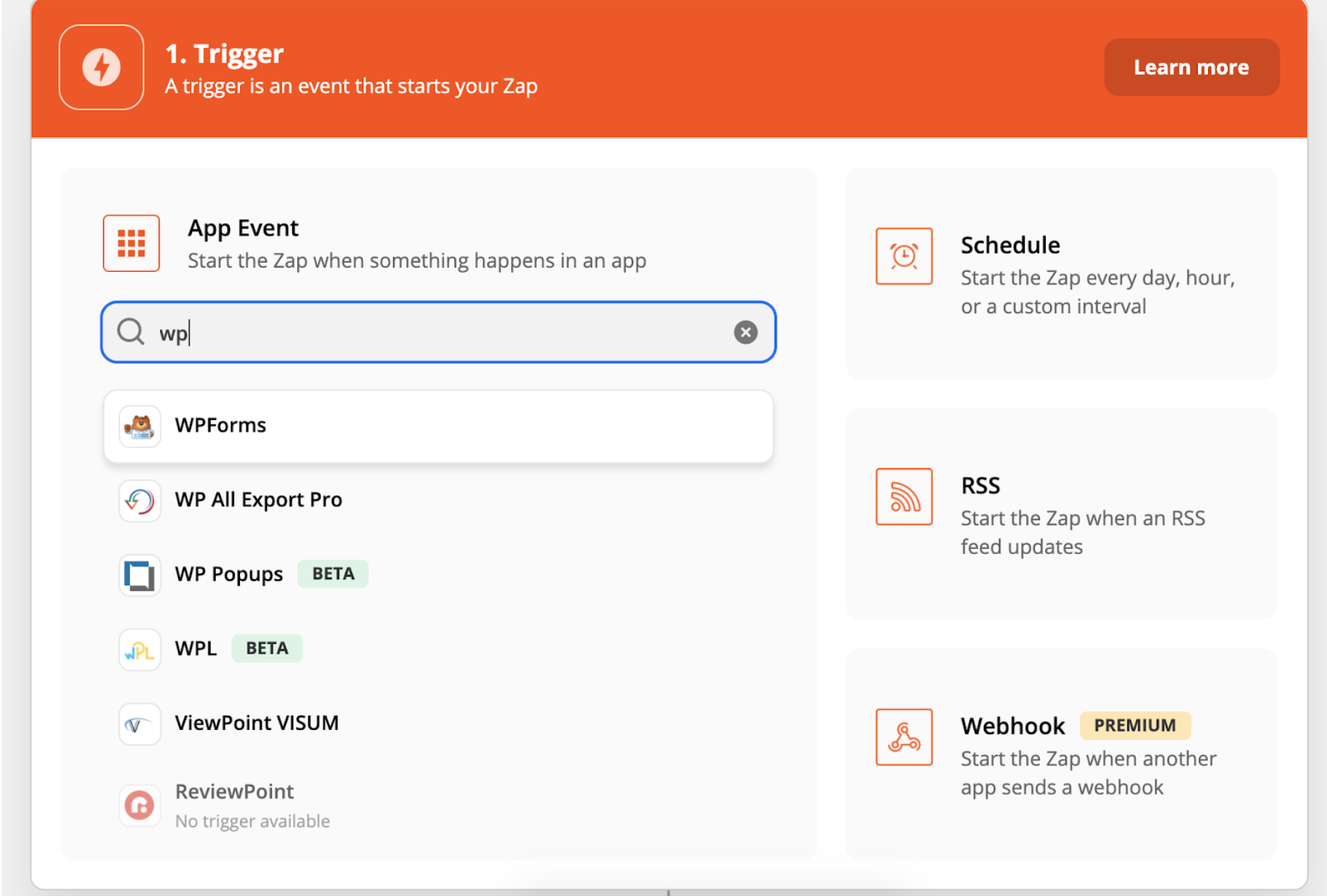
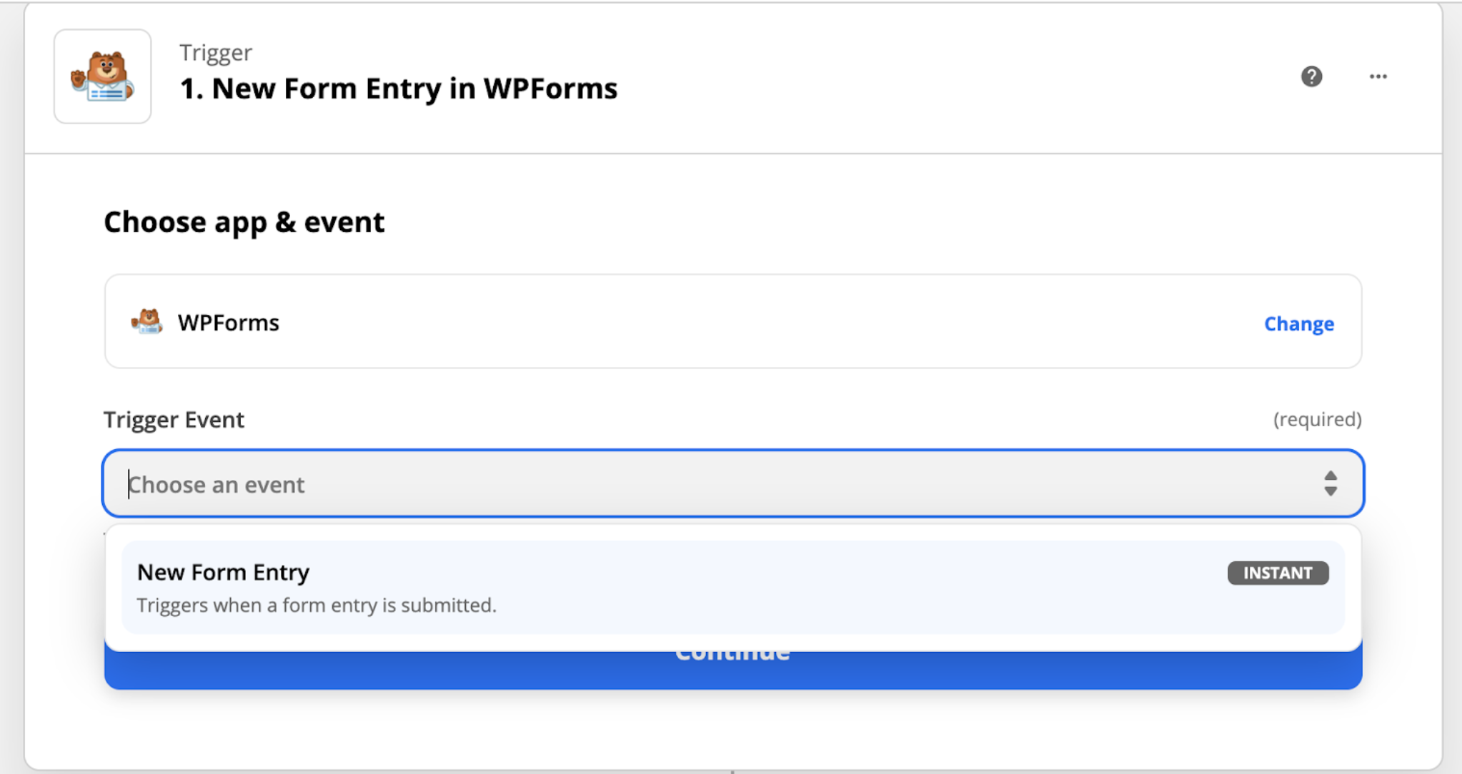
Step 1: Select WPForms as your trigger
Step 2: Choose the Trigger Event of New Form Entry
Step 3: Select the WP Account with which the form is associated. You’ll need to connect your WP Account to Zapier with API Keys if you haven’t done this before. Follow the steps to do so.
Step 4: Choose the form that you want to send submitted information from in your zap.
Step 5: Test trigger as instructed by Zapier and make sure information is correct in your test.
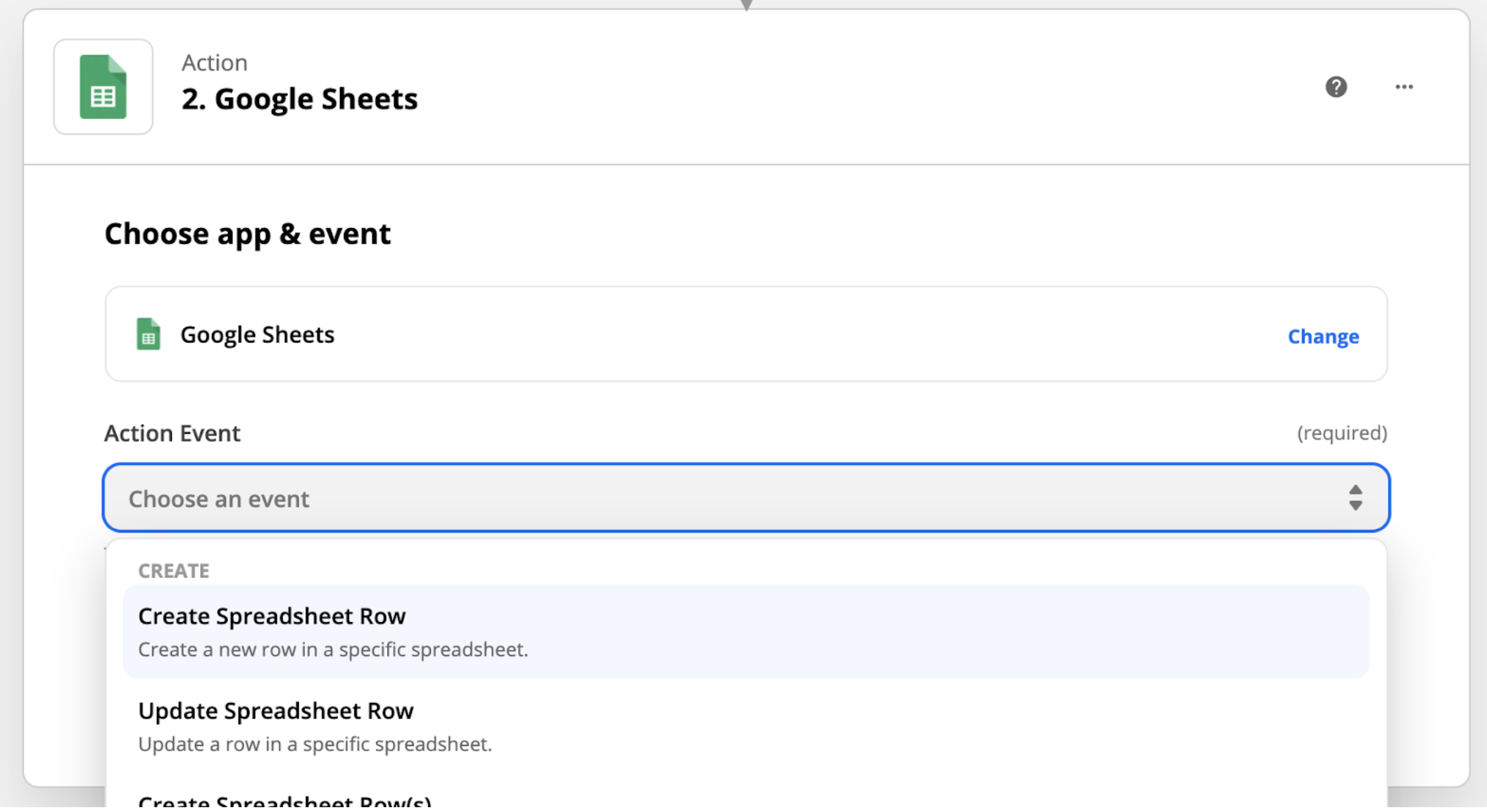
Step 6: Choose the action that you want to happen when someone submits a form. In this case, the action is Google Sheets.
Step 7: Choose your action event. For this zap, you’ll want to choose “Create Spreadsheet Row”
Step 8: Choose the Google Account associated with where your spreadsheet is housed.
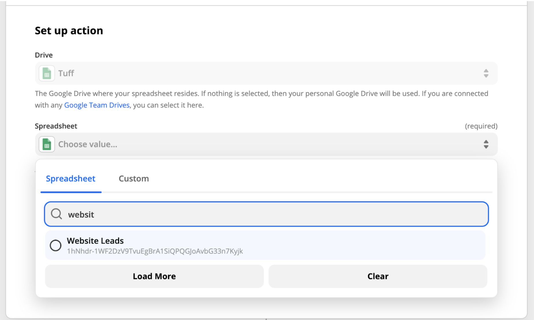
Step 9: Choose the Google Drive associated with account that house the spreadsheet.
Step 10: Choose the Google Sheet that you want to send the submission data to.
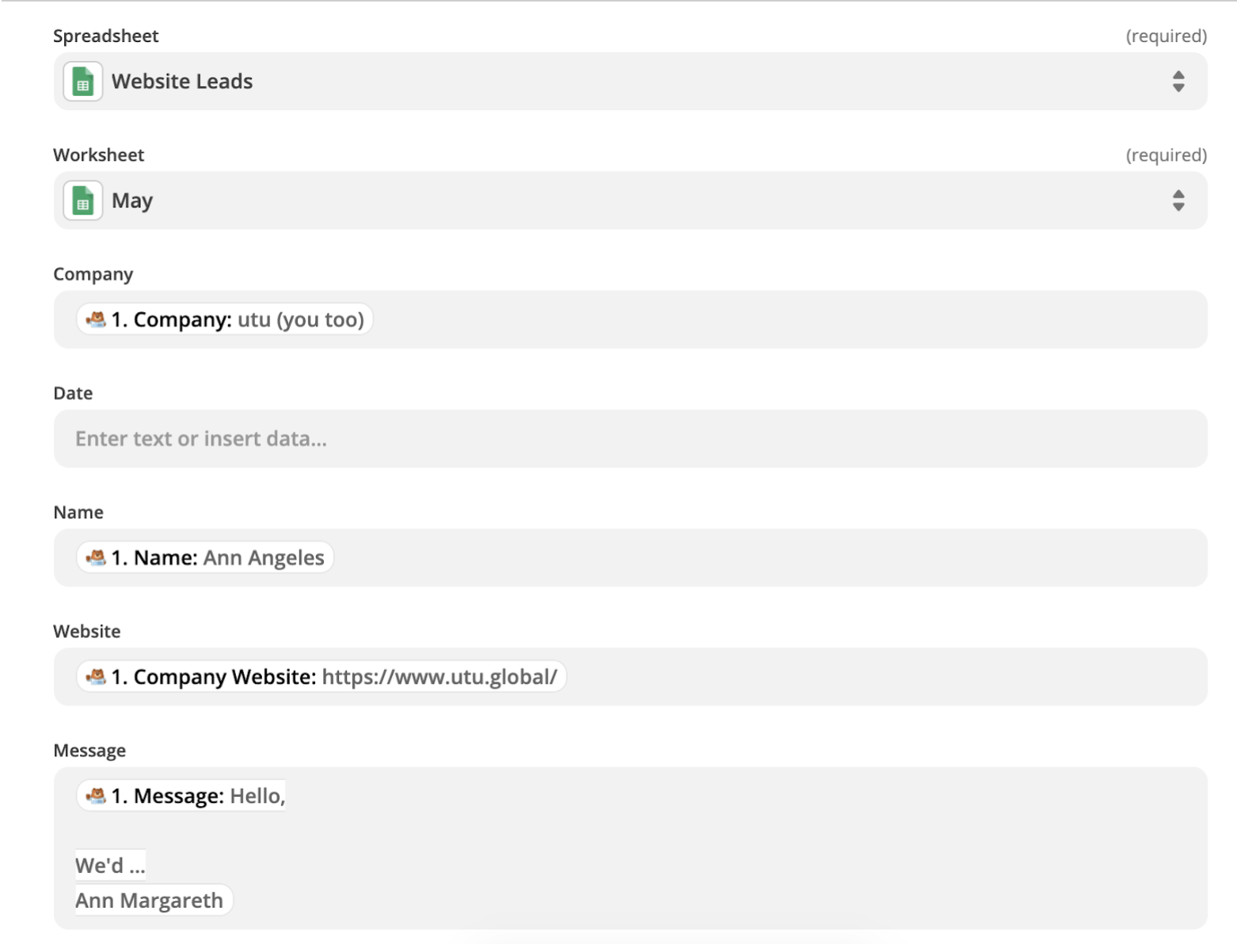
Step 11 Optional: If there are tabs in your spreadsheet, then choose which tab you want to send the data to.
Step 12: Now that you’re connected to the correct spreadsheet then Zapier will pull in header information and you will need to select what information from the form goes in each header column.
Step 13: Test and review that your Zap is working correctly. This is a live test so Zapier will pull info from your latest submission on your WPForms over to Google Sheets. If it successful then you should see your submission updated in Google Sheets after you click test.
Step 14: Once your test returns a positive result, then click “continue” and turn on your Zap.
Note: You will need to refresh your zap every few weeks. If it stops working for some reason then go back through the steps and re-integrate your accounts to keep everything working smoothly.
11. Value Props Exercise
Grab a copy of this spreadsheet here >>
While it’s incredibly important to make sure you’re set up for success with budgets, projections, goals, and reporting, it all falls flat without putting in the legwork to really dig in and create smart, compelling value props. For the data and dollar-sign driven types like founders and growth marketers, this can feel a bit daunting, but sharpening the language around why your customer/client should convert can streamline spend and make all other growth marketing activities work more efficiently.
For the left-brainers in the room (us included!) we created a spreadsheet to help us achieve this right-brain task.
Hot tip: many marketers that jump into value props start in the wrong place. Instead of focusing first on the end goal—a smart value prop—we recommend starting with the problem. Think first about the exact moment in someone’s life where they stumble across a problem, hit a roadblock, or create a workaround that your product directly addresses. Then, work right, circling back to the actual value prop as the last thing you do.
If you’re Uber, here’s how we would approach it.
Problem: I waste my time standing on a street corner trying to flag down an empty taxi.
Implication: I cut into my day by carving out extra time to flag down a taxi and I run the risk of being late.
Solution: A way to connect with an available driver and know exactly when they’ll show up.
Benefit: A guaranteed ride and a predictable timeline.
Value Prop: Get a guaranteed ride on your time.
Note: the most important part of this exercise is to remember that even when you’ve scrutinized it, edited it, and rewritten it, it’s still a living document. Instead of putting it up on a shelf, periodically crack it open, make strategic updates, and use it!
12. Facebook Ad Creative Analysis Spreadsheet
Grab a copy of this spreadsheet here >>
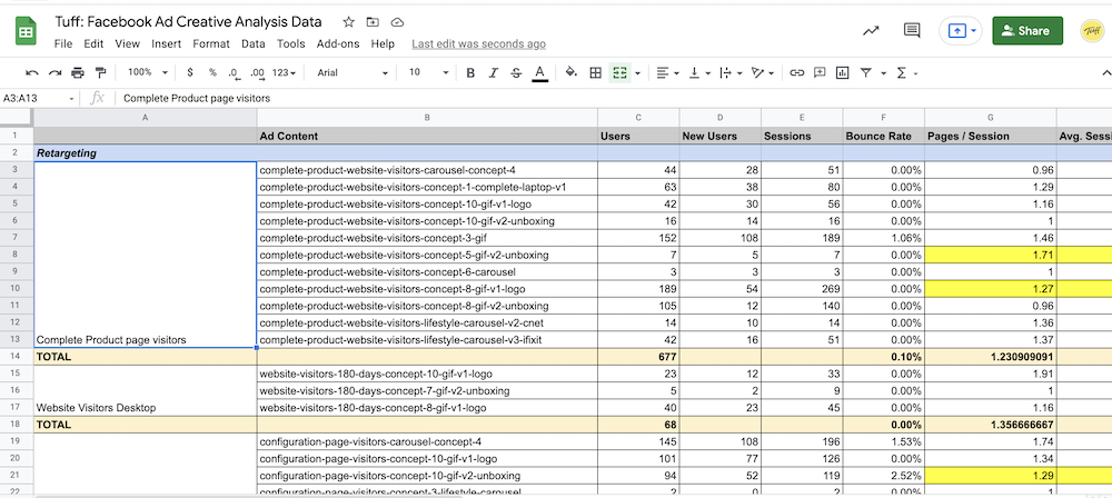
We’re a revenue and conversion-first agency. But great creative—from ads to emails to landing pages and beyond—is a critical part of the equation.
Because we want to really dig into understanding what ad creative is performing the best, our team uses this spreadsheet to pull the core performance metrics for our paid campaigns on Facebook and Instagram. This helps us, and our clients, understand what’s working, what’s not working, and how we want to test moving forward.
We left the data in this spreadsheet so that you could see what the final output looks like. If you’re interested in using this spreadsheet to better understand how your Facebook creative is performing, download this and make a copy.
13. Landing Page Testing Plan Timeline
Grab a copy of this spreadsheet here >>
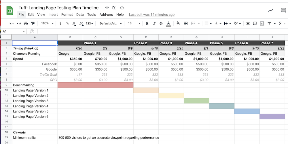
When it comes to increasing the conversion rate for our clients, we’re often focused on implementing impactful changes to the layout, copy, and images used throughout various landing pages to help increase our number of conversions.
For our process, it’s important to isolate as many variables as possible throughout testing so that we’re able to definitively say what improved (or negatively impacted) results. Not all CRO landing page tests go as planned, but with our testing methodology, we can always go back to the previous version of the landing page and start again with a new variable to test.
That’s why we structure our tests bracket-style using this spreadsheet. We’ll have two almost identical campaigns running in our paid channels, but with the ads pointing to two different landing pages. We’ll take the winner, and pit it against the next iteration of the landing page, keeping all the data organized in this spreadsheet.
14. SEO Forecasting
Grab a copy of this spreadsheet here >>
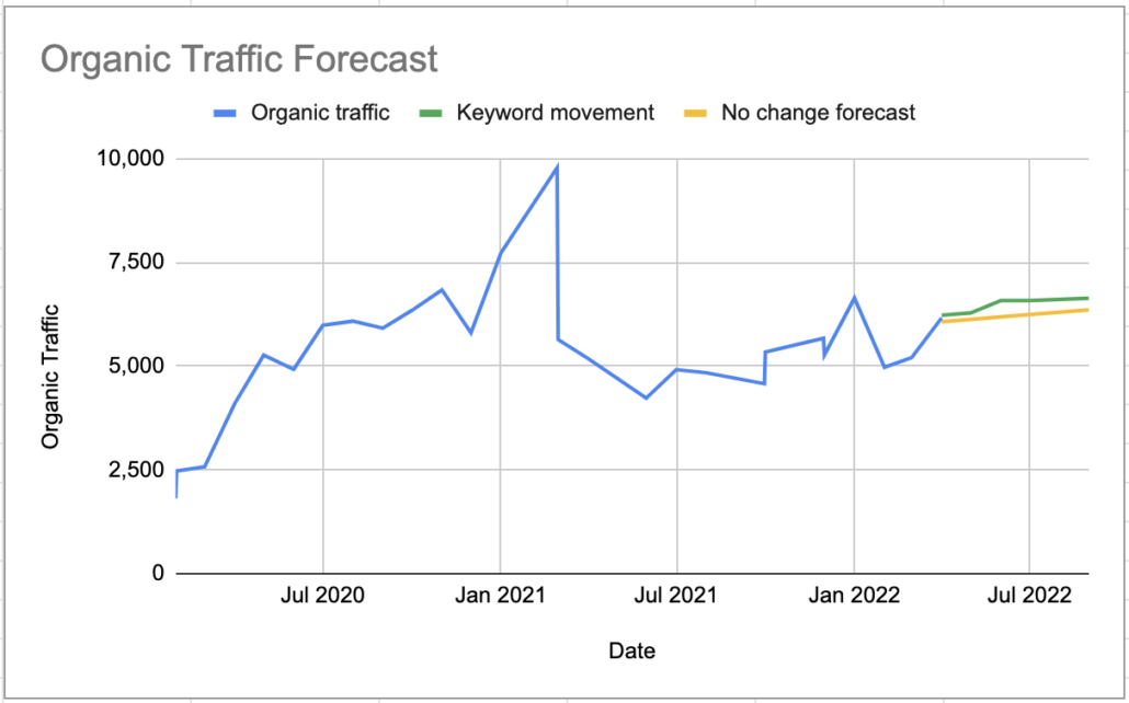
SEO forecasting lets you use data to estimate future organic traffic results and keyword movement. It leverages historical data and assumes traffic patterns are likely to continue and can help you prioritize SEO efforts and allocated resources based on potential impact.
Forecasting is critical when it comes to prioritization and something we believe every early stage startup and scaleup needs to consider.
At Tuff, we’ve been using this Google Sheet to forecast organic traffic growth for our clients for the last 6 months, and it’s proven extremely reliable with its predictions.
Happy Spreadsheeting-ing
Thanks for reading! I hope you picked up one or two new tips and tricks for your spreadsheets here.
I’d love to hear what growth marketing spreadsheets your team has been using? What has worked well for you?

Ellen is the founder at Tuff and one of the team’s core growth marketers. She is a versatile marketer with expertise in multiple channels – from ppc to seo to email to others – responsible for the experiments and testing. She is happiest when she’s on the ski hill or outside pointing her mountain bike downhill.


