How We Boosted Koala’s eCommerce Conversion Rate by 153%
New Mexico based Hangtime Gear is an early stage startup designing innovative mobile accessories.
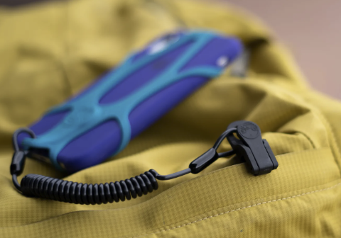
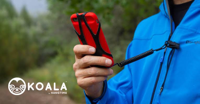
Their core product is the KOALA Super Grip Phone Harness – a smartphone holder with a leash and clasp that secures to any fabric keeping your phone safe from drops, damage, and loss.
The KOALA was originally a 2019 IndieGoGo Campaign that raised over $500K. It has been featured in Outside Magazine, The New York Times, Gear Patrol, The Boston Globe, and on CBS’ Innovation Nation with Mo Rocca.
From crowdfunded campaign to eCommerce Growth Strategy
Hangtime Gear reached out to our team in March 2020 to help them build and execute an eCommerce growth strategy. After doing foundational research and reviewing the full user journey, we immediately got started on getting quality traffic to the site. This included:
- Google Ads
- Google Shopping
- Facebook and Instagram Ads
- YouTube
As traffic increased, we turned our focus to conversion rate optimization. When it comes to increasing revenue, we knew it would take more than clicks.
In this post, we’re going to break down how our website optimizations increased the eCommerce conversion rate by 153% by:
- Differentiating between a crowdfund backer vs eCommerce customer.
- Rewriting, redesigning, and rebuilding key sections of the site.
Crowdfunding Campaign Design ≠ eCommerce Website Design
A great crowdfunding campaign can pave the way for your eCommerce business by giving you access to the capital you need, market validation, PR, and product reviews.
What it can’t do is provide a verbatim model of how to advertise to your customers and optimize your eCommerce website.
Hangtime Gear’s existing website featured design elements that were pulled from their crowdfunding page, which didn’t translate into a high enough conversion rate for our paid advertising strategy to produce a high ROAS.
This is a common situation for founders that launch with crowdfunded campaigns – what works for a backer audience doesn’t always translate.
A crowdfunding backer is supporting an idea – more times than not this idea isn’t fully realized or completed – which is okay. The point of the crowdfunding campaign is to give you a platform to test your assumptions.
On the contrary, an eCommerce customer is buying a fully functional product to use for a specific need.
Due to this distinction, the two audiences require different customer journeys and user experiences, especially when it comes to a website.
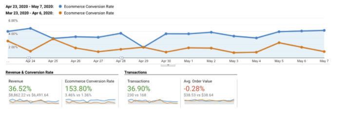
Here are the four main changes we implemented to increase Hangtime’s eCommerce conversion rate from 1.36% to 3.46%.
We started with the homepage.
The first step in the redesign process was the homepage section. Originally, the site featured all product information on one page like you would do for a crowdfunding campaign page or for an Amazon listing.
You could learn about the product, read customer reviews, look through top-tier publisher testimonials, and add the product to your cart, all from the homepage.
The strategy behind this is smart – lots of the world’s leading platforms utilize it from Amazon to IndieGoGo and Kickstarter. This design centers on the assumption that the conversion rate will be higher if people have to navigate to fewer pages.
For Amazon and crowdfunding platforms it works for two reasons:
- High levels of trust with those platforms.
- Those platforms have spent thousands of hours and millions upon millions of dollars optimizing their single page layouts to perform at the highest conversion rates the world has ever seen.
However, for early-stage startup brands with very little recognition and no resources to properly optimize a single home page and product page website, getting the conversion rate results to scale can be incredibly tricky.
To help clean up the user experience, we started by breaking out the home page from the product page and utilizing a product benefit banner structure on the homepage featuring different creatives with product specific copy and different CTAs (Calls To Action) on each banner.
We introduced a separate product page.
For the product page, we utilized the product page section from the original website but broke it out onto its own page for the above-the-fold content. Here’s what this looks like:

Below the fold of the product page, we added a customer product review section using Stamped.io’s widget that highlights top reviews with user-generated content and chronologically ordered reviews. With Stamped.io, users can filter through the reviews using a query function as well as preset tags to see all reviews featuring a term like “iPhone.”
After the review section, we added an additional product information section that dives deep into exactly how the product is used, how it was made, and why you should use it. We used an app designed for Shopify websites called PageFly Page Builder to build this custom section. The app also allowed us to utilize a feature called lazy loading which made the product page’s loading speed faster.
We built a dedicated review page.
One of the great things about Hangtime Gear’s KOALA product, especially for an early-stage brand, is that it has over 400 reviews. Given that they’ve only been around for a few months – this is amazing and speaks to their customer satisfaction.
However with 400 reviews, we didn’t want to crowd the home page or product page showcasing all of the user-generated content. We decided to break out the reviews onto their own page using generated code that we injected into the Shopify page using Stamped.io.
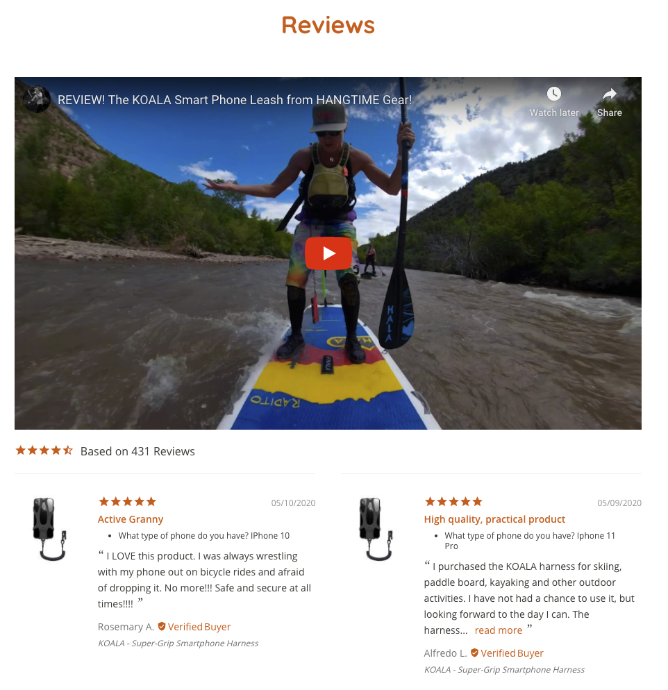
The start of this page features a YouTube Video testimonial of the KOALA in action and is preceded by a scrolling page of the reviews.
We restructured the header navigation to provide easy pathways to find the product, product proof, or helpful answers about the product.
The final change that we made to the KOALA Website was to reformat the header and footer navigation menus. We wanted to control the UX journey flow, so we took out specific menu items to push non-purchasers to either learn more about the product, read user reviews, or learn about the product on the FAQ page.
We removed:
- About
- Blog
We kept:
- Shop
- Reviews
- FAQs
Website Optimization Results
We launched the new version of Hangtime’s website on April 23 and instantly saw an increase in conversion rate that leveled out over the next 12 days.
In addition to bumping up conversion rate, we saw added benefits:
- The average session duration increased by 299%
- Revenue increased by 36%
- Bounce rate decreased by 28%
- Page speed increased by 29%
Not a one and done solution.
At Tuff, ongoing optimization is part of our conversion rate optimization website design process. It can also be used for our clients who already have high conversion rates and would like us to test new variables in a safe testing environment.
We typically implement 2x tests per week to optimize the conversion rate. We do either a copy or creative test followed by an offer based test. The process uses 72-hour testing increments to let us measure the success rate of the test.
If the first test increases or perpetuates the baseline conversion rate, then we leave it and add a second variable into the mix. If the test decreases the conversion rate, then we pull the test variable and move the original variable back into place. Then we move onto the second test of the week.
This testing process allows us to test new variables regularly without adding too many variables at once which makes it difficult for us to measure what contributed to an increase or decrease in conversion rate.
If you want to explore more about how to increase your eCommerce conversion rate with Tuff or want a first-hand look at the data showcased above, touch base to set up a free, 30-minute growth strategy session with our team. We’d love to learn more about who you are and what you do so that we can help you find your way to the next level.