How to Set Up an A/B Test so You Get REAL Results
When analyzing ad creative, it can be hard to tell which element really makes a piece resonate with the viewer. Is it the bold color? The little bit of sass? The scroll stopping typography? Or is it how you articulate the value you’re offering? The audience you’re addressing?
There are so many variables that it can feel overwhelming. That’s when it’s time to start A/B testing!
At Tuff, methodical A/B testing has allowed us to both make small yet powerful tweaks to well-performing ads and also generate powerful business-level insights. Most importantly, it helps us drive up click-through rate, and drive down costs. This article will take you through our process from the initial creative development all the way to the implementation and analysis of A/B tests so you can supercharge your ad creative too.
A/B Testing 101
An A/B test is when you run 2 versions of the same ad, but with one variable that’s different. You can then look at the ad performance to see which version more effectively resonated with your audience in order to gain insights that will help your overall campaign.
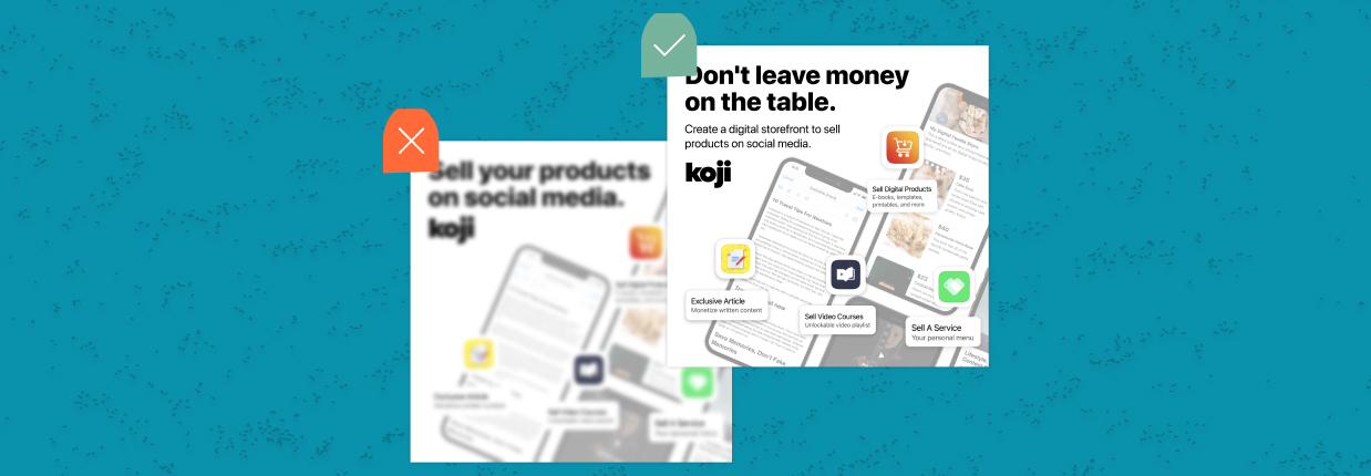
Below is an example where we were A/B testing different hero images to see if people would be more likely to engage with language about “virtual photoshoots” or language that targets a more sophisticated creative demographic that might be looking for “photo assets.”
Here are the results:
- A Variant (photoshoot company)
- CTR = 0.36%
- Purchases = 20
- B Variant (photo assets)
- CTR = 0.24%
- Purchases = 1
Notice that every variable is the same from the logo color and placement to the lay-down imagery to the highlight color. While it would have been possible to truly isolate one variable here in this ad (like JUST changing one word) there’s strategic decision making that went into our approach so, before you put pen to paper, it’s important to ask yourself…
Where to Start?
A/B testing for A/B testing’s sake is just about as useless as hanging your clothes out to dry in a rainstorm. Without some forethought and a strategic outline, you’ll be left with results and also a resounding, “so what?”
So, at the outset of creative production, we’ll get our full team together. This usually consists of a growth marketer, or big-picture strategist, a campaign manager, or the person deep in the day-to-day on-platform optimizations, and the creative strategist, or the person on the hook for developing creative that’s on-trend, on-brand, and platform-specific. We’ll ask ourselves three major questions:
1. Why do we want to run this test?
An A/B test that originates in an actual impactful question makes a significant difference in its effectiveness. This can be as simple as: “is our creative more compelling when it features people or just products?” It can be as complex as: “should we position ourselves as a disruptor in the market or a powerful alternative to other stale options?”
2. How do we measure success?
It’s important to outline your KPIs for an A/B test before you develop your ad creative.
If click-through rate (CTR) is your primary metric that determines success, then you’ll want to seriously consider your hook, the headline, and potentially the CTA as elements that move the needle.
If you’re more focused on a metric like cost per action (CPA), then you’ll want to consider your holistic message and how well the information, look, and feel of the ad matches the landing page experience in order to determine success.
Finally, if you’re considering a metric that tells you more about general awareness like cost per 1,000 views (CPM) or watch rate, then you’ll need to talk about what elements of creative will be responsible for driving those metrics and honing in there.
3. What do we expect to learn from it?
Remember 8th grade science class? Then you’ll remember how important a hypothesis is. It’s critical to have a clear understanding of what you hope to learn, or what you expect to discover by running your A/B test so that when it concludes, you’re one step closer to driving optimal performance with your ad creative. This is closely related to point #1 above, but takes it one step further. Here’s what that looks like using the two examples.
“is our creative more compelling when it features people or just products?”
- Hypothesis: the presence of people demonstrating our product in use is a crucial part of generating interest and sales of it. So, we expect to learn that more education about HOW our product works is an important step in the user journey.
“should we position ourselves as a disruptor in the market or a powerful alternative to other stale options?”
- Hypothesis: people are curious about us as disruptors, but are more efficiently compelled to sign up/request a demo when they understand how to compare us to one of our competitors or a “poor alternative.”
4. How are we going to go about it?
This is where the real cross-team fun begins! Before you begin your brief and define how to build your creative to get the findings you’re after, it’s critical to collaborate with your campaign managers to understand their approach to creating an appropriate environment within the right channel. Is this a test for Meta, LinkedIn, or YouTube? What’s the right audience? How about budget and duration? Aligning on these points will set you up for success.
Developing Creative for Your A/B Test
One of the most popular elements to start A/B testing is the hook of a video. A hook refers to the first 2 seconds of a social video ad because this is the time it takes most viewers to either get engaged or keep scrolling. It’s basically the 2022 equivalent of the age-old newspaper term “above the fold.”
A/B testing can be done on a fresh ad idea (like the still images example in the previous section), but we’ve also found success through using A/B testing to revamp a struggling ad that we believe still has potential. This is useful when we know a video ad has elements and messaging that has worked in other iterations, but for some reason, it is failing to draw an audience. This is a great opportunity for developing an A/B Test around a new hook. If we can get a successful hook, viewers will stick around for the valuable meat of the message.
An example of this was for our product photography partner, soona. On our first round of creative, we were optimistic about a testimonial concept that ended up underperforming. The ad had a lot going for it, the testimonial was sincere, the edit was fun and the messaging was similar to ads we’ve seen succeed in the past. So instead of scrapping the idea, we created an A/B test where we produced a B variant with a new hook.
We hypothesized that the ad struggled because the viewer didn’t know what soona was quickly enough, so for the B variant, we added a 2 second frame with copy explaining it (a virtual product photography company) with photo examples before jumping into the testimonial.
Then, we isolated these two videos in a fresh campaign with a modest defined test budget to ensure that the performance of the original wasn’t impacted by an audience that had already seen it.
Here’s our original (on the right) and our B variant (on the left). The two videos were exactly the same except for the fresh 2 second hook in variant B. Headline and text copy remained exactly the same between the two:
Ultimately, the results were surprising:
- The original video (with Rob’s face as the hook) showed a significantly stronger click-through rate:
- CTR = 0.25%
- The B variant:
- CTR = 0.11%
So, we proved our hypothesis wrong! And in the spirit of science, we didn’t ball our test up and throw it out, we dug in deeper to try to uncover what it is about this asset that lagged behind. Ultimately, we ran several more additional tests and discovered that short, quippy, brightly-colored stills tend to generate our strongest click-through rates, reaching upwards of 0.8%.
Top Tips for Structuring Your Test Campaign
Let’s get into the nuts and bolts of how to set up your campaign structure in order to walk away with definitive findings like the ones we generated above.
The first thing you’ll want to do when planning how to execute your A/B test is put together a strategic plan that outlines the following:
- How you’ll test the two variables against each other
- Where the test will take place
- How long you’ll be running the test
- KPIs for success
There are two ways to implement a A/B test on paid social –– using Facebook’s A/B tool or isolating the variables and measuring the data manually.
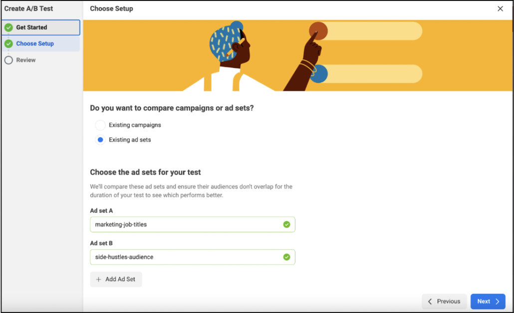
To use the A/B testing tool on Facebook, you’ll want to create two new ad sets using the same audience (one ad set with variable A and one ad set with variable B). From there, you’ll click the A/B test button in the main navigation which will take you to a page that looks like this to set up your test.
For the A/B test above with the two different text graphics, we wanted to make sure that we were isolating the two different assets and testing them in the same audience on Facebook so that way we could have concrete data on which graphic performed better. Since we know that the KPIs vary for different audiences based on where they fall in the user funnel, we typically like to execute the A/B test in one prospecting audience and one retargeting audience.
From there, we decided that we’d run the test for 10 days or until each audience reached $500, which would give us enough significant data to analyze and determine which variable was the winner.
Our main KPI for this A/B test was CTR. We also layered on number of purchases and cost per purchase as secondary KPIs.
Think Like a (Creative) Scientist
Ultimately, to get REAL results from your A/B test you’ve gotta keep an open and unbiased mind and lean in with curiosity. If your test doesn’t generate the results you were hoping for, change up the creative and test again! When you’re after insights greater than “which color button performs better,” you’re reckoning with a number of different variables. So, creating a new hypothesis, and diving back into another test is the best way to keep you inching closer to creative assets that unlock amazing performance.
Ready to dive into an impactful A/B test with us? Let’s talk.
