SEO and UX Design: How to Create User-Friendly Websites That Rank and Convert
Search engine optimization (SEO) and user experience (UX) play a massive role in how well your website and company perform. The two frequently overlap, but SEO and UX audits can influence your success in different ways.
When you have strong SEO, you can pull in visitors from search engines to your website without paying for clicks. With organic traffic, you rely less on paid advertisements to get people to your website.
However, SEO is a long-term play. We usually see results from SEO initiatives three to six months after publishing content. Driving qualified visitors to your website is not enough to be effective.
Are users taking the actions you want them to take when they get to your website? For example, are they adding products to the cart and completing checkout? Are they filling out your lead generation forms? If they aren’t, then you probably have some user experience issues.
You need to have a strong user experience to keep users on the page, clicking around your website, and completing the actions that you want them to take.
In this article, we’ll go over the exact steps you can take to improve your SEO and UX to rank higher in search engines and convert more website visitors into customers. We’ll also show you how to conduct a quick SEO and UX audit of your site to find opportunities and quick wins.
How to conduct an SEO Audit
An SEO audit usually involves looking at your technical SEO, everything on your website that impacts your search engine rankings, as well as user experience. Examples of common technical SEO issues that we see include:
Duplicate content
Many times ecommerce product pages have duplicate versions. It confuses Google because it doesnt know which version to index in search results. You’ll also get flagged for duplicate content if you have large chunks of identical text that appear on multiple pages.
How to fix it: The solution for duplicate content depends on the specific case, but for product pages, you’ll usually set up a canonical tag. It tells search engines which URL is the version you want them to crawl.
Oftentimes, technical SEO issues also impact your user experience, and those are ones you should prioritize fixing. Examples of SEO and UX issues include:
Broken links and 404 pages
Internal broken links, especially to high-traffic pages, create a poor user experience because you’re sending visitors to a page that doesn’t exist.
How to fix it: Get a list of the URLs that have broken links. You can use a Chrome extension like Broken Link Checker to help you identify them faster on the page. Then, remove the broken links or redirect 404 pages to working URLs.
Page loading speed
Page speed can greatly influence and improve your user experience as well as conversion rates. If a website doesn’t load within three seconds, over half (53%) of mobile visitors will leave. Ideally, your website should load within one second.
Research has shown that page loading speed has a direct impact on a website’s conversion rates. For example, Walmart found that when it improved page loading speed by one second it increased conversion rates by 2%.
How to fix it: Fixing loading speed can be a lengthy process that involves multiple tactics to improve it. To start, analyze image file size and keep images under 70 KB for faster loading. Next, you’ll need to look within the code and identify areas to clean it up. We recommend working closely with a developer on page speed optimization.
Site navigation
Shoppers want to easily browse and find products when they go into a store. Stores are organized in a way that makes it easy for people to navigate and checkout. Aisles are labeled clearly and grouped into categories.
Your online store or website also needs to be organized, starting with the main site navigation all the way to your overall site architecture. When building a website, businesses often get caught up in the design and overlook the importance of site navigation to user experience.
How to fix it: Improving site navigation also involves many elements and can be a lengthy process. To get started you can follow these steps:
- Identify the most important pages on your website.
- Limit your top navigation to 5-7 links or fewer.
- Organize your pages into main categories that form the basis of your navigation.
- Push less important but necessary information like privacy pages to the bottom footer navigation.
Going through your website manually to find these issues would be time-consuming and ineffective. Luckily, there are several SEO tools you can use to audit your website for you.
How to run a technical audit with Semrush
Semrush and Ahrefs will crawl your site and identify issues. As of this writing, the lowest cost plans for these tools vary anywhere from $99 to $129. Semrush offers a free trial. If your website has few pages (under 100) to crawl, you can sign up and run a technical site audit with a free Semrush account.
To do this in Semrush, you’ll go to “Site Audit” under “On-Page and Tech SEO”. Then create a project by adding your website domain.
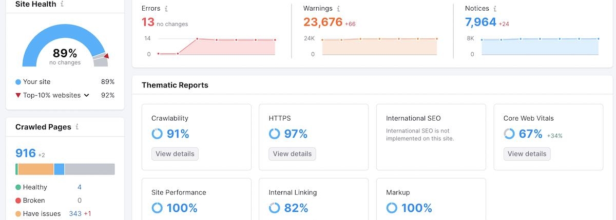
When Semrush is done crawling your website, it will look something like this:
Ideally, you want your site health, which is a measure of all your technical SEO, to be close to or above 90%.
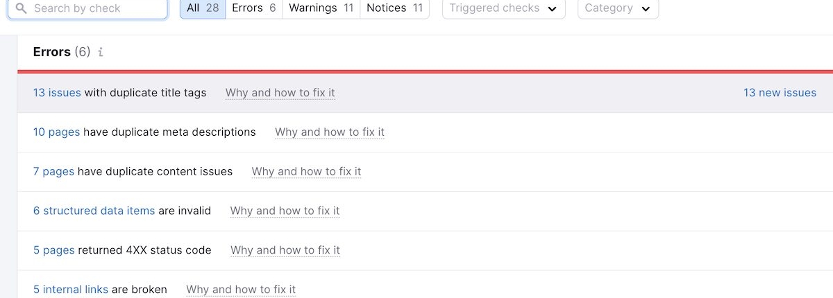
To view the specific technical SEO issues on your website, go to the tab that says “Issues”. Semrush tries to prioritize issues as:
- Errors: Usually the most impactful, biggest issues to fix.
- Warnings: Issues you should fix but may take more time.
- Notices: Issues that are recommended but aren’t urgent.
However, keep in mind that these are only tools. They can identify issues, but you’ll need to resolve them on your own or hire an SEO agency to resolve them for you.
Also, they aren’t foolproof. Sometimes, auditing tools miss errors and aren’t great at prioritizing them. It helps to have an expert manually verify errors and implement fixes from the highest priority, quick wins to low priority.
How to do a website UX audit
There are many ways to approach a UX audit. One of them is a heuristic website analysis or evaluation. If you have a limited UX budget and time to do user research, a heuristic evaluation is a scrappy way to identify quick wins and opportunities on your site. User research is still important but this will help you get started.
It’s a quick way to gauge the user-friendliness of a website. Instead of testing with users, which can be expensive and time-consuming, experts review your website.
Heuristic website analysis
There are many methods of heuristic analysis. Each tests the usability of your website to identify areas that you can improve.
A common method is to look at Jakob Nielsen’s 10 principles. Another method is the seven-level conversion framework. There are several variations of this, but they all evaluate website design by how well it facilitates user conversions.
You’ll go through your website’s most important user flows and assess how well it does for each level. For example, let’s say you want someone to search for a product in your online store, add it to their cart, and complete the checkout process. You’d go through that process and evaluate it using the framework.
The levels of the conversion framework include:
- Relevance: When users land on this page, is it right for them?
- Trust: Does the page include reviews, social proof, and other elements that evoke trust?
- Orientation: Is it easy for users to navigate and find what they want?
- Stimulation: Are you giving them a compelling reason to buy your product or service?
- Security: Do you feel safe to share information with or purchase from this website?
- Convenience: Is it easy and quick to use the website and purchase?
- Confirmation: Do users feel good about their decision after buying or taking action?
Go through each level, identify issues, and then brainstorm solutions. Ultimately, you want to eliminate user pain points or areas that cause friction as quickly as possible.
SEO and UX audit checklist
SEO and UX have many moving parts. Although this audit checklist isn’t exhaustive, it can help you identify the biggest areas of opportunity.
☑️ Technical SEO
- Check indexing: Ensure that search engines can crawl and index your website’s pages.
- Sitemap: Verify that an XML sitemap is created and submitted to search engines.
- Robots.txt: Most websites have a robots.txt file that looks like this: https://www.patagonia.com/robots.txt. Go to yours and make sure you’re only blocking or disallowing pages you don’t want search engines to crawl.
- Page speed: Use Google PageSpeed Insights to test the speed of your mobile and desktop experience.
- HTTPS: Make sure your website is using a secure SSL certificate (https://).
- Canonical URLs: Use canonical tags to prevent duplicate content issues.
- URL structure: Make sure URLs are descriptive, user-friendly, and include relevant keywords.
- Broken links: Check for internal and external broken links. Redirect them to relevant pages or remove broken external links.
- Schema markup: Implement structured data to enhance search result appearances.
- Duplicate content: Check for and address any duplicate content issues.
☑️ On-Page SEO
- Title tags: Each page should have a unique, descriptive, and keyword-rich title. For some pages you may be able to no-index so you don’t need to update every page.
- Meta descriptions: Meta descriptions appear in the preview of search results. Improving them could lead to better click-through rates.
- Headings: Use appropriate heading tags (H1, H2, H3). The H1 tag is the page title and there should only be one per page. The rest should be H2 and so on.
- Image optimization: Use descriptive alt text and compress images for faster loading.
- Keyword optimization: Identify keywords you need to rank for and opportunities to create or improve content to rank in search results.
- Content quality: Review the content on your site to make sure it is SEO-optimized. It should match search intent and show your expertise.
☑️ User Experience (UX)
- Site navigation: Review your navigation to assess if it’s easy to follow and find your most important pages.
- Responsive design: Test the site’s performance and layout on desktop, mobile, and tablets.
- Visual hierarchy: Can users easily identify the most important messages or actions on the page?
- Call-to-action (CTA): Do your main pages include one primary call-to-action and is it designed in a way that encourages users to click?
- Forms: Are your forms easy to complete and collect only the most critical information?
- Site search: Can visitors easily search and filter search functions?
- Font and typography: Is your font easy to read with the right sizes and high contrast?
- Accessibility: Does your website meet accessibility guidelines (WCAG)?
Once you audit your site, you should regularly monitor performance and make adjustments. SEO and UX audits are ongoing. If you’re looking for ways to improve your website’s SEO, user experience, or conversions, you can also reach out to Tuff and book a strategy call. We’re here to help.


