Onboarding Emails: Three things that increased clicks by 50%
Installs, sign-ups, trials, and demos mean nothing if you can’t keep your users. Which makes your onboarding email campaign incredibly important.
It’s your first impression. But, it’s also your opportunity to guide new users to take the action that will increase their lifetime value.
Before you start working on getting more people to your site, you need to make sure you have an onboarding experience that motivates your users to take that action you care most about. Otherwise, you’re throwing money out the window.
Onboarding Emails In Action
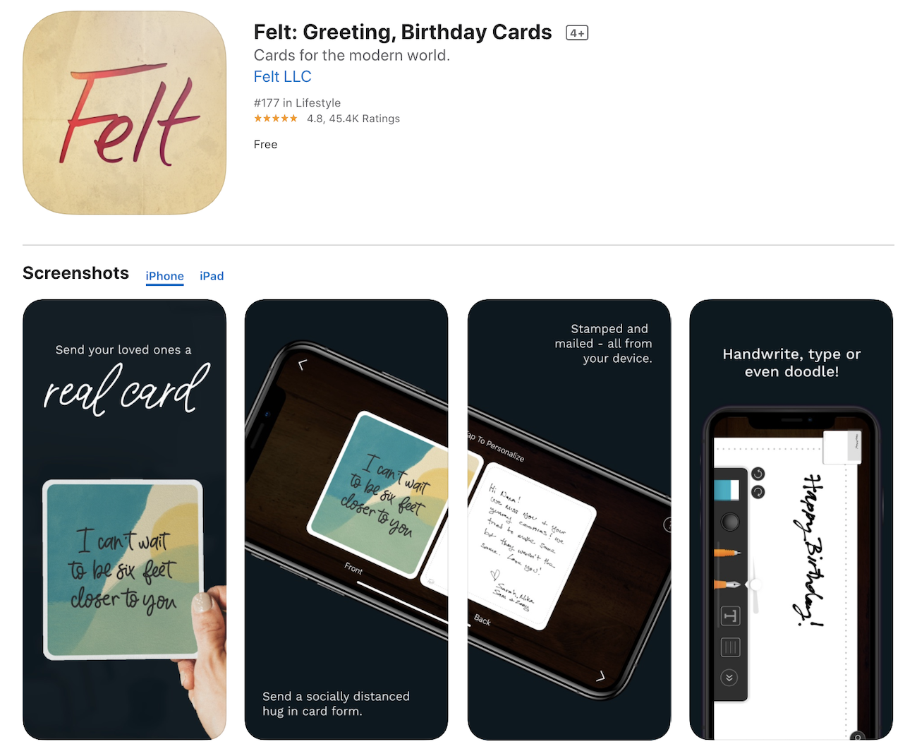
Earlier this year we started partnering with Felt, a company building an app that sends your personal, handwritten cards and photos from your phone. Our goals were to increase reach, installs, and revenue by running data-driven campaigns on different channels.
While our full strategy was a mix of campaigns and channels (Facebook Ads, Google, YouTube, Apple Search Ads, etc), in this post, we’re going to focus on just one of the tactics: onboarding emails. We were able to increase clicks by 50% through these three steps:
- Step 1: Mapping out the existing flow and setting benchmarks
- Step 2: Figuring out the “aha” moment (using data)
- Step 3: Rewriting, redesigning, and rebuilding each email to focus on that “aha” moment
But, first, we’ll set the stage.
The Results: A look inside the numbers
On average, 600 – 700 people install Felt every day. Each person who downloads the app and doesn’t immediately send a card, gets put into the new user onboarding email flow.
Here’s what the numbers looked like before and after we made adjustments based on our research, learnings and experience. On the left, you have the original onboarding flow and on the right, you have the updated flow.
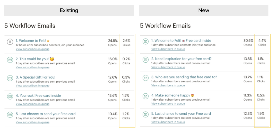
With our first round of improvements, we were able to increase the ‘Clicks per unique opens’ from 7.5% to 11.3%. This action (getting people back in the app and sending cards) immediately gave us a sustainable increase in daily revenue.
At this point, we’re only scratching the surface.
Holistically mapping the user journey
With every client, we analyze each piece of the conversion puzzle so we can spend our time focused on the areas with the highest impact on revenue.
In the first two months of partnership, we:
- Configured Branch for better campaign analytics
- Produced copy and creative (videos and images)
- Set up Facebook/Instagram ads
- Set up Google Ads
- Set up Pinterest ads
- Built and launched an influencer program
With the combination of these tactics, install volume skyrocketed. It’s also worth noting that sending handwritten cards from your phone is a helpful resource while the country sheltered in place.
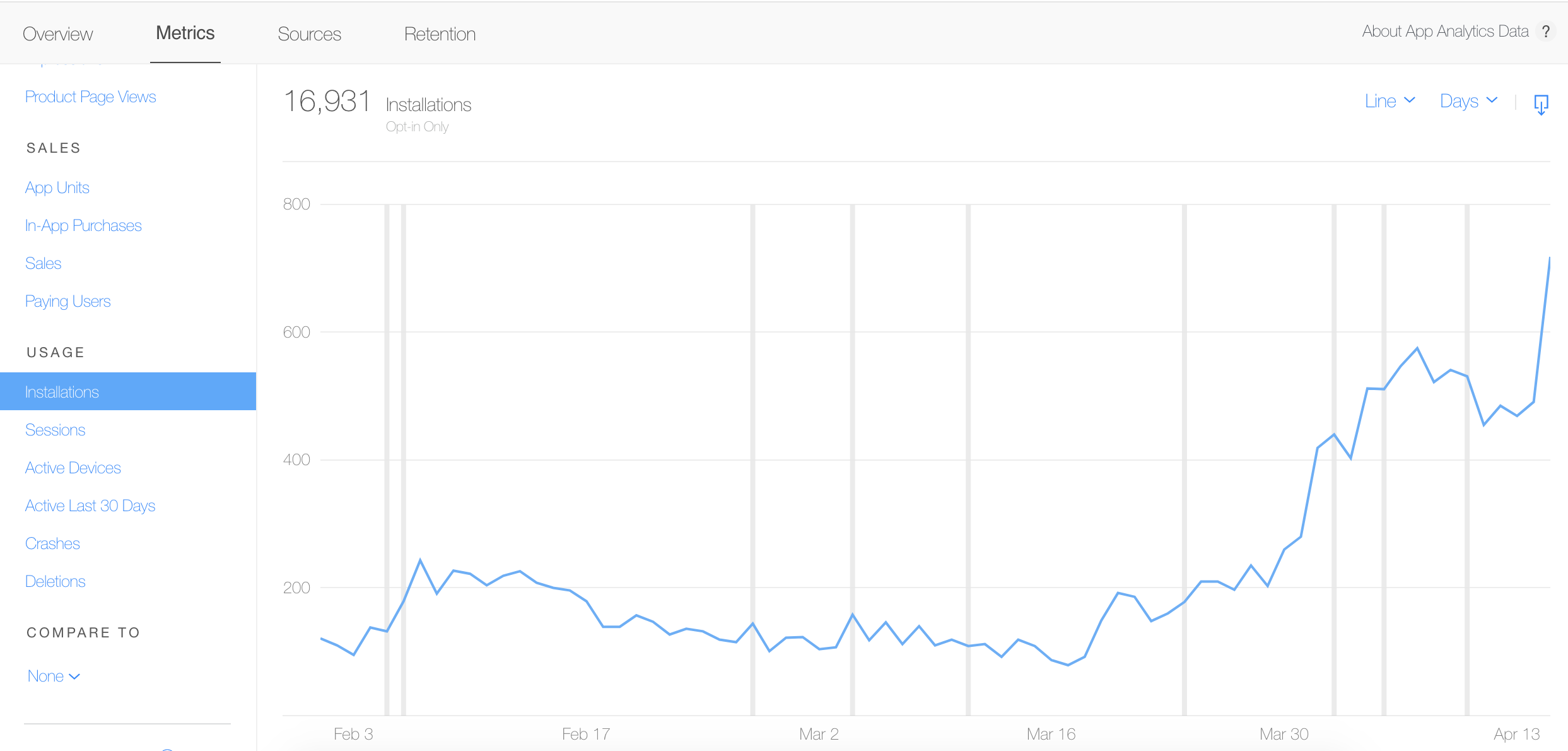
With the spike in users, it was even more important to make sure they were adopting the Felt app, sending cards, and having an awesome experience.
So we conducted a full funnel analysis. We asked key questions and mapped data to the user journey to identify where we could improve. We started with:
- How does a user get from install to paying subscriber?
- For Felt, it’s when the user sends their first card. If a new user sends a card, they 2x their spend in the subsequent 5 day period.
- What’s our “aha” moment? When do users really get the value of Felt?
- When the person they sent a card to actually gets it in the mail. Which speaks to the “do good, feel good” aspect of Felt. When people send cards it makes them feel happy.
- What touchpoints can we leverage to guide our users down the funnel?
- For us, this came down to triggered emails, retargeting ads, and app-based onboarding cues. The first, and quickest win was email, so we started there.
Here’s what we did:
Step 1: Mapping out the existing flow and setting benchmarks
The 5-series email flow for new installs was in good shape. It was already set up in Mailchimp and had been running for months. We liked the timing but wanted to see if we could increase the number of users who click on each email in the sequence.
We started by mapping out the entire email flow:
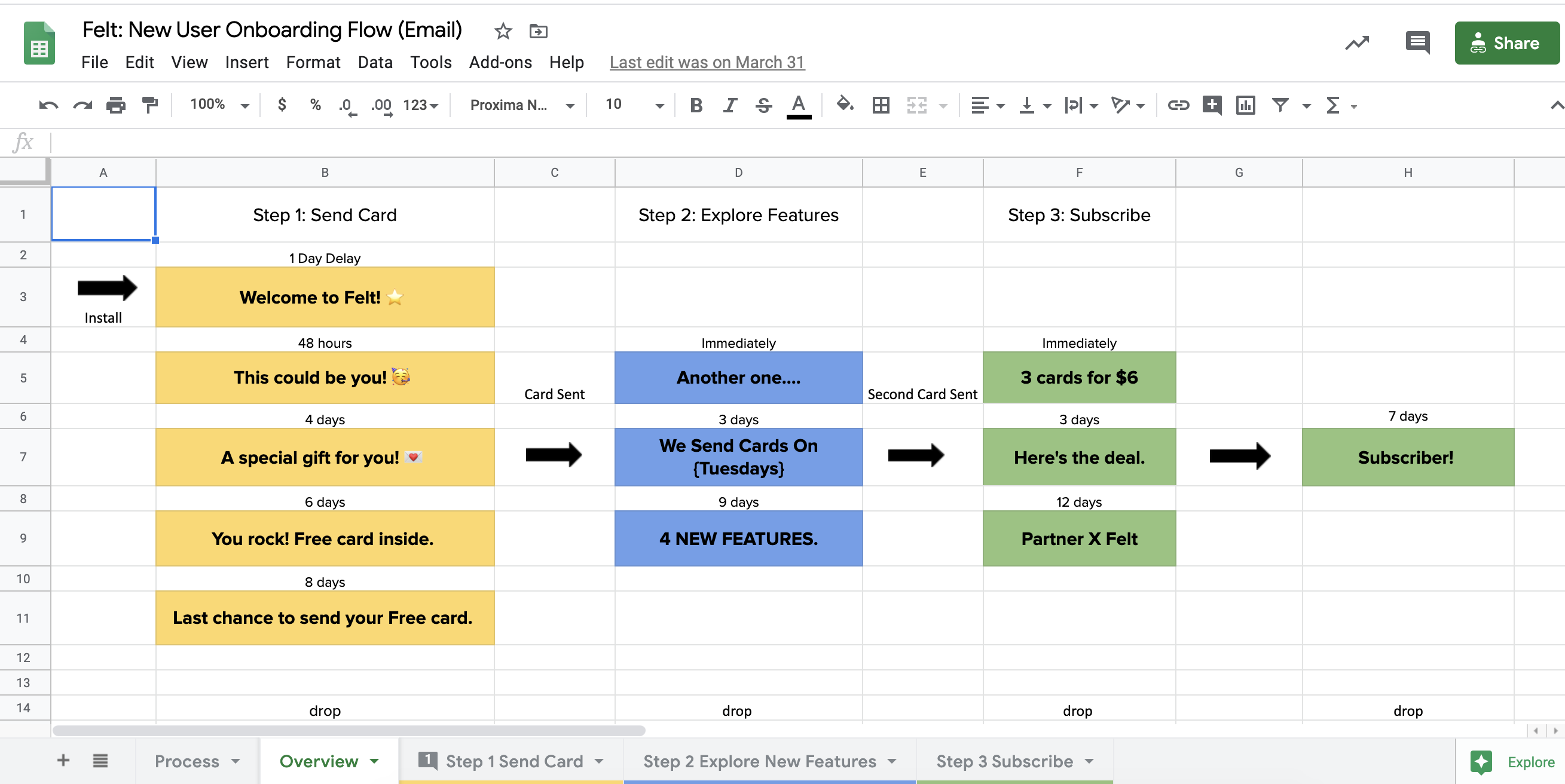
(There are tools to visualize this type of work but I still love good ol’ fashion spreadsheets).
Step 2: Figuring out the “aha” moment (using data)
When we conducted the full funnel analysis we uncovered one of the most critical moments for a Felt user. The first card in Felt is always free. When a user sends that free card within the first week of downloading the app, they are 4x more likely to become a paying customer.
So, how do we get someone who downloads the app to send a card quicker?
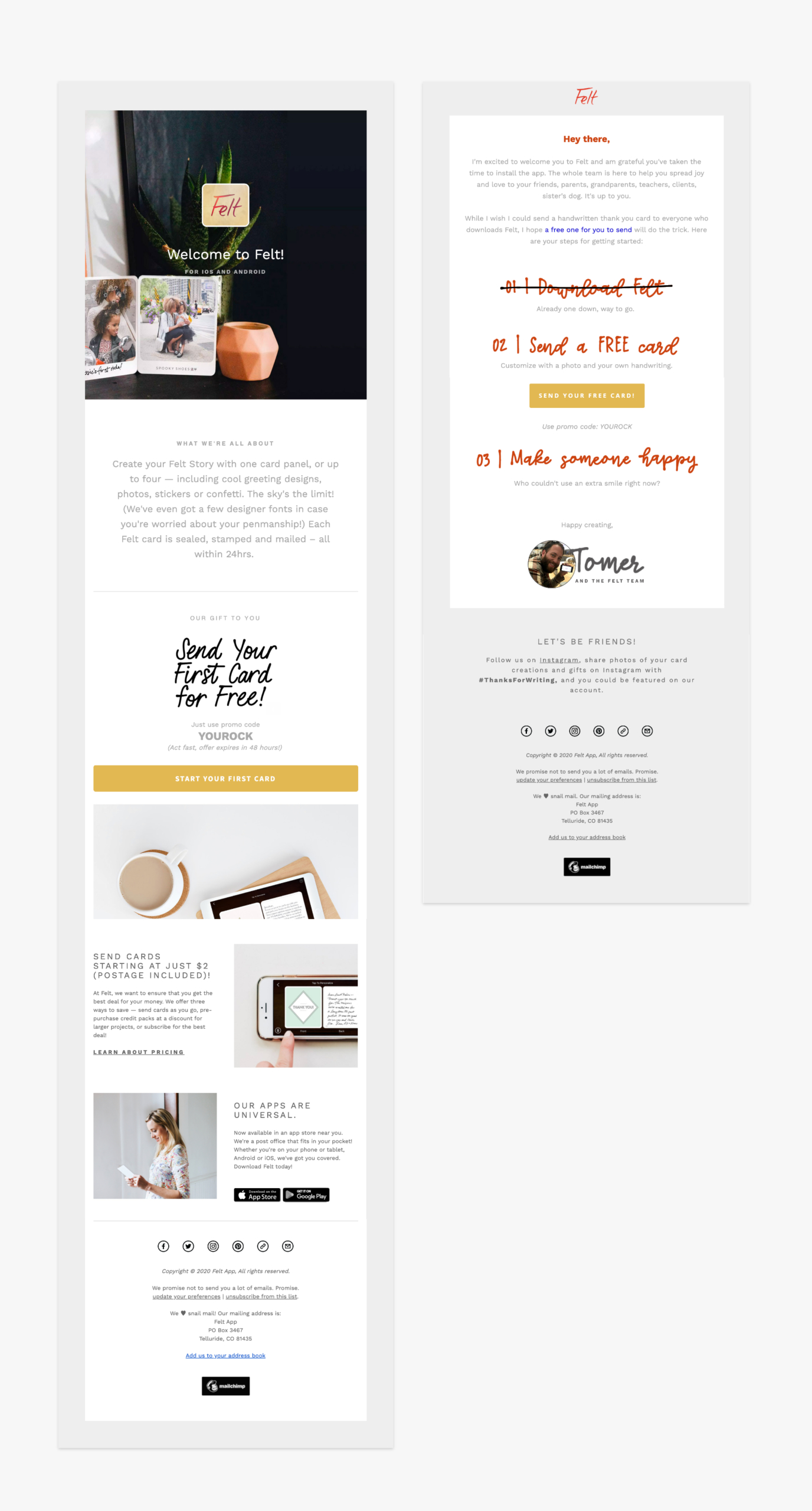
Step 3: Rewriting, redesigning, and rebuilding each email to focus on that “aha” moment
Now that we were crystal clear on the one action we wanted our users to take (CTA was “send a free card”) we rebuilt the email flow to focus users on taking this action in a few ways:
- We stripped out extra images (removed 4 total)
- We removed any marketing copy that wasn’t about our sole CTA (cut the word count by 505)
- We outlined the user journey so it was clear exactly what the next steps with Felt looked like
- We acknowledged that they had already done something huge (install the app) and so only had one more thing to do
- We linked the “send free card” twice – in the primary CTA and in the text of the email
To put it more directly, we removed anything that would distract the user from sending the free card.
Up Next
We mentioned these adjustments are just scratching the surface. We’re lucky that the Felt team had already been sending onboarding emails, giving us a benchmark to start from.
As we continue with our goals to increase reach, installs, and revenue we’ll want to continue updating and testing emails so the next post is about how we increased conversion by 50%.

Ellen is the founder at Tuff and one of the team’s core growth marketers. She is a versatile marketer with expertise in multiple channels – from ppc to seo to email to others – responsible for the experiments and testing. She is happiest when she’s on the ski hill or outside pointing her mountain bike downhill.