Reduce, Reuse, Recycle: Short-Form Video for TikTok and YouTube
We know firsthand that creating impactful, short-form video content can make a huge difference for startups. When done correctly, bite-sized videos have the power to instantly capture your viewers’ attention and increase conversions—but if they aren’t platform-specific, they can quickly fizzle out without making a splash.
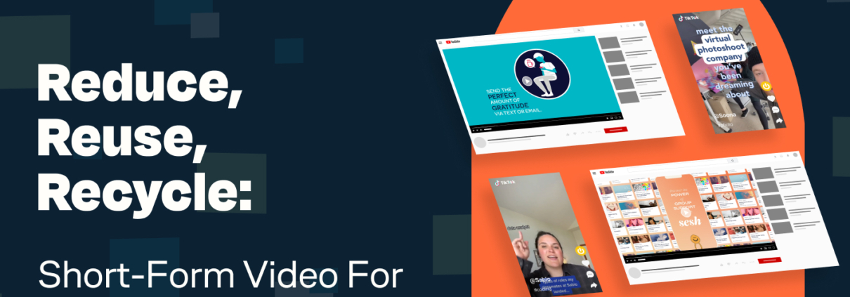
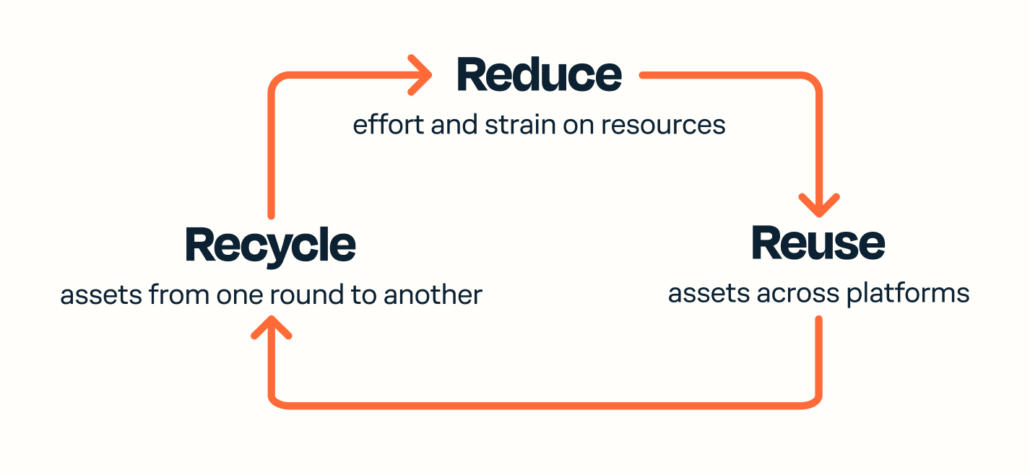
If you want to create powerful content for your brand, you’ll need to understand how platforms like YouTube and TikTok influence the videos you produce. To help you get started, We’ll first compare the differences between content for YouTube and content for TikTok. We’ll then share some cost-effective ways to increase your engagement without increasing your production cost with this Reduce, Reuse, Recycle technique. Here’s a sneak peek:
- Reduce: Lower costs by creating low-lift, high-impact in-house creative.
- Reuse: Tweak assets made specifically for one platform to perform well on another platform.
- Recycle: Double down on assets from one creative round to optimize the next.
Platform Dynamics: TikTok vs. YouTube
TikTok and YouTube both capture attention via user-generated content (UGC for short), but they do this in very different ways.
TikTok is built to handle all editing in-platform, leading to specific, amateur-style video editing that users prefer and the platform encourages. YouTube is built for uploads, which means creators use their own tools for video capture and editing. YouTube videos are usually made with better cameras and editing techniques, leading to high-quality, professional-looking videos.
So, with these platform differences in mind, it begs the question: What kind of ad content really grabs people’s attention?
Performance Creative: Crafting Irresistible Videos For TikTok
We know what you’re thinking: “Higher quality ads must always perform better, right?” But surprisingly, our A/B test results tell us that optimizing ad quality to match a platform’s surrounding content is the most effective strategy.
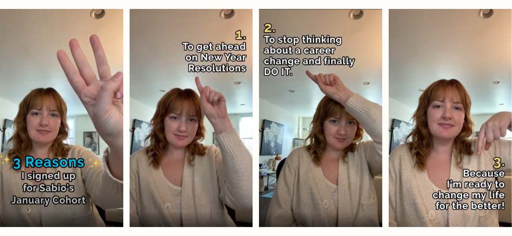
If you’re producing ads for TikTok, you’ll want to create videos that match the platform’s native, amateur style. Check out this example, where CodePath saw a 47% increase in CTR by using TikTok caption styling:
Version A
UGC with branded style and animation: 0.32% CTR
Version B
UGC with native TikTok font captions: 0.47% CTR
During this test, we learned that simple, choppy, on-screen text performs better than buttery smooth transitions and flashy logo animations.
For us motion designers, this revelation poses a unique challenge. Instead of aiming for the highest quality design possible, we should instead match the subtle imperfections and simplicities of TikTok’s native style while still keeping the ad engaging, message-focused, and adhering to brand guidelines.
With that in mind, here are some tried-and-true tips for more making effective TikTok ads:
- Watch a LOT of TikToks. You’ll get a better feel for in-platform timing between messages and footage cuts. By watching the content critically, you’ll learn what you find most engaging and how that can translate to better ads. (And proudly tell yourself that you’re not wasting time, you’re researching!)
- Keep an eye out for trends. Utilizing TikTok trends in your ads can help you showcase your brand’s message in fun, creative ways and further connect with your audience. For example, we’ve created a few high-performing ads where our talent points to different areas on the screen and corresponding copy appears.
- Do it yourself! This is where “reduce” comes in. TikTok is an awesome tool for startups —you don’t have to spend tons of money on video production to see results. Ask your team if anyone would like to try recording videos or voiceovers. Authenticity is everything on this platform, so show them who you are!
Performance Creative: Crafting Irresistible Videos For YouTube
We’ve learned that a much different approach works best for YouTube. Combining higher production value with high-quality footage, voiceover, and/or complex animations is our formula for success.
Take an example from our blog post, How YouTube Ads Work + 5 YouTube Ad Campaign Examples. We made an ad for Tony’s Acoustic Challenge that combined animation and high-quality footage with a voiceover recorded by a member of our team. We were able to increase their click-through rate by 36% over the UGC-style ads they previously produced.
Being flashy and appealing to emotion is the name of the game—but don’t just take our word for it! YouTube actually has a great resource called the ABCD’s of effective video ads for the platform. You’ll notice many of their examples are ads that cost a LOT to produce. Since most orgs work within strict budgets, here are a few helpful tips for creating more effective YouTube ads without breaking the bank:
- Reuse what you already have! If you have some leftover UGC footage from your TikTok experiments, spice it up with your brand logo/fonts/colors and add some text animation. (Don’t forget to export your TikTok video before you add text to it. You’ll want to make sure you have a nice clean video file to work with.) User testimonial videos can work well here. They’ll give your ads some voiceover audio, which works much better than just music alone.
- Make sure your brand is present early and often. Ideally, you’ll have your logo on screen and have the audio state your brand name within the first three seconds.
- Keep your ad type in mind. YouTube offers three types of in-video ads, and all have their strengths depending on your goals. We usually start off testing the three against each other to narrow down which has the most value:
- Bumper ads: A six-second, non-skip ad. Prices fluctuate, but these are generally the cheapest option because they can’t be clicked on. Keep in mind that this route is best suited for an awareness campaign.
- Skippable: An ad that can be skipped after five seconds. These ads tend to be moderately priced and can be extremely useful. Just make sure you have an interesting hook to grab the viewer’s attention right away — you want them to watch past the skip point!
- Non-skippable: These are about 15-30 seconds long. They’re usually the most expensive because you hold the viewer for your entire ad.
Data Insights for Improvement
Now that you have a basic understanding of platform-specific content and tips for how to produce engaging ads, your next step is to identify key metrics for gauging your video performance and doubling down on what works. Here’s how to do that:
Step #1: Plan
Figure out what your goal is. Conversions? Signups? Leads? Purchases? It will be a bit different for every company, but the important common thread is to make sure it’s driving measurable actions. Things to measure include click-through rates (CTR), return on ad spend (ROAS), and cost per acquisition (CPA). You’ll want to decide what’s most important to you at the beginning to make sure you have a north star to follow through the rest of the process.
Step #2: Execute
Produce assets that align with your goals. Your assets should be engaging and platform-specific, but the messaging and call-to-action should also be clear to the viewer. We recommend starting with three to five assets on a first round of production so you can test them against each other. A quick way to reach this quantity during your first round is to use the same asset with two or three different messaging themes. (This is an A/B/C test!)
Step #3: Analyze and iterate
First, you’ll want to create a timeline for running your ads. (We’d usually recommend a 4-12 week period.) Next, you’ll need to pull the data and analyze the metrics you chose during your planning stage. See which messaging/ad aesthetic performed best, and then move all of your assets in that direction during your second round of production. For round two, I’d still recommend three to five assets — but instead of starting from scratch, you can “recycle” instead. Keep your top two performing assets (making tweaks if needed) and produce one or two new assets based on the data you pulled.
If you’re looking for even more in-depth information about testing and iterating your creative, check out our article: Performance Creative: What is the Ideal Timeline and Cadence of Testing and Iterating?
Wait, wait, wait!
Creating three to five platform-specific concepts per round? That’s a lot of content! But remember, that’s why we’re focused on reducing, reusing, and recycling.
- Reduce cost: Create your own content within your organization and keep it authentic.
- Reuse assets: Start with an amateur-style video to use on TikTok — then tweak it and add brand colors, music, and some graphics/animation to raise the production value for YouTube.
- Recycle content: Don’t toss previous assets. Instead, iterate on them to align with your goals and send them back out there!
Now that you have insightful platform knowledge and tips for executing effective creative, you should have all the tools you need to make sure your video content makes a splash! Looking for help from the experts? Reach out to Tuff and we’ll get you where you need to be!

Travis a Motion Designer and Video Editor currently working for Tuff Growth Marketing. He’s worked with many interesting clients on lots of amazing projects and is always looking for opportunities to branch out and try new things.


