Ad Creative Types That Constantly Drive Performance (Regardless of Industry)
Testing, testing, testing! As a creative team tucked inside a growth agency, we throw around that word a LOT. Especially because we partner with scaleups looking for quick, efficient (and sustainable) paths to growth. Making sure we’re clear about what we’re testing—and executing it within rock-solid social ad campaigns—ensures that on the other side of a few thousands of dollars worth of ad spend (and oftentimes even less), we can take a step back and confidently say, “here’s what worked; here’s what underperformed.” You can read all about that and get our tried-and-true templates in this blog!
How we set up an ad creative test at Tuff:
- Most often when we begin to outline our tests for a new partner, we’re talking value props. Our question: “Which of your core messages is most likely to stop a scroll and win a click?” During this testing phase, we’re keeping the creative formatting relatively simple and getting very particular about the creative messaging. This way, we can isolate that variable and come to a cleaner, more definitive conclusion after our test period has ended. For one of our partners, Betterleap, this is what this looked like!
- After we’ve run a few tests and feel confident that we’ve honed in on our strongest message, we’ll begin to experiment with look and feel of ad creative. In this phase we’ll diversify creative type and formatting, launching a suite of creative that includes user generated content, UX animation, simple/bold copy statements, offers, and more.
- Our goal in these subsequent phases is to hone in on what elements of creative assets drive those clicks. And THAT is what this blog is all about. Although the companies we partner with span across a wide range of industries, after publishing hundreds of creative assets and running dozens of tests, there are three main types of ad creative types that reign supreme.
Note: while we run campaigns on a multitude of different platforms, this blog centers primarily on what we’ve found to drive the best performance on Facebook/Instagram.
The three types of ad creative that constantly drive performance:
1. Split-Screen Creative
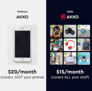
Believe it or not, REGARDLESS of industry or company type, split-screen creative is consistently among our top performers. We’ve even pitted it against bold, colorful branded videos, 3D animations, custom illustrations…you name it. And split-screen creative still drives better performance. When we first spotted this trend (with our partner, AKKO) we scratched our heads and thought, “okay let’s create a fresh version in our next round and see if the trend holds up.” Spoiler alert: it maintained it spot at the top of our performance pyramid and hasn’t wavered since.
If you’re over there thinking, “no way, jose! Video ALWAYS wins!” Well…that’s what we thought too before we saw the numbers!
2. Made-On-TikTok Creative
TikTok is unequivocally the fastest-growing social platform. It’s a hotbed for sprouting new trends that permeate every other. It’s also the channel we get asked about the most by organizations looking to partner with a growth agency like Tuff. “Can you run ads on TikTok for me?” is arguably the question that we see most often in our “Let’s Talk” form fill.
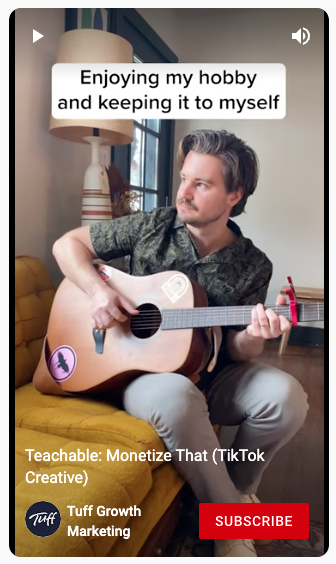
So, we started building a network of creators and making high-impact ad creative for TikTok! We also spotted an easy opportunity to test this creative outside of the TikTok ad platform. Our results: regardless of channel—but most clearly on Facebook/Instagram—our made-on-TikTok ad creative type drives incredibly strong performance (even when resized in 1080×1080 for in-feed placements). (Note: click the image to see the full video!)
3. UX Animation
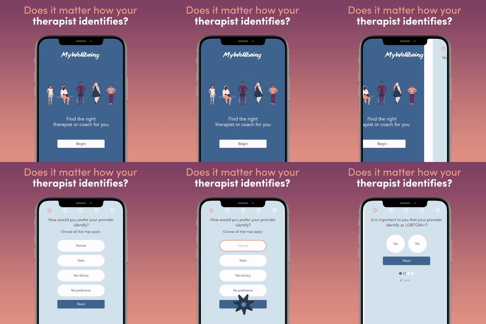
The third type of creative that consistently puts up strong click-through rate numbers is UX animation. This doesn’t just apply to SaaS businesses, though, when we can show what the user experience of any platform is like (even if it’s just a checkout flow or onboarding process—something the user might only experience once) we see performance inching higher.
Our hypothesis: when we can demystify the “how it works” part of the equation right out the gate at the top of the funnel, we subliminally communicate to our audience that we really care about their experience. So much so, we want to show them ALL the inner workings before they even click! Especially because the most-used sites on the internet are user obsessed, your potential customer has a low tolerance for clunky interfaces or ugly design. Positioning yourself as a winner in UX from the get-go is consistently a win! (Note: Click the image to view the full video!)
There you have it! While we’re always generating new ideas and hypotheses, these three ad creative types are ones you’ll consistently see within our ad creative suites. Because they work!
Have you been experimenting with creative formatting? We’d love to hear about it! Or, if you’re curious about what we could uncover about your organization and target audience through creative testing, let’s chat!


