Revving the Creative Engine: A Checklist for Setting a New Creative Team Up for Success

Working with a new designer? Onboarding a new team member onto your creative team? OR maybe you’ve just called in a growth marketing agency like Tuff to make amazing ad creative and boost your growth marketing strategy. No matter the particularities, there are a handful of things you can hand over to your new team to set them up for success and make sure your brand stays consistent in the process.
As a startup or scaleup, though, we realize that sometimes as you’re building your company brick by brick, a brand is something that can come about in a more organic way, and not necessarily in a neatly-packaged brand book or style guide. That’s okay!
We built our creative department at Tuff because we believe that great, hardworking creative doesn’t have to be a production, nor does it need to follow all the rules that a more traditional creative agency might insist on. So, consider the following list aspirational. And, if you need to look to our team (or whoever you’re pulling into the scrum) to help elevate your brand throughout UX design or ad creative projects, that is 100% doable.
Ultimately, maintaining a level of brand consistency isn’t just an exercise in vanity. Overtime, recognizability and memorability of your brand will help potential clients or customers recognize you across platform or as they move from awareness to consideration stages, and ultimately, increase their chances of conversion!
Logo File
First and foremost, your logo will be used across all marketing campaigns. It’s important to include all variations and color combinations of your logo. Color variations of all main logo types typically have a light, dark, and full color variation and can allow your creative team to take a number of different creative approaches, like light text on a dark background, dark text on a light background, and everything in between. The more variation we have here, the more we’re able to test, and the more we’re able to hone in on the type of creative that produces the best results.
![]()
When you’re compiling logos, consider all of the following (we’d love to keep as many of these as possible on hand):
- Symbol or icon
- Word mark
- Letter
- Combination – combines word mark with symbol or letter
- Emblem – company name is placed in an emblem, usually a circle or shield
- Emblem + slogan
The file type of these matters to designers as well as developers working across design software. Vector files or SVG (scalable vector graphic) files ensure your logo will appear clear and crisp across different scales and not pixelated. It is best practice to avoid PNG or JPG file types when working within a design software as these often appear blurry and pixelated when scaling across marketing projects. PNG versions are beneficial when correctly sized when handing off to developers for a web project. They should be less than 200KB to ensure fast load times. PNGs are lossless compressed files. This allows them to maintain quality at a small file size. Besides an SVG, here are some other common vector file types:
- .ai (adobe illustrator) this is Adobe’s own source vector file – only editable in Adobe.
- .eps (encapsulated postscript for adobe illustrator) another Adobe-specific file. Best used for printed materials such as business cards, posters, brochures, stickers, clothing, and more.
- .pdf (portable document file can be vector or raster depending on how saved) can be opened and edited in most major design software. Best used for printed materials such as business cards, stationary, letterheads, etc.
- .svg (Scalable Vector Graphic) standard vector file format and can be opened and edited in most major design software. This is the best source file to provide your designer. Can be used across web and print.
Color Palette
Branding elements like the color palette are crucial for designers. Color palettes often include primary colors and secondary colors. Honing in on a consistent color palette does wonders for brand awareness. When establishing a color palette within your style guide, it’s imperative to include HEX codes, RGB (red, green, blue) and CMYK (cyan, yellow, magenta, black) codes. Here’s why (get nerdy with us 🤓):
- HEX codes are most commonly used for designers across digital design. Developers also use HEX codes when implementing website designs. These are displayed as a six-digit combination of numbers defined by a mix of RGB.
- RGB is for electronic digital screens (computers, TVs, cameras, smartphones, etc) where combinations of red, green and blue light are compiled within pixels. RGB is an additive process using colored light. Values range from 0 to 255.
- CMYK is for printed media (magazines, flyers, photographs, product packaging, brochures, etc) and are measured in percentages. CMYK is a subtractive process using the pigment of inks, dyes, or paint.
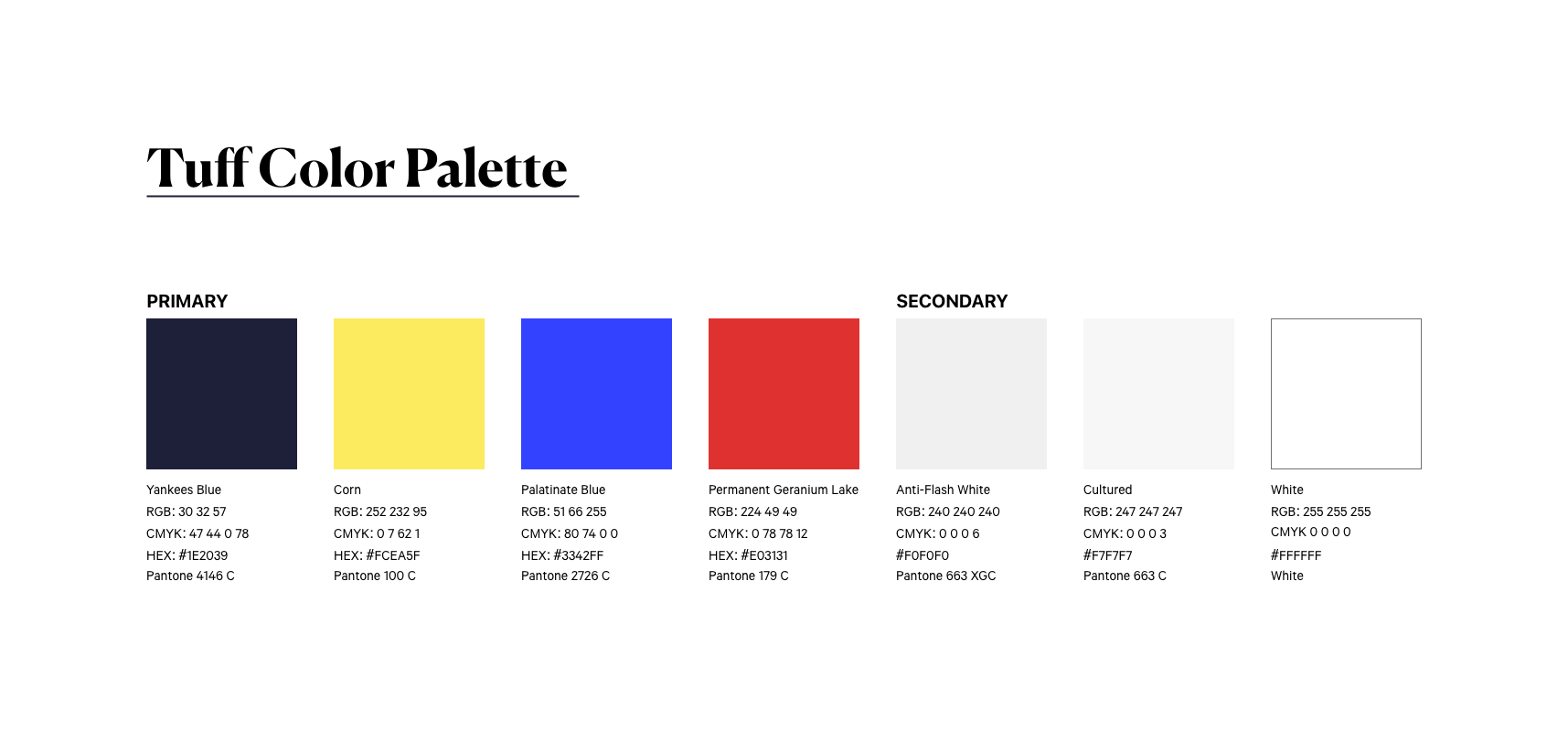
While our creative team here at Tuff steers clear of printing (so CMYK are less important to us) it’s helpful to note that if you are working within a file intended to be used to print, be sure to check your software settings to confirm it is set to the correct color mode.
Typography Files
Typography matters. Typography connects your voice with visual recognition to your audience. The style of typography helps subliminally convey both personality and emotion. And, there are tons of fun design tricks we can use when we’re trying to say something in particular. For example, we can totally change the emphasis on, or noticeability of a sentence when we use different font weights like bold, semi-bold, regular, and thin. Establishing a consistent typeface paired with your color palette is the best way to make your brand stand out from the crowd.
The best file types for fonts to provide a designer is OTF or TTF. These are easily downloadable to install across Figma and Adobe software (our personal faves). These files are also extremely useful for developers as these are easily able to upload and code into a typography system on websites.
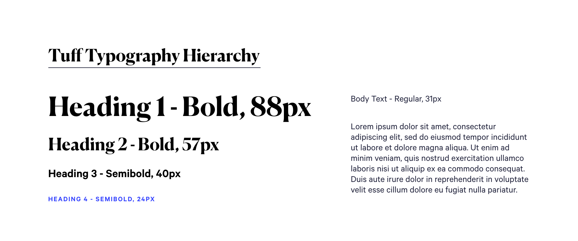
When you’re able to provide your typography hierarchy for Headings (H1, H2, H3, H4, H5, H6) and body text, it sets us up for success for creating landing pages and other web related content so everything is consistent. As a designer, establishing a hierarchy ensures font types and sizes are categorizing information in the right structure to create harmony.
Again, like we mentioned above, if you’re in the relatively early stages of establishing your brand, this is something you might not have and something we’d be happy to help you out with!
Graphic Elements
Do you use graphic elements to communicate concepts at a glance? Brands often establish a particular icon style for clear representation throughout their identity. Icons are powerful tools when used correctly. They provide universal understanding without the use of language. People have short attention spans and often skim information, only stopping to read more in depth if a website or ad is eye-catching within the first blink of an eye. Successful icon illustrations allow designers to communicate concepts quickly without a lot of text.
Providing an icon library ensures that the designers have these specific icon styles to utilize across social ads, website layout, and other marketing materials. And, if we spot a need to create a new symbol to convey a message, it’s super helpful to have a clear style direction to ensure consistency is kept across the brand platform.
Brand Tone and Voice
What is your mission statement? What are your values? What are 5 words that sum up your brand? These all contribute to your brand tone and how you come across to your target audience. And, they’re super helpful for your new creative team when we’re getting to work on concepting—whether we’re dreaming up landing pages, email flows, or social ads.
You might be surprised to learn that your tone and voice can really positively influence a designer. Do you take a bit of a whimsical approach? Then we might choose softer colors. Do you make declarative, bold statements as part of your brand voice? Then we might lean on bolder typefaces. There are nearly endless ways to use your brand voice and tone.
Most organizations that we partner with either has an early version of brand tone and voice, or none at all! Take a peek at our value props exercise (spreadsheet number 11 in this lineup) to see how we’ll help a brand develop the start of a voice during the kickoff of every one of our partnerships.
Photography (Stock vs. Company Photography vs. UGC)
Imagery creates a high impact in design. It has the ability to evoke emotion and effects a user’s mood. When thinking about creative, it’s important to note when to use the right type of photography.
Stock photos are great for providing high-resolution visual assets on a budget to support your brand tone. The risk with free stock images is, hundreds if not thousands of businesses and independent establishments have more than likely downloaded the exact same photo. This typically hurts brand recognition, especially if competitors are using the same photos to communicate similar concepts.
Do you have customers sharing images or reviewing your product online? This user generated content (UGC) may become valuable assets. Using random images on social accounts, such as Instagram or Facebook, for commercial purposes is a big no-no due to copyright violation reasons. It’s worth starting a list and reaching out to your customers to get permission regarding content you are approved to use. This type of content is proven to yield higher click through rates than common stock photography. Providing your designer with a pre-approved list of unique UGC assets will save so much time throughout the design process. Need a place to start with influencer creative? We share our top tips in this article.
Lastly, people LOVE to see who is behind the business. Featuring your leadership team or employees in different departments establishes more trust between your audience and your company. It’s worth investing in company-branded photography for individual headshots, team shots, and community photos during events to allow people a peek into your company culture. Showcasing your team instead of using stock photography creates a more memorable first impression and depicts your brand in a more authentic way. If you have taken the time to invest in company portrait photography, these assets will go a long way for your designer.
Raw Assets
Any raw asset files you have to offer from previous campaigns is a treasure trove to a designer. These may be existing vector files, image files, or video files that are extremely useful for a designer to analyze. Often, when raw Adobe After Effects, XD, Photoshop, or Illustrator files are provided, these can be repurposed and elevated for new content. Original files are always a lifesaver to manipulate and edit content with a quicker turnaround time. However, designers like our team, are used to getting scrappy with minimal MP4, GIF, or PNG/JPG files and are able to recreate or re-imagine elements from scratch.
Strict vs. Flexible
Are you a brand with an established style guide or a brand struggling to create a consistent recognizable identity? This is great information for a designer to know up front in order to determine what constraints they need to work within or if they are able to take more creative liberty to present something unexpected.
Make it all the way through the list? Can you check off all the boxes? Do you have all of this information packaged up and neatly organized in your Google Drive to hand off to any new creative that might be making fun things for you? Thank you win 🥳. If you don’t, you’re still in luck! As we truly can’t say enough, we built our creative department at Tuff on the belief that creative doesn’t need to be a production. Even if you’ve just got the beginnings of a brand, we’ve got you. Let’s talk!

Megan is a multidisciplinary creative designer currently based in Portland, Oregon. Her work ranges from digital marketing design, web design, and development. When she’s not designing you’ll likely find her exploring new cultures or refurbishing furniture.